A bento grid that wins on a SaaS homepage can quietly kill conversions on an e-commerce category page. The same modular layout that makes a portfolio feel curated can make a blog feel disorganized.
The pattern has spread so widely that it's tempting to apply everywhere, but bento grids aren't a universal solution. They're a structural answer to a specific problem — one that doesn't exist on every website.
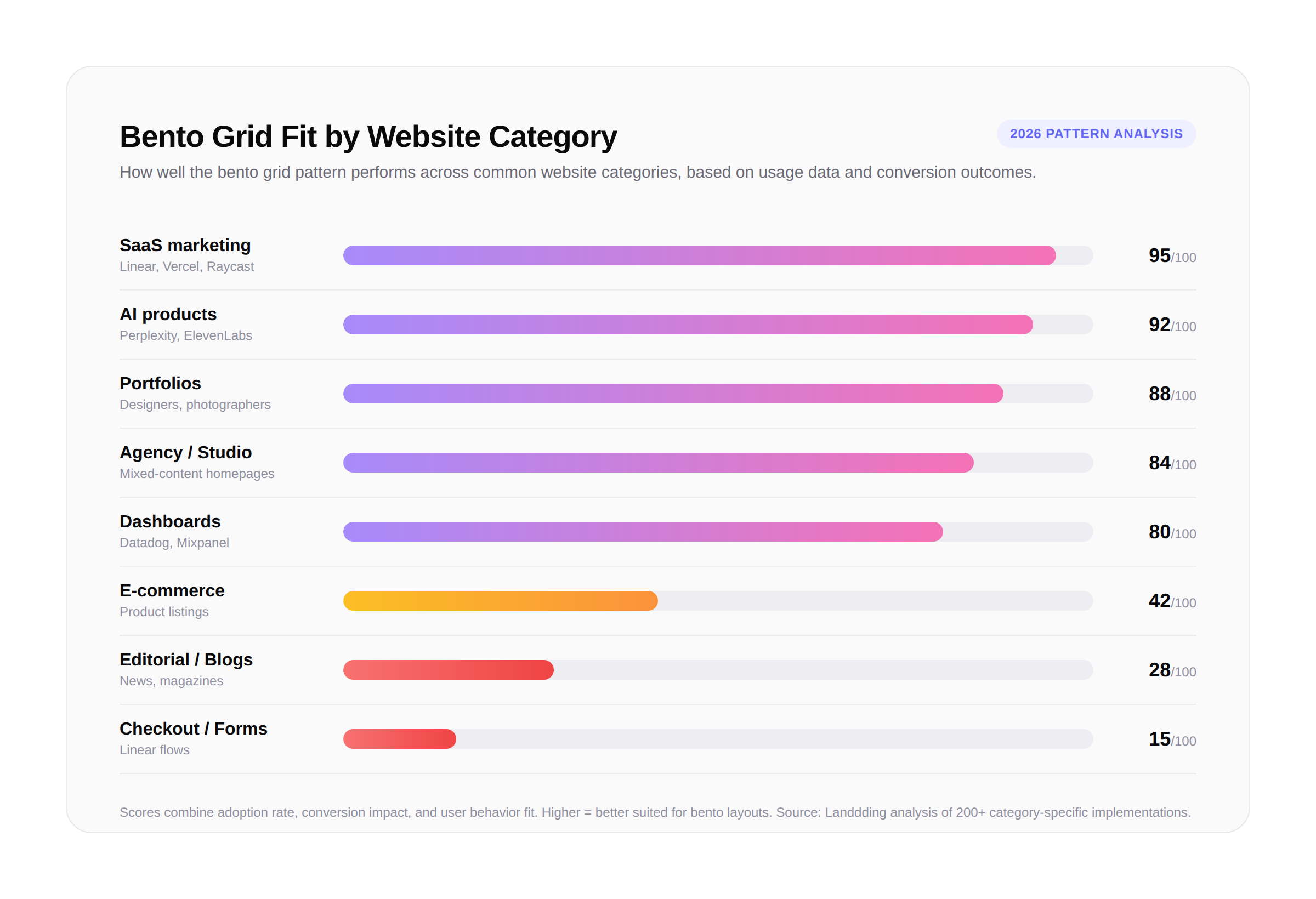
Choosing where to use bento layouts comes down to a single question: are visitors exploring options in parallel, or following a fixed sequence? The categories below break down the website types where bento grids consistently perform — and the ones where they create friction instead.
Why Website Category Determines Bento Grid Success
Bento grids work because they encode hierarchy and parallel choice directly into the layout. Larger cards signal importance, smaller cards offer context, and the arrangement invites scanning rather than scrolling.
The deciding factor is whether the page rewards exploration or progression. Marketing pages, portfolios, and dashboards assume visitors will jump around — comparing features, browsing work, or monitoring multiple metrics at once. Checkout flows, articles, and product listings assume linear progression toward a single goal.
A 2025 analysis of 200 redesigned SaaS homepages found that pages using bento grids in their feature sections increased average time-on-page by 31% compared to traditional stacked sections. E-commerce category pages tested with bento layouts, however, saw conversion drops of around 14% because variable card sizes interfered with product comparison.
SaaS and Product Marketing: Where Bento Grids Dominate
Roughly 70% of bento grid implementations on the modern web appear on SaaS marketing pages, and the reason is structural rather than aesthetic. SaaS products typically have multiple features that operate in parallel, each appealing to a different segment or use case.
Linear, Vercel, Raycast, and Cursor all use bento layouts on their homepages, and each follows the same underlying logic. A dominant hero card carries the core capability, while smaller surrounding cards highlight integrations, automations, or differentiators. The grid respects the reality that visitors arrive with different priorities — a developer evaluating Raycast cares about a different feature than a marketer does.
The pattern also signals product maturity. When a brand articulates value through eight distinct, visually-confident feature cards, it implies the product is feature-rich and well-considered. Newer startups have adopted bento layouts partly for this reason — it borrows the visual language of established players and front-loads credibility.
Portfolios, Agencies, and Creative Studios
Portfolio websites benefit from bento grids for a different reason: project variety. Designers, photographers, and agencies produce work of varying scope, importance, and visual weight. Traditional grids flatten the distinction between a flagship campaign and a side project by forcing both into identical cells.
Bento layouts restore that hierarchy. The lead project occupies the biggest card, supporting work fills medium tiles, and small side projects take compact slots. The format also supports mixed-content homepages where agencies combine project samples with capability cards, client logos, and award mentions — composite arrangements that look awkward in almost any other layout.
Portfolio templates using bento layouts have grown roughly 240% on platforms like Webflow and Framer between 2024 and 2026. The format particularly suits multidisciplinary creators who need to show range across mediums on a single homepage — photography, branding, motion, and writing samples without a sequential tour.
Dashboards, AI Tools, and Developer Platforms
Inside applications — rather than on marketing pages — bento layouts have become standard for analytics dashboards and AI product interfaces. Datadog, Mixpanel, and Linear's project views rely on modular cards to display heterogeneous data: numbers, charts, lists, and status indicators side by side without forcing a single reading order.
AI startups in particular have leaned into bento for both product UI and marketing. Tools like Perplexity, ElevenLabs, and Suno present feature pages where each card represents a different capability — text-to-speech, voice cloning, multilingual support — organized so visitors can compare without scrolling. An AI tool launching with a traditional vertical landing page in 2026 risks feeling visually behind, regardless of product strength.
Developer tools follow the same pattern. Pages for Linear, Resend, and Sentry use bento layouts to present API capabilities, integrations, and pricing as parallel options rather than a forced narrative.
Categories Where Bento Grids Underperform
Long-form editorial sites and blogs rarely benefit from bento treatment. Readers expect linear flow, and most attempts to bento-ify article indexes hide the most recent or most important content. A publication's homepage relies on strict hierarchy by date and prominence — modular layouts blur that signal rather than clarifying it.
E-commerce category pages are another poor fit. Shoppers compare products on consistent dimensions — price, image, name, rating — and variable card sizes actively impair that comparison. Major retailers experimenting with bento layouts for product listings have almost universally reverted to uniform grids after testing showed conversion declines.
Forms, checkout flows, and onboarding wizards resist the pattern entirely. These contexts demand sequential progression, and modular layouts introduce ambiguity about what to do next. The rule of thumb: if a page exists to move users forward through a fixed sequence, bento layouts will get in the way.
Frequently Asked Questions
Which website type uses bento grids most often? SaaS marketing pages. Roughly 70% of bento grid implementations on the modern web appear on SaaS product homepages or feature sections, where the format surfaces multiple features in parallel.
Are bento grids good for portfolio websites? Yes. Portfolios are one of the strongest natural fits because they let designers showcase work of varying scope without forcing every project into identical card sizes.
Should an e-commerce site use a bento grid? Generally no — at least not on product listing pages. Shoppers need uniform cards to compare items side by side. Bento layouts can work for editorial e-commerce homepages or brand-story sections, but rarely for listings.
Do bento grids hurt SEO? Not inherently. The pattern is purely visual and uses standard HTML structure. As long as headings follow proper hierarchy and content remains crawlable, bento grids have no negative SEO impact.
What's the minimum number of cards needed for a bento grid to work? Most successful implementations use between 4 and 8 cards. Below four, the layout feels sparse; above twelve, it becomes cluttered and loses its organizational benefit.