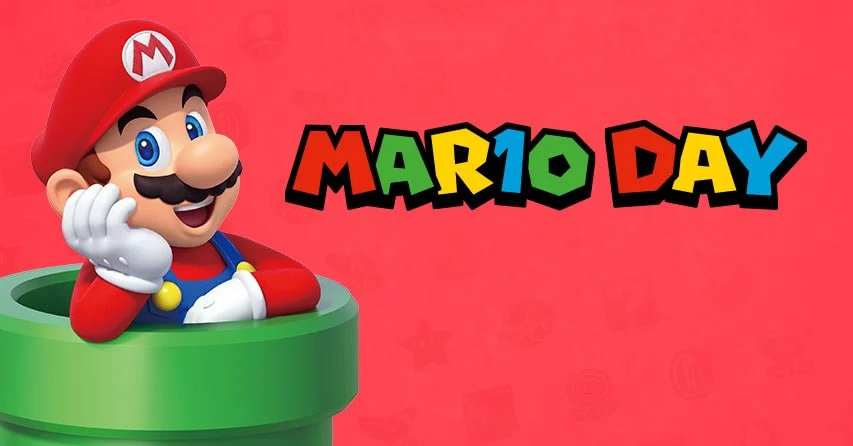
Today is MAR10 Day — the annual celebration of gaming's most iconic character. March 10 looks like "Mario" when written as MAR10, and what began as a fan-made internet pun has grown into one of Nintendo's biggest yearly events.
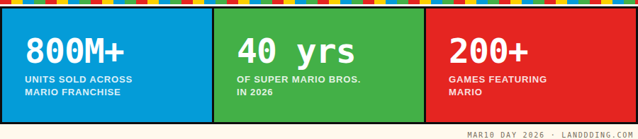
In 2026, it carries extra weight: it's the 40th anniversary of Super Mario Bros., with a new movie landing in April and an internet full of nostalgia.
But at Landdding — a platform obsessed with great web design — we couldn't just write another "happy birthday Mario" post. Instead, we asked a different question: what can the designers behind Mario's universe teach us about building websites that people actually love?
The answer, it turns out, is quite a lot.
MAR10 2026 Is a Cultural Moment Disguised as a Calendar Joke
Mario Day didn't start in a boardroom. It grew organically — fans on social media noticed that "MAR10" looked like "Mario" and ran with it. Nintendo officially embraced the holiday in 2016, and it's been building ever since.
This year, the celebration is bigger than ever, with in-store events, Nintendo Switch game deals, Mario Kart World online tournaments, and the theatrical debut of The Super Mario Galaxy Movie arriving April 1st.
It's a reminder that the strongest brand moments aren't engineered top-down — they bubble up from genuine affection. And affection, in Mario's case, has been earned over four decades of thoughtful, player-first design thinking.
Design Lesson 01
World 1-1 Is the Greatest Landing Page Ever Built
Think about the first seconds of Super Mario Bros. No tutorial screen. No instructions. Mario appears on the far left of the screen, and you instinctively understand: move right. Everything in that opening level is a masterclass in visual communication — a ? block hovers in the air, begging to be hit. A mushroom bounces toward you. Within 30 seconds, you've understood the game's language without reading a single word.
Web designers, this is your homepage. A great landing page does exactly what World 1-1 does: it communicates the core value proposition through experience, not explanation. The user shouldn't need to read a wall of text to understand what you're offering. Visual hierarchy, spatial logic, and a single clear call-to-action should guide them forward — just like Mario always moves left to right.
The Landdding parallel: The best sites in our gallery share this principle — they establish context instantly, guide the eye to a single action, and reward the first click with something satisfying. Zero cognitive load. Pure forward momentum.
Design Lesson 02
Radical Simplicity Isn't a Limitation. It's the Design.
The original Super Mario Bros. ran on hardware with 2 kilobytes of RAM. Mario had a mustache not for style reasons — it was easier to animate than a mouth. His cap removed the need to animate hair. His overalls clearly showed arm movement. Every pixel served a purpose, and constraints forced brilliance.
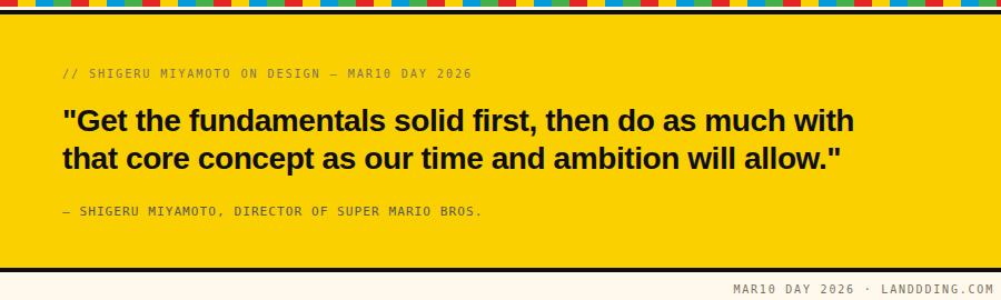
Shigeru Miyamoto, Mario's creator, built the game by nailing the fundamentals first — the jump physics, the feel of movement — and only added levels and enemies at the very end. The core experience was the product.
That's a philosophy modern web designers desperately need to revisit. How many websites are built the other way around — starting with the decorative layer, piling on features, and shipping something bloated before the core interaction feels right? Mario never did that. Neither should your UI.
Design Lesson 03
Progressive Disclosure: Teach Without a Manual
Mario introduces complexity gradually. World 1-1 teaches you to walk. World 1-2 introduces pipes. World 1-3 introduces moving platforms. By the time you face Bowser, you've unknowingly passed through dozens of micro-tutorials — each one layering a new skill on top of the last.
This is progressive disclosure in its purest form. You show users only what they need to know right now. You don't front-load complexity. You earn trust first, then introduce nuance. In web product design, this maps directly to onboarding flows, feature reveals, and the hierarchy of information on any given screen.
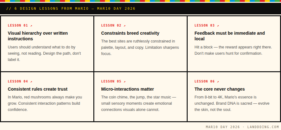
The ? block is a brilliant UI metaphor: you don't know what's inside, but the visual affordance — it pulses, it stands out, it looks "hittable" — tells you it's worth interacting with. Every interactive element on your website should carry that same sense of obvious invitation.
Design Lesson 04
Why Mario Feels Good: The Science of Emotional Design
Mario doesn't just work — it feels good to play. That's not an accident. The jump arc is tuned so that the peak of the jump lands at exactly the moment you'd expect it to. The animation when you collect a coin is satisfying in a way that's almost neurological. The music speeds up as the timer runs down, creating just enough tension to keep you alert.
Emotional design is one of the most undervalued tools in a web designer's toolkit. How does your interface make users feel? Not think — feel. The best websites in Landdding's gallery share something with great Mario levels: they produce a small but genuine moment of delight on arrival. Something unexpected. Something that says someone cared enough to go one step further than functional.
That's the design gap between a site that works and a site that gets bookmarked, shared, and submitted to galleries like ours.
Think about this: Mario has remained the most recognized video game character in history for over 40 years — not because he's technically advanced, but because the emotional experience he delivers is reliable, joyful, and consistent. Your brand should aspire to that same reliability of feeling.
Design Lesson 05
Simple Systems Outlast Trends
Look at the websites that have stood the test of time. Google's search box. Craigslist's bare-bones grid. Wikipedia's hierarchical text. These aren't beautiful by current standards — but they're extraordinarily functional, and they haven't needed a rebrand to stay relevant. They are systems, not aesthetics.
Mario teaches the same lesson. While visual fidelity has leaped from 8-bit to 4K, the underlying interaction model — jump, collect, avoid, progress — is unchanged from 1985. The system is the product. The graphics are just the clothing.
Web designers chasing every new visual trend risk building sites with a shelf life of two years. Designers who invest in rock-solid interaction logic, clear hierarchy, and genuine usefulness build things that last. On MAR10 Day 2026, as Nintendo celebrates 40 years of its most iconic character, that's perhaps the most powerful reminder of all.
Happy MAR10 Day
Go Build Something Timeless
Mario Day isn't just a nostalgia festival. It's a yearly reminder that the best design principles aren't found in trend reports or on social media — they're baked into the games and products that have genuinely stood the test of time. World 1-1 is 40 years old and it still teaches UX better than most design textbooks.
At Landdding, we spend our days looking at the world's most inspiring websites. The ones that stop us in our tracks share something with Nintendo's greatest work: intentionality, clarity, and a core experience that feels genuinely, unmistakably right.
So today — hit the ? block. You might find something worth keeping.