If you spend enough time browsing “cool websites,” you’ll start noticing a pattern. They look impressive, sometimes even award-winning, but many of them are hard to use, slow to load, and unclear in what they’re trying to communicate.
That’s the trap most junior designers fall into. They chase trends like animated websites or aesthetic websites without understanding the underlying purpose of design. The result is work that looks modern on the surface but fails where it actually matters.
Modern website design is not about decoration. It’s about clarity, structure, and controlled interaction.
Let’s break down what that really means in practice.
The homepage is not a playground — it’s a decision engine
One of the biggest mistakes in home page design is treating it like a canvas for creativity instead of a tool for communication. A homepage has one job: to help users quickly understand what they’re looking at and what they should do next.
When you look at strong modern website design examples, you’ll notice how intentional everything feels. The headline is clear, the structure is predictable, and the flow guides you without forcing you to think.
Compare that to many beginner designs, where sections feel randomly stacked, each trying to be visually impressive but disconnected from the bigger picture. That kind of homepage doesn’t convert because it doesn’t guide.
A good homepage doesn’t try to say everything. It prioritizes, simplifies, and leads.
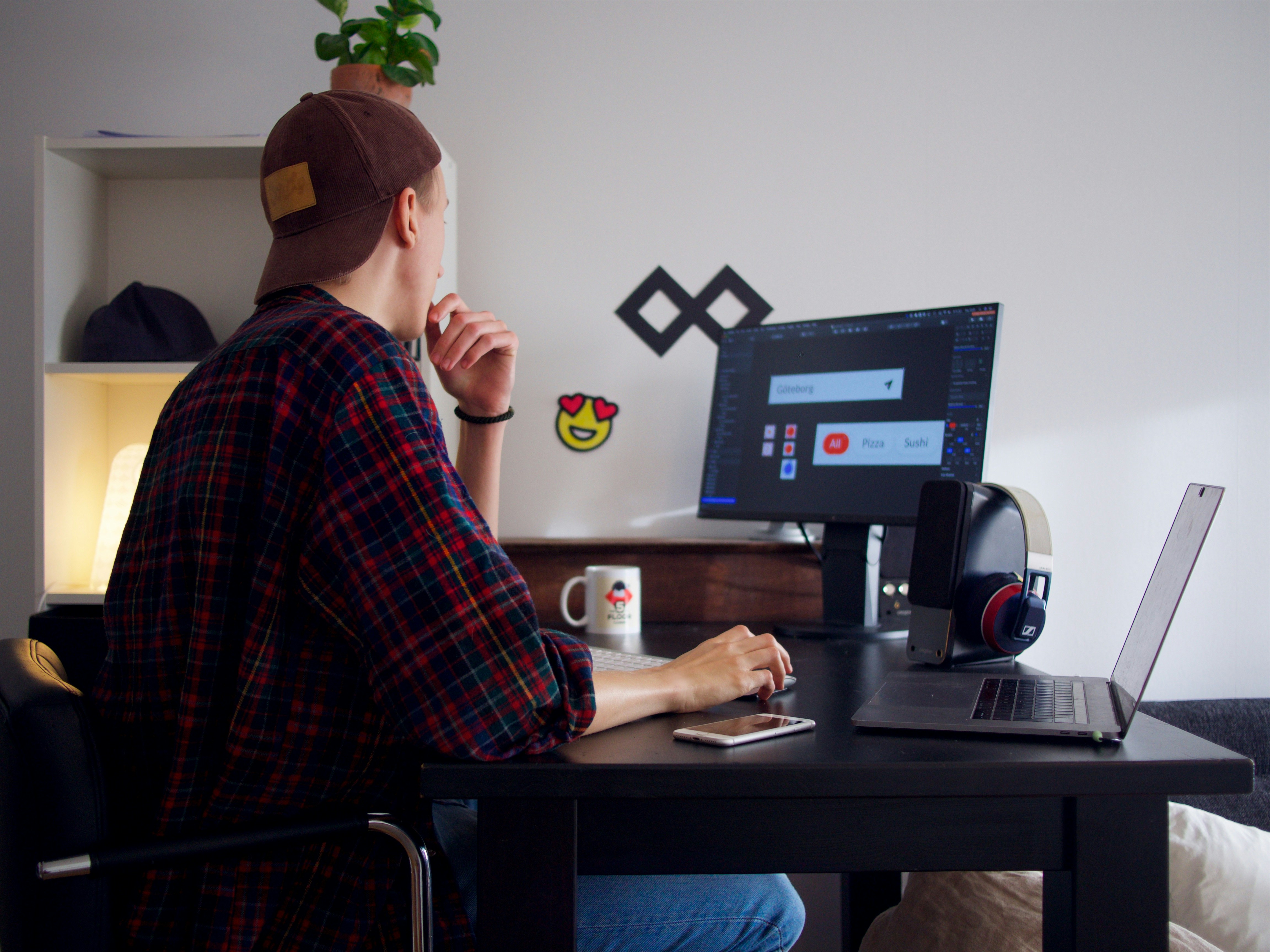
Interactive websites are about feedback, not decoration
Interactivity has become a defining feature of modern websites, but it’s also one of the most misunderstood.
Many designers think adding hover effects, scroll animations, or transitions automatically makes a site feel advanced. In reality, most of these additions are meaningless because they don’t improve the user’s experience.
Well-designed interactive websites respond to user behavior in a way that feels natural. When you hover, something reacts. When you scroll, content reveals itself at the right moment. When you click, the system confirms your action.
These details are subtle, but they build trust. They make the interface feel alive without being distracting.
If your interactions don’t add clarity or feedback, they’re just noise.
Animated websites only work when they respect speed
Animation is powerful, but it’s also one of the fastest ways to ruin a website.
A lot of animated websites look impressive in demos but become frustrating in real use. Delayed content, heavy assets, and over designed transitions make users wait, and users don’t wait anymore.
The best use of animation is directional. It helps users understand where to look, what changed, or what just happened. It creates continuity between sections and adds rhythm to the experience.
What it should never do is block access to content.
If your animation slows down the experience, it’s not modern — it’s outdated thinking disguised as creativity.
Aesthetic websites are built on consistency, not trends
The term “aesthetic websites” gets thrown around a lot, but most of the time it’s used incorrectly.
Aesthetic doesn’t mean visually impressive or trendy. It means controlled and consistent.
When a website feels aesthetic, it’s usually because the designer has made disciplined choices. Typography is limited and intentional. Colors follow a clear system. Spacing feels balanced across every section.
On the other hand, many beginner designs try to look aesthetic by combining gradients, modern fonts, and trendy layouts without any real system behind them. That’s why they feel chaotic after a few scrolls.
Consistency is what creates aesthetic quality. Without it, even the most “modern” elements fall apart.
Black website design is powerful — and easy to mess up
Dark interfaces and black website styles are everywhere right now, especially in tech and creative industries. When done right, they create a premium, focused experience.
When done poorly, they destroy readability.
The problem is that many designers underestimate how sensitive dark design is to contrast. Slight mistakes in color balance can make text hard to read and interfaces uncomfortable to use.
A good black website design feels sharp and intentional. Typography stands out clearly, spacing gives breathing room, and accent colors are used sparingly to guide attention.
If everything glows, nothing stands out.
“Cool websites” don’t mean effective websites
There’s a big difference between a website that looks cool and one that actually works.
A lot of “cool websites” are built to impress other designers. They experiment with layouts, interactions, and visuals in ways that win awards but don’t necessarily serve real users.
If you’re designing for real businesses, your priorities should be different. Users don’t care how creative your layout is if they can’t quickly find what they need.
Modern website design is about reducing friction. Navigation should feel obvious. Content should be easy to scan. Actions should be clear.
The best websites often feel simple, almost invisible. That’s not because they lack creativity, but because their creativity is controlled.
Modern website design is about systems, not pages
The shift that separates junior designers from professionals is thinking beyond individual pages.
Modern websites are built as systems. Components repeat, layouts follow consistent logic, and design decisions scale across the entire product.
This is why platforms like Webflow, and tools like design systems in Figma, have become essential. They force structure, and structure creates efficiency.
When you design with a system in mind, everything becomes easier to manage, update, and expand. Without it, every new page becomes a new problem.
And that’s where most beginner workflows break.
Final thought
If your goal is to create better work, stop chasing trends like animated websites or aesthetic websites as isolated ideas.
Focus on fundamentals.
Clarity, structure, interaction, and consistency — these are what define modern website design. Trends come and go, but these principles stay.
The difference between a beginner and a professional designer isn’t creativity. It’s control.