What is the anatomy of a high-converting landing page? A high-converting landing page typically includes a clear value proposition above the fold, a focused headline and supporting subheadline, strong visual proof or product demo, trust signals such as testimonials or logos, a clear benefits section, social proof and validation, objection handling, a strong call to action, minimal navigation and distractions, and fast load time with mobile optimization. These elements guide visitors from click to understanding to trust to action.
Why Landing Page Anatomy Matters for Conversion
Most visitors who click your ad, open your email, or tap your search result will leave within 10 seconds if the page doesn't immediately make sense to them. Not because your product is bad. Because the page failed to communicate clearly, quickly, and convincingly.
A landing page is not the same as a website. A website informs. A landing page converts. Every section, every word, and every visual element either moves a visitor closer to taking action or gives them a reason to leave.
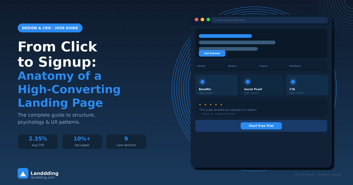
The difference between a mediocre page and a top-performing one is measurable. According to WordStream, the average landing page conversion rate sits at around 2.35%, while the top 25% of pages convert at 5.31% or higher, and the very best performers routinely hit 10–11%+.
That gap is almost never about having a better product. It's about having a better-structured page. Understanding the anatomy behind high-converting landing pages is the fastest way to close it.
The Conversion Path: Click to Attention to Trust to Action
Every visitor who lands on your page goes through a predictable psychological journey. Understanding those stages tells you exactly what each section of your page needs to do.
Stage 1: The Click
Traffic arrives from ads, search results, social posts, or newsletters. The click creates an expectation. The visitor read something that made them curious or hopeful, and they want to see if the page delivers on it.
This is called message match. If your ad says "Build landing pages in 10 minutes," your headline must say something very close to that. Any mismatch between the source and the landing page creates instant confusion. Confused visitors leave.
Stage 2: Immediate Clarity
Research from the Nielsen Norman Group consistently shows that users make their initial judgment about a page in 3 to 5 seconds. In that window, they scan three things: the headline, the hero visual, and the primary CTA.
If those three elements don't immediately answer "what is this, and why should I care?" the session is effectively over. The rest of the page never gets read.
Stage 3: Trust Formation
Once a visitor understands what you do, they immediately start looking for reasons to believe you. Is this real? Do other people use this? Is it any good?
Logos, testimonials, user counts, and product screenshots all serve one function: reducing the perceived risk of moving forward. Trust is not built with words. It's built with evidence.
Stage 4: The Decision
The final stage is the moment of action. A clear, benefit-oriented CTA with minimal friction converts visitors who have made it this far. Friction at this stage is the most expensive mistake a landing page can make.
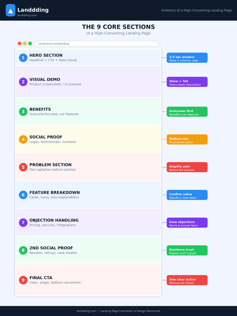
The 9 Core Sections of High-Converting Landing Pages
The following sections form the proven structural backbone of landing pages used by high-growth SaaS companies, AI tools, and marketplaces. Not every page needs all nine, but the most consistent performers include most of them.
1. The Hero Section
The hero is the most important real estate on your page. It must communicate your value proposition immediately, include a clear CTA, and present a compelling visual. Use this formula: Problem > Outcome > Proof. A headline like "Build beautiful landing pages in minutes without code" works because it speaks to the pain, the outcome, and implies accessibility.
The subheadline expands on the headline, typically adding one layer of specificity or social proof. CTA button copy should be outcome-focused. "Start building free" beats "Submit" every single time.
Explore what top-tier hero sections look like in practice at Landdding's design category: landdding.com/c/design
2. Visual Product Demonstration
Show the product as early as possible. A screenshot of the actual UI, an animation, or a short product preview does more to build desire than any amount of written copy. Show, don't tell is the most reliable principle in SaaS marketing.
Dashboard screenshots, product walkthroughs, and interface previews all work. The goal is to let the visitor picture themselves using it. If your product has a strong visual, get it on the page within the first scroll.
For inspiration on how technology products use visuals effectively, see landdding.com/c/technology
3. Benefits Section
Benefits and features are not the same thing. Features describe what the product does. Benefits describe what the user gains. High-converting pages lead with benefits and treat features as supporting evidence.
An AI-powered landing page builder is a feature. Launching campaigns faster without a designer is the benefit. Real-time A/B testing is a feature. Knowing what works before you spend on ads is the benefit. Keep this distinction front of mind when writing every line of copy on your page.
4. Social Proof
The presence of social proof dramatically increases conversion. Logos from recognizable brands, a user count like "Trusted by 30,000+ teams," or a testimonial grid all signal that real people have made the same decision the visitor is considering. This reduces perceived risk and activates the psychological principle of social validation.
The most effective formats are logos of known companies (fastest to scan), testimonials with real names and photos (most believable), and aggregate stats (most impressive at scale).
5. Problem Agitation Section
Before presenting your solution in full, briefly remind the visitor of the pain they're trying to escape. This reconnects them to the motivation that drove the click. A visitor who remembers why they need this is far more receptive to the solution that follows.
This doesn't need to be long. A short list of relatable frustrations works well. Still manually designing pages? Still waiting on developers? Still paying for features you don't use? This is classic before and after framing, and it converts.
6. Feature Breakdown
After establishing the emotional case, you can go deeper on features. Use cards, icons, and short explanations. This section is typically scanned rather than read, so keep each item to a headline and one sentence. The goal is to confirm the product actually does what the visitor hopes it does.
Browse how leading AI landing pages structure their feature sections at landdding.com/c/ai
7. Objection Handling
At this point, most visitors who haven't yet converted have a specific objection holding them back. Pricing concerns, questions about integrations, setup time worries, or security questions are the most common. Name the objection and answer it directly.
The best landing pages anticipate the exact concerns their audience has, based on sales calls, customer interviews, and support tickets, and address them on the page before the visitor can bounce.
8. Secondary Social Proof
A second wave of social proof near the bottom catches visitors who have scrolled through but not yet converted. Review quotes, star ratings, case study snippets, or media mentions all work here. The repetition is intentional. Trust needs to be reinforced, not just stated once.
9. Final Call To Action
The page should end with a CTA at least as strong as the hero CTA. Visitors who have read to the bottom are your most engaged prospects. Give them a clear, frictionless way to act. "Start your free trial." "Get early access." "Build your page today." Short, active, and benefit-led.
High-Converting Landing Page Design Patterns
Beyond individual sections, the overall structure of your page determines how visitors experience it. Three dominant patterns emerge from studying thousands of high-performing landing pages.
Pattern 1: Product-First
Lead with the product UI immediately after the headline. Used by most SaaS tools. Works because it turns "what does this do?" into an instant visual answer. Stripe and Figma both use this pattern effectively.
Pattern 2: Story-Driven
Opens with a relatable problem, builds tension, then reveals the solution. Popular with AI tools, startups, and creator products. Notion uses narrative-first structures to build emotional connection before showing features.
Pattern 3: Social Proof-Heavy
Places testimonials, logos, and ratings above the fold or very early. Common in fintech and marketplace products where trust is the primary barrier. HubSpot uses this pattern to immediately validate credibility with enterprise buyers.
The pattern you choose should match your audience's primary objection. If visitors doubt the product works, go product-first. If they doubt it's relevant to their problem, go story-driven. If they doubt the brand, go social proof-heavy.
UX Principles Behind High Conversion
Design psychology explains why certain layouts consistently outperform others. These are not trends. They are fundamental principles of how humans process visual information and make decisions.
Clarity Beats Creativity
A clever headline that confuses is worse than a plain headline that communicates. This is one of the most counterintuitive findings in conversion rate optimization. When brands optimize for being clever instead of clear, conversion rates drop. The hierarchy is always clear first, creative second.
Visual Hierarchy Guides Attention
The eye follows size, weight, color, and contrast. High-converting pages engineer a clear reading path from large headline to supporting visual to CTA button. When every element competes for attention equally, nothing converts. Nielsen Norman Group research confirms that users follow predictable scanning patterns and good landing pages are designed with that in mind.
Cognitive Load Must Be Minimized
Every extra choice, extra navigation link, and extra piece of information increases cognitive load. Higher cognitive load correlates directly with lower conversion. This is why landing pages remove global navigation, keep copy tight, and present a single primary action. More options means fewer conversions. This is the paradox of choice, well documented in consumer psychology research.
Single Goal Design
A landing page has one job. Every element should either support that goal or be removed. Buttons leading to other pages, footer links to your blog, and social media icons all create exit paths. The top-converting pages are architecturally ruthless: one page, one goal, one CTA.
Landing Page Design Trends Increasing Conversion in 2026
The structural principles above are timeless, but how they are executed evolves. Several design and technology trends are changing what high-converting pages look like in practice this year.
AI-generated personalization is allowing pages to dynamically adapt their headline, hero copy, and social proof based on the traffic source. A visitor from a paid ad about marketing agencies sees a different hero section than one who arrived from a startup founder newsletter.
Bento grid layouts have replaced the traditional three-column feature card pattern. Asymmetric, card-based layouts allow for visual hierarchy that directs attention more naturally and tend to look more modern and premium.
Interactive product demos embedded directly into the page are replacing static screenshots for SaaS. Visitors can click through a sandboxed version of the product without leaving the page, dramatically reducing time-to-understanding.
Micro-animations and instant previews communicate product behavior without requiring the visitor to watch a video. Hover states that reveal UI previews, scroll-triggered reveals, and subtle animated transitions all increase engagement time and conversion.
For a full breakdown, see the 2026 landing page predictions guide at landdding.com/blog/landing-page-predictions-2026-design-ux-seo-aeo and the UI design trends for 2026 at landdding.com/blog/ui-design-trends-2026
Example: High-Converting SaaS Landing Page Structure
The following section order reflects the most commonly used and highest-performing sequence for a SaaS product landing page, used by companies like Notion, Stripe, and Figma in their most conversion-tested iterations.
Hero — Headline, subheadline, primary CTA, product visual
Visual Product Demo — Screenshot, animation, or interactive preview
Benefits — 3 to 4 outcome-focused benefits with icons
Social Proof, first wave — Logos, user count, or top testimonial
Problem and Feature Breakdown — Problem agitation, then feature cards
Objection Handling — Pricing clarity, integration list, security note
Social Proof, second wave — Detailed testimonials or case study
Final CTA — Repeat the primary action with urgency or incentive
This sequence follows the psychological conversion path outlined earlier: understand it, want it, trust it, do it.
Common Landing Page Mistakes That Kill Conversion
Weak or unclear headline. If a visitor can't understand what you do within 5 seconds, they'll leave. "Transform your workflow" says nothing. "Replace your CRM with one shared inbox for support teams" says everything.
Too many calls to action. When you ask visitors to start a trial, book a demo, watch a video, and read case studies all at once, you create decision paralysis. Pick one primary CTA and let everything else support it.
Leaving navigation links on the page. Every link that leads off the landing page is an exit path. Remove the main site navigation entirely.
Generic stock photography. A photo of smiling people in a stock office says nothing about your product. Show the actual product, actual results, or actual customers. Real visuals convert better than stock, consistently.
Slow page load speed. Google's data shows that as page load time increases from 1 to 3 seconds, the probability of bounce increases by 32%. Compress images, minimize scripts, and test load speed before launch.
Talking about features instead of benefits. Visitors don't care how your product works. They care what it does for them. Every feature should be translated into an outcome the visitor actually wants.
No social proof above the fold. If a visitor has to scroll past four sections before they see evidence that other people use your product, you are losing them before you can build trust.
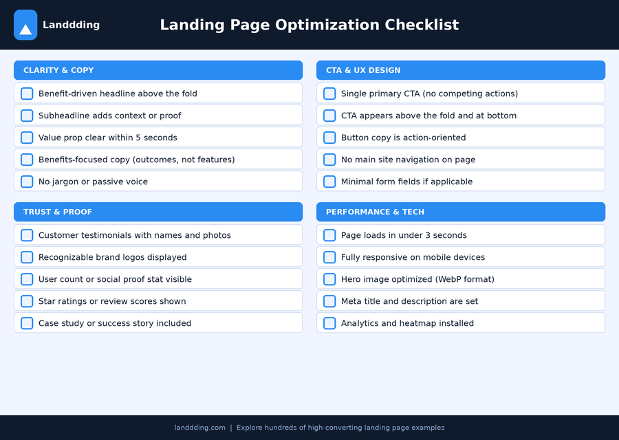
Landing Page Optimization Checklist
Headline communicates a clear value proposition within 5 seconds
Subheadline adds specificity or a layer of proof
Hero includes a product visual or screenshot
Primary CTA is above the fold and uses action-oriented copy
Only one primary CTA on the page
Main navigation is removed
Benefits section leads with outcomes, not features
Social proof appears within the first two scroll depths
Testimonials include real names, roles, and photos
Objection handling addresses pricing, security, and integrations
A second CTA appears at the bottom of the page
Page loads in under 3 seconds on mobile
Page is fully responsive on all screen sizes
Images are compressed and in next-gen formats
Analytics, heatmap, and conversion tracking installed before launch
For additional inspiration and real examples, browse the full Landdding library at landdding.com
Frequently Asked Questions
What makes a landing page convert well?
A high-converting landing page combines message clarity, visual trust signals, and minimal friction. The headline must immediately communicate value, the product must be demonstrated visually, social proof must reduce perceived risk, and the CTA must be obvious and singular. Pages that convert well are stripped of anything that doesn't serve the single conversion goal.
What is the most important part of a landing page?
The hero section. It's what every visitor sees first and determines whether they stay or leave. A strong headline that communicates your value proposition, supported by a product visual and a clear CTA, does more to drive conversion than any other section on the page. If your hero fails, no amount of optimization below the fold will save your conversion rate.
How many sections should a landing page have?
Most high-converting landing pages include 6 to 9 sections. Simple tools can convert well with 4 to 5 sections. Enterprise SaaS pages often need 8 to 10 sections to handle all the trust-building and objection-handling required for high-value purchases. The guiding principle: include every section your visitor needs to feel confident, and nothing more.
What is a good landing page conversion rate?
The average landing page conversion rate is around 2.35% across industries. A good rate is anything above 5%, and the top 10% of landing pages convert at over 11%. Rates vary significantly by industry, traffic source, and offer type. Lead generation pages typically convert higher than direct sales pages.
Should landing pages have navigation?
No. Removing navigation is one of the most consistently impactful CRO changes you can make. Every navigation link is an exit path. A minimal header with just your logo and one CTA button is the optimal configuration.
What is the best CTA placement on a landing page?
The primary CTA should appear above the fold in the hero section. A second CTA should appear at the bottom. For longer pages, a sticky header CTA or a mid-page CTA after the social proof section can also increase conversions. Button copy should be specific and outcome-oriented. "Start building free" outperforms "Get started," which outperforms "Submit."
How long should a landing page be?
Landing page length should match the complexity of the decision the visitor is making. Low-commitment offers can convert with 600 to 900 words. Higher-ticket offers typically need 1,500 words or more to address all objections and build sufficient trust. As long as it needs to be, as short as it can be.
How do I know if my landing page is underperforming?
A conversion rate below 2% is a strong signal something structural is wrong. Use heatmaps to see where visitors stop scrolling and session recordings to find where drop-off happens. The most common culprits are a weak headline, missing social proof, too many CTAs, or a slow mobile load time.