Industry context shapes everything: the headlines, the visuals, the proof points, and even the color palette. This guide breaks down real SaaS landing page patterns by industry, showing you what converts and why. No theory, just working examples and actionable patterns you can apply to your own product.
Whether you're designing your first landing page or optimizing your tenth, these industry-specific patterns will help you understand what your audience expects and what drives conversions in your space.
B2B SaaS Landing Page Design Examples
B2B SaaS landing pages have one job: qualify leads fast. Your visitors are busy. They're comparing tools. They need to understand your value, see proof, and decide if it's worth their time, all in about 8 seconds.
The best B2B SaaS pages strip away the fluff and lead with clarity.
Key patterns that work:
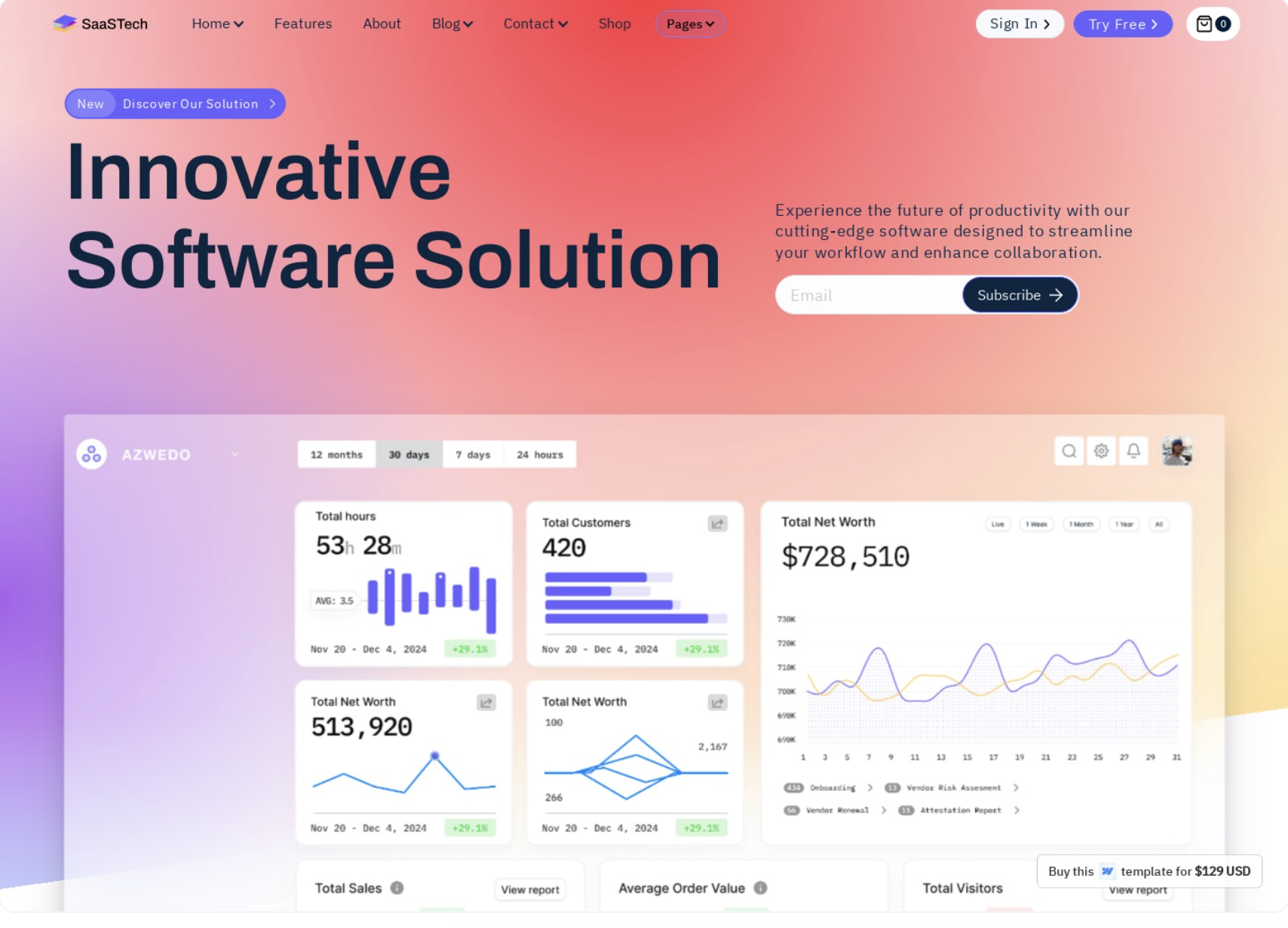
Value proposition clarity above the fold. No clever taglines. No vague promises. Visitors need to know exactly what you do and for whom within seconds. HubSpot nails this with "Customer platform for the AI era" paired with immediate role-based navigation. Salesforce uses "Build lasting relationships that drive growth" with clear industry callouts.
Social proof immediately visible. Logos, customer counts, or G2 badges should appear within the first scroll. When Slack shows "Trusted by companies large and small," they back it up with recognizable brand logos. This isn't vanity, it's risk reduction. B2B buyers need to know others have made this decision successfully.
Product UI screenshots over abstract illustrations. B2B buyers want to see the actual product. Notion shows their workspace interface. Airtable displays their grid views. These aren't stylized mockups, they're real screenshots that communicate functionality and professionalism. According to research from Nielsen Norman Group on enterprise UX, concrete product visuals significantly reduce perceived risk in B2B purchase decisions.
Clear CTA hierarchy. Primary action is obvious (usually "Start free trial" or "Get demo"). Secondary actions like "Watch demo" or "See pricing" are visually subordinate but accessible. Intercom does this well with a bold blue CTA and a ghost button alternative.
Trust indicators woven throughout. Security certifications, integration logos, testimonials with photos and company names. These aren't decorative, they're evidence. Gong includes video testimonials from named executives. Greenhouse shows hiring metrics from real customers.
Example: Notion
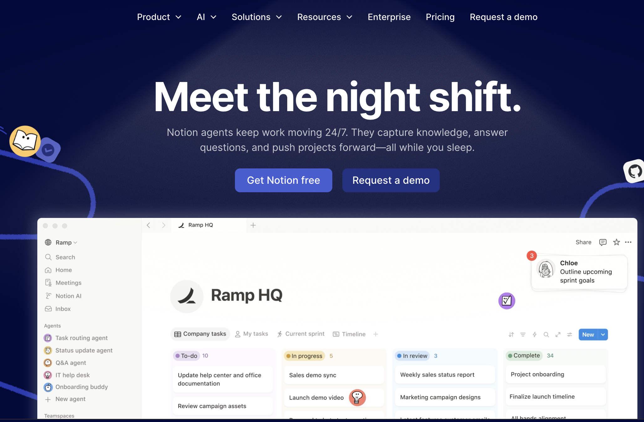
What they do well: Clean hierarchy, immediate product visibility, use case clarity without overwhelming options. Their landing page shows the product in action with real workspace examples. Navigation clearly segments by team type (personal, team, enterprise), letting visitors self-select their journey.
Example: Stripe
What they do well: Technical credibility through design. Code snippets visible above the fold. Integration ecosystem prominently displayed. Stripe's landing page speaks developer while remaining accessible to business buyers. Their headline "Financial infrastructure for the internet" is aspirational but grounded in concrete capability.
The B2B pattern is about reducing friction through information, not adding excitement through design tricks.
AI SaaS Landing Page Design Examples
AI SaaS landing pages face a unique challenge: education and differentiation. Many visitors don't fully understand what AI can do in your specific context, and they're drowning in similar-sounding AI tools.
An AI SaaS landing page typically includes explicit capability statements, use case examples, and visual demonstrations of the AI in action. These pages need to demystify the technology while building confidence in the results.
Key patterns that work:
Explicit "what it does" copy. No assuming visitors understand. Jasper says "AI copilot for marketing teams" then immediately shows content creation examples. Copy.ai opens with "Write better marketing copy and content with AI" and displays output samples. The specificity matters. "AI-powered" alone means nothing anymore.
Use case driven sections. Instead of feature lists, show scenarios. Grammarly's business page shows email writing, document editing, and team collaboration as distinct use cases. Each section demonstrates the AI solving a specific problem, not abstract "intelligence."
Reduced jargon, increased clarity. Words like "neural networks" or "large language models" rarely appear on converting AI SaaS pages. Instead, you see outcome language. Descript says "Edit video by editing text" which is clear and magical. The AI is the how, not the what.
Interactive demos or GIFs. Static screenshots don't convey AI behavior. The best pages use screen recordings or embedded demos. Loom shows their AI summarization in motion. Runway displays video generation frame by frame. Movement communicates capability better than description.
Before and after comparisons. Show the transformation. Otter.ai displays messy audio transcribed into clean, structured notes. Remove.bg shows complex image backgrounds vanishing. These visual proofs do more than testimonials ever could.
Example: Midjourney
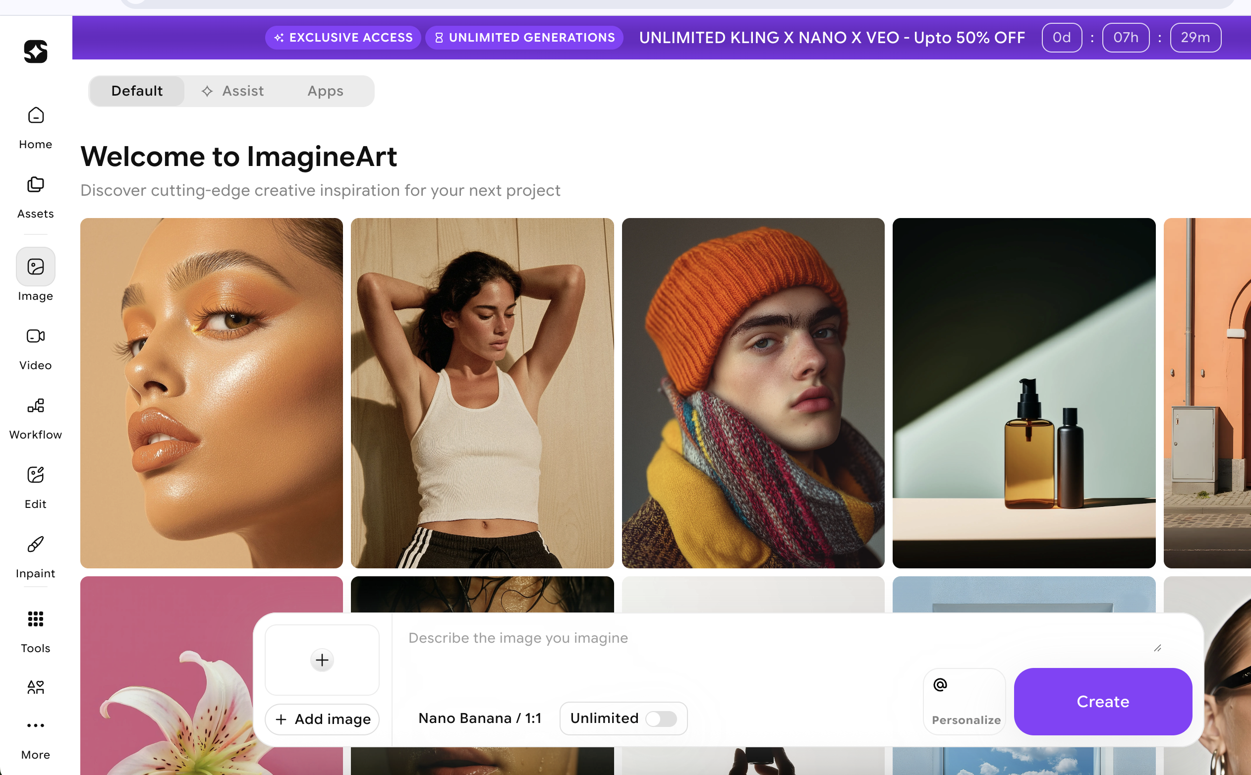
What they do well: Let the output speak. Their landing page is primarily a gallery of AI-generated images. No lengthy explanations of the technology. The results are the pitch. Visitors immediately understand the quality and possibility.
Example: Notion AI
What they do well: Contextual integration. Rather than a separate AI product page, Notion shows AI embedded in familiar workflows. "Ask AI to edit," "Generate summaries," "Translate text." The AI enhances existing behavior rather than requiring new learning.
According to Google's AI Overview guidelines, clear capability statements and specific use cases improve visibility in AI-generated search results. This isn't just good UX, it's good SEO for the AI era.
For more examples of how AI landing pages are evolving to meet visitor expectations, explore our curated collection of AI product pages.
The AI pattern is about show, don't tell, with exceptional clarity about inputs and outputs.
Fintech SaaS Landing Page Design Examples
Fintech landing pages walk a tightrope between innovation and trust. You're asking visitors to trust you with money, compliance, or financial data. Get the design wrong and you trigger immediate skepticism.
Key patterns that work:
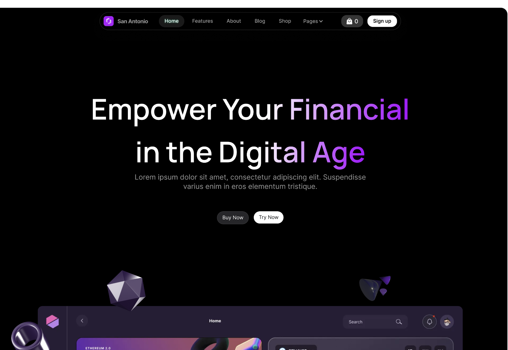
Clean, minimal layouts. No busy backgrounds. No aggressive animations. Fintech pages lean conservative by design. Plaid uses generous whitespace and a calm blue palette. Wise keeps layouts spacious and typography large. This isn't boring, it's reassuring.
Security badges and compliance indicators. SOC 2, PCI DSS, bank-level encryption. These aren't hidden in the footer, they're featured. Mercury Bank prominently displays FDIC insurance. Brex shows their compliance certifications above the fold. In fintech, credentials are conversion tools.
Conservative color palettes. Blues, greens, and neutrals dominate. Avoid bright reds or chaotic gradients. Stripe's signature purple works because it's used sparingly and paired with professional typography. Robinhood's design took heat partly because the gamified colors clashed with financial seriousness.
Clear CTA hierarchy without pressure. "Open account," "Get started," "Request access." These CTAs are direct but never aggressive. No countdown timers. No "limited spots" pressure. Fintech buyers need to feel in control of the decision.
Transparent pricing or fee structure. Hidden fees destroy trust. Wise shows exact exchange rates and fees. Carta displays pricing tiers clearly. Even if your pricing is complex, showing something builds more confidence than "Contact sales" alone.
Social proof from institutions. Consumer testimonials matter less than institutional backing. "Trusted by 10,000 businesses" beats "Love this app!" Ramp shows company logos. Checkout.com displays transaction volume statistics. Numbers and institutions signal scale and reliability.
Example: Stripe
What they do well: Professional aesthetic that feels both modern and trustworthy. Their design system is imitated across fintech for good reason. Clear information architecture. Complex capabilities explained simply. The page never feels like it's trying too hard.
Example: Revolut
What they do well: Balance between consumer friendliness and financial credibility. They use friendly language and clean product screenshots while maintaining security messaging. Their stats (50+ million customers, $250B processed) provide institutional proof while colorful cards add personality.
Research from Baymard Institute on checkout usability shows that perceived security directly impacts conversion in financial contexts. Every design choice either builds or erodes that perception.
Browse more finance landing page examples to see how fintech companies balance trust and innovation in their designs.
The fintech pattern is trust through restraint, where what you don't do matters as much as what you do.
Marketing SaaS Landing Page Design Examples
Marketing SaaS pages can be bold. Your audience understands persuasion. They're evaluating your landing page as proof that you understand conversion. If your marketing tool has a boring landing page, that's a red flag.
Key patterns that work:
Bold, outcome-focused headlines. Not features, results. Mailchimp says "Turn emails into revenue" not "Email marketing platform." Unbounce leads with "Build landing pages that convert" not "Landing page builder." The outcome is the hook.
Animated UI or dashboard reveals. Show the tool in action. HubSpot uses subtle animations to reveal dashboard elements. Semrush cycles through different tool interfaces. These animations serve a purpose: demonstrating breadth without overwhelming the visitor.
Strong color choices and visual confidence. Marketing tools can embrace vibrant palettes. Canva's colorful brand works because it signals creativity. Hootsuite uses bold purple. These aren't just aesthetic choices, they're positioning decisions. Conservative colors would undermine the creative promise.
Metric-heavy social proof. Marketing professionals trust numbers. "10,000 happy customers" is vague. "2.3M emails sent daily" or "Average 47% conversion rate lift" is compelling. Optimizely leads with experiment statistics. VWO shows case study metrics prominently.
Multiple CTAs for different intent levels. Free trial for the ready. "See examples" for the curious. "Watch demo" for the skeptical. Marketing pros expect options because they design similar funnels. ActiveCampaign offers "Try it free," "See a demo," and "Pricing" all above the fold.
Use case segmentation by channel or goal. Rather than one generic pitch, show email marketing, social automation, or lead generation as distinct paths. This mirrors how marketers think about their own strategies.
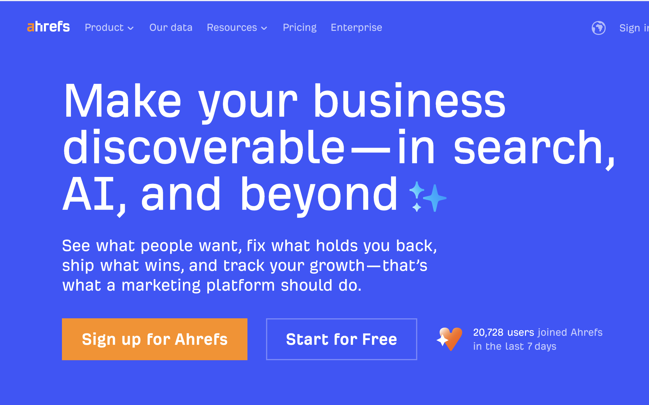
Example: Ahrefs
What they do well: SEO tool that ranks incredibly well (meta). Their landing page is simple, tool-forward, and metric-rich. "Data from 13 trillion links" establishes authority. Product screenshots show real dashboards. The page practices what it preaches.
Example: ConvertKit
What they do well: Creator-focused positioning through design. Clean layouts that feel artistic, not corporate. They show email examples from real creators. The landing page targets a specific subset of marketers (creators, not agencies) and the design reflects that specificity.
The marketing SaaS pattern is confidence through demonstration, where the page itself is proof of capability.
Developer Tools SaaS Landing Page Design Examples
Developer tool landing pages strip away marketing speak. Developers are allergic to fluff. They want to see code, understand capabilities, and evaluate technical fit. Get between a developer and the documentation, and you've lost them.
Key patterns that work:
Code snippets or API references above the fold. GitHub shows repositories and code samples immediately. Twilio displays API calls with syntax highlighting. These aren't decorative, they're evidence of capability and ease of integration.
Clear onboarding or "getting started" path. Developers want to know time-to-first-value. Stripe's docs show you can process a payment in "7 minutes." Vercel emphasizes "Deploy in seconds." Concrete timelines reduce perceived complexity.
Minimal fluff, maximum information density. Short paragraphs. Bullet points for features. No stock photos of people pointing at whiteboards. Supabase's page is dense with technical information but scans cleanly. PostgreSQL, real-time updates, edge functions, all visible immediately.
Technical credibility signals. Open source badges. GitHub stars. Technology stack visibility. Railway shows their infrastructure providers. PlanetScale emphasizes MySQL compatibility. These details matter to technical evaluators.
Clear pricing for compute or usage-based models. Developers need to estimate costs. "Contact sales" creates friction. Better pages show free tiers, usage calculations, or transparent unit economics. Cloudflare displays pricing by service with usage breakdowns.
Integration ecosystem visibility. What works with your tool? Logos or a searchable integration list should be prominent. Zapier's landing page is essentially a directory of integrations. That IS their value prop to developers.
Example: Stripe
What they do well (mentioned twice because they execute brilliantly for both B2B and devs): Code examples in multiple languages. Clear API structure. Global infrastructure stats. The page respects developer intelligence while reducing integration uncertainty.
Example: Vercel
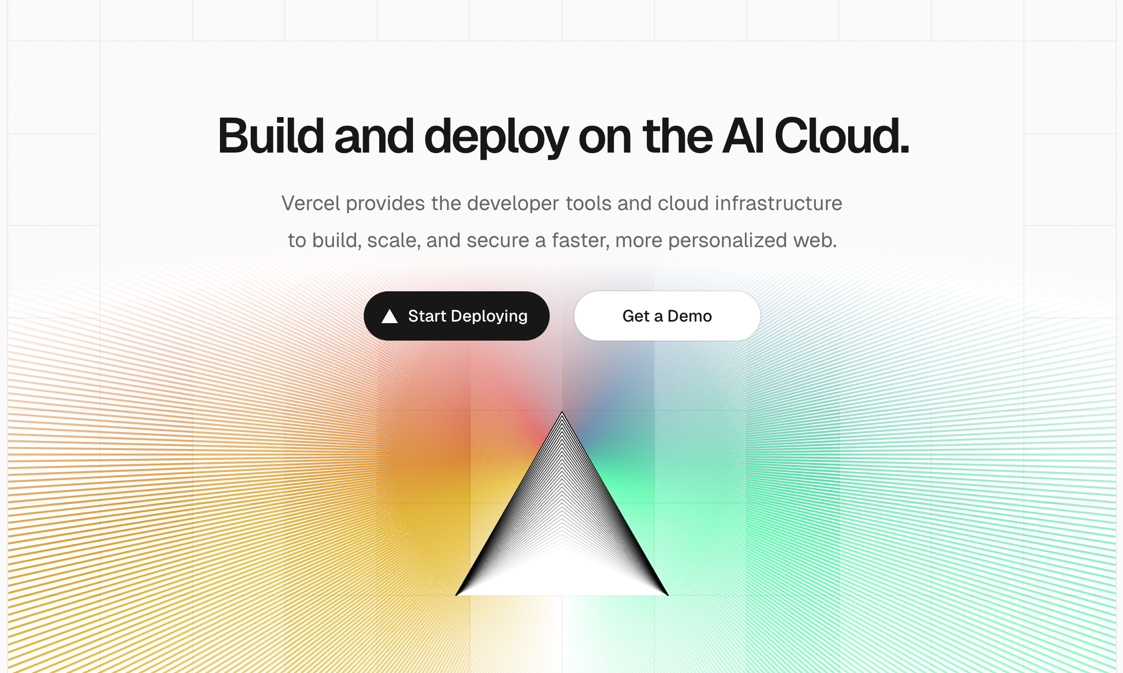
What they do well: Speed as the central value prop, demonstrated through design. Fast page load. Minimal clicks to deploy. Their landing page mirrors the product promise. Framework logos (Next.js, React, etc.) provide technical orientation immediately.
See how leading technology companies structure their landing pages for technical audiences.
The developer tools pattern is respect through directness, where every element serves technical evaluation.
HR and People Ops SaaS Landing Page Design Examples
HR and People Ops tools bridge emotional and operational needs. You're selling to people who care about employee experience while also needing compliance, efficiency, and reporting. The landing page needs warmth and professionalism in equal measure.
Key patterns that work:
Human-centric visuals. Photos of real people (or illustrated figures that feel human). BambooHR shows diverse teams. Lattice uses warm photography. These visuals communicate that the software serves people, not just processes.
Clear role-based benefits. HR teams, managers, and employees all use these tools differently. The best pages segment by perspective. Gusto shows "For employers" and "For employees" paths. Culture Amp displays views for HR leaders, managers, and team members.
Simple, jargon-free language. HR buyers aren't always technical. "Performance reviews made simple" beats "360-degree feedback orchestration platform." Workday sometimes violates this by leaning too corporate. Rippling succeeds by using straightforward language even for complex capabilities.
Emotional clarity around outcomes. Better retention. Happier employees. Streamlined onboarding. These aren't just operational wins, they're human wins. Namely emphasizes "employees love using" throughout their messaging. This emotional angle matters in HR tech.
Compliance and security messaging. GDPR, employment law, data security. These reassurances should be present but not dominate. ChartHop includes compliance mentions without making the page feel regulatory.
Clear demonstration of the employee experience. Show both the admin view and what employees see. If your tool creates work for employees, that's a dealbreaker. Deel shows how simple country-specific compliance can be for workers, not just admins.
Example: Lattice
What they do well: Balance between human warmth and professional capability. Their landing page uses warm colors and people-focused copy while maintaining clear feature differentiation. Performance, engagement, and growth are presented as connected human experiences, not isolated modules.
Example: Greenhouse
What they do well: Recruiting-specific focus with clear outcomes. "Hire for what's next" is aspirational yet concrete. They show hiring pipeline metrics and candidate experience improvements. The page speaks to both recruiter pain points and company growth goals.
The HR SaaS pattern is humanity through clarity, where emotional intelligence and operational excellence coexist.
What Changes Across Industries
Understanding the patterns is useful. Understanding what specifically shifts between industries is actionable. Here's what actually changes when you move from one SaaS vertical to another:
Headline style differences:
B2B: Direct, outcome-focused, role-specific AI: Capability statements, use case clarity Fintech: Conservative, trust-building, security-forward Marketing: Bold, metric-rich, conversion-focused Developer tools: Technical, specific, integration-focused HR: Human-centric, role-segmented, outcome-emotional
CTA language differences:
B2B: "Start free trial," "Get demo," "Talk to sales" AI: "Try for free," "See examples," "Generate now" Fintech: "Open account," "Get started," "Request access" Marketing: "Start free," "See results," "Watch it work" Developer tools: "View docs," "Start building," "Deploy now" HR: "See demo," "Get started," "Talk to an expert"
Visual hierarchy shifts:
B2B prioritizes social proof and product UI early AI leads with output examples and use cases Fintech opens with security and clean layouts Marketing uses bold color and animated elements Developer tools show code and technical specs first HR balances people imagery with feature clarity
Proof types used:
B2B: Customer logos, G2 ratings, named testimonials AI: Output galleries, before/after, interactive demos Fintech: Transaction volume, institutional backing, certifications Marketing: Conversion metrics, case study ROI, user counts Developer tools: GitHub stars, uptime stats, integration counts HR: Retention metrics, employee satisfaction, company growth stats
These aren't subtle shifts. A marketing SaaS page that looked like a fintech page would fail. A developer tool that led with emotional copy would lose credibility immediately.
How to Use These Examples for Your Own SaaS
You've seen the patterns. Now here's how to apply them without copying blindly.
Match layout to buying intent in your industry. If you're building B2B SaaS, your visitors expect product clarity and social proof early. If you're launching an AI tool, they need use case education before feature lists. The layout should reflect how your specific audience evaluates tools. Check competitive pages not to copy them, but to understand established expectations. Then meet or exceed those expectations.
Borrow patterns, not aesthetics. The value isn't in Stripe's exact shade of purple or Notion's specific font. The value is in how they structure information, sequence proof points, and guide visitor attention. When you see a pattern that works (like code snippets above the fold for dev tools), adapt the principle to your context. Don't recreate their visual identity.
Optimize above the fold per industry norms. What visitors see before scrolling determines whether they scroll. B2B buyers need instant value prop clarity. Fintech users need visible trust signals. Developers need technical proof. Your industry sets the rules for those critical first seconds. Study the examples in your category and notice what information consistently appears early.
Test against your specific audience, not general best practices. What works for Stripe's sophisticated developer audience might not work for your less technical buyers. What converts for Notion's prosumer users might not resonate with your enterprise target. Use these patterns as starting hypotheses, then validate with your actual traffic and conversion data.
Remember that design serves strategy. A beautiful landing page that doesn't convert is decoration. These examples work because the design choices reinforce strategic positioning. Clean fintech layouts build trust. Bold marketing tool pages demonstrate capability. Developer-focused minimalism shows respect for technical evaluation. Your design should serve your specific strategic goals, not just look professional.
Want more SaaS landing page inspiration across different approaches and tactics? Explore hundreds of real examples with filterable patterns and industry tags.
Landing page design isn't about universal best practices. It's about industry-specific expectations, audience-appropriate proof, and conversion patterns that align with how your buyers actually evaluate tools.
The examples here show what works across six major SaaS categories, but the real insight is understanding why these patterns work and how they map to buyer psychology in each space. Use this as a framework, not a template. Your industry has established norms because they reduce friction for your specific audience. Meet those expectations first, then innovate where it matters.
For more curated landing page design examples across industries and tactics, explore our full collection organized by conversion pattern and business model.