Landing pages exist for one reason: to convert. Yet most of them fail quietly, bleeding traffic that never turns into leads, trials, or sales.
Studies consistently show that the average landing page conversion rate sits between 2% and 5%. High-performing pages regularly hit 10% to 15% or higher. That gap is rarely about how much traffic a page gets. It is almost always about design and UX decisions.
This guide breaks down the 15 most common landing page design mistakes, explains why each one destroys conversions, and gives you concrete fixes you can apply right now. Whether you are building on Webflow, Framer, or any other platform, these principles apply across the board.
Quick Answer: What are the most common landing page mistakes that reduce conversions?
The most common landing page mistakes include: weak or unclear headlines, too many calls to action, slow page speed, confusing navigation, lack of social proof, poor visual hierarchy, generic stock imagery, and overwhelming forms. Fixing even two or three of these issues can significantly increase conversion rates and improve user trust.
Mistake #1: Weak or Confusing Headlines
Users decide in 3 to 5 seconds whether a landing page is relevant to them. If the headline does not clearly communicate what the product does and who it is for, they bounce.
Most headlines are written to sound impressive rather than to be useful. Phrases like "Welcome to our platform" or "The future of digital solutions" communicate nothing. They force the visitor to do extra cognitive work just to understand what the page is about, and most users simply will not bother.
A strong headline answers three questions at once: What does this do? Who is it for? What outcome does it produce?
✗ Bad: Next Generation AI Tools
✓ Better: Generate High-Converting Landing Pages With AI in Minutes
The second version is specific, outcome-focused, and immediately tells the user whether this page is relevant to them.
Fix: Test at least three headline variants using A/B testing. Prioritise specificity over cleverness. If your headline could appear on a competitor's page unchanged, it is not specific enough.
Mistake #2: Too Many Calls to Action
Landing pages should have one primary conversion goal. One CTA. One job.
When users see "Sign up", "Watch demo", "Download ebook", and "Book a call" competing for attention on the same page, they hesitate. This is called choice overload, and it is one of the most documented conversion killers in UX research.
Research from Unbounce found that pages with a single CTA achieved an average conversion rate of 13.5%, compared to 10.5% for pages with multiple CTAs — a 22% difference from one change alone.
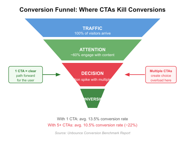
Fix: Identify the single most important action and design the entire page around it. If you must include secondary CTAs like a demo link, make them visually subordinate — text links, not buttons.
Mistake #3: No Clear Value Proposition
Many landing pages spend their above-the-fold space talking about features instead of communicating outcomes. Users do not buy features. They buy what changes in their life as a result.
A feature tells the user what something does. A value proposition tells the user why they should care. That difference shows up directly in conversion rates.
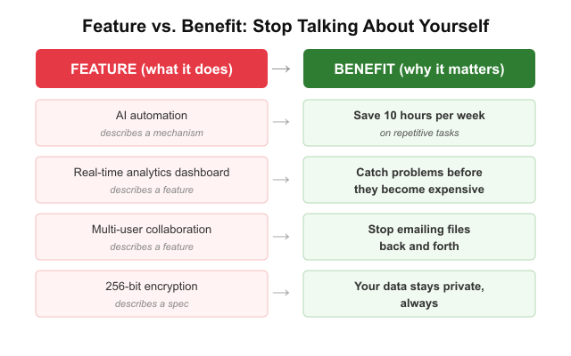
• Feature: AI automation → Benefit: Save 10 hours per week on repetitive tasks
• Feature: Real-time analytics → Benefit: Catch problems before they become expensive
• Feature: Multi-user collaboration → Benefit: Stop emailing files back and forth
Fix: Rewrite your hero copy to lead with the outcome, not the mechanism. Ask yourself "So what?" after every feature claim. The answer is your value proposition.
Mistake #4: Poor Visual Hierarchy
Users do not read landing pages top to bottom. They scan. Research on reading patterns shows visitors follow F-pattern or Z-pattern eye movements, focusing on the top-left and skimming horizontally before dropping down.
When everything on a page has the same visual weight — headlines the same size as body text, buttons the same colour as the background — users cannot identify what matters most. The result is a page that feels overwhelming and hard to act on.
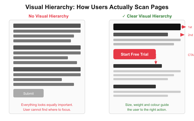
Fix: Use size, contrast, and whitespace to create clear visual priority. Your headline and CTA should be impossible to miss. Everything else should be smaller or lighter. If everything is emphasised, nothing is.
Mistake #5: Slow Loading Pages
Page speed is a direct conversion variable, not just a technical concern. According to Google research, when page load time increases from 1 second to 3 seconds, the probability of a user bouncing increases by 32%. At 5 seconds, that probability reaches 90%.
Every unnecessary image, unoptimised script, or heavy font file is costing you conversions in real time. This matters especially for mobile users on slower connections, who make up the majority of traffic for most landing pages.
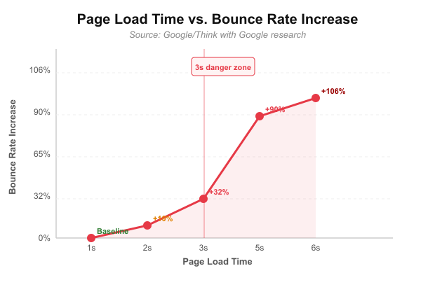
Google Core Web Vitals — particularly Largest Contentful Paint (LCP) and Cumulative Layout Shift (CLS) — are the key metrics to monitor. Measure them free at Google PageSpeed Insights.
Fix: Compress all images before upload. Defer non-critical JavaScript. Use a CDN. Avoid render-blocking resources. Aim for LCP under 2.5 seconds on mobile.
Mistake #6: Too Much Text
Landing pages are not blog posts. Users scan. When a hero section greets visitors with three dense paragraphs, most will not read a single word before leaving.
Walls of text signal effort to the reader. They make a page feel slow and complicated — the opposite of what a high-converting landing page should feel like.
A useful content ratio for landing pages: roughly 40% visuals, 30% headings that carry the core message, 20% UI components and CTAs, and 10% body text. Most landing pages have this completely inverted.
Fix: Cut your body copy by 50% and monitor bounce rate. Replace explanatory paragraphs with bold subheadings, short bullet points, or visual diagrams. If a concept needs extensive explanation, move it below the fold.
Mistake #7: Forms That Ask for Too Much
Every additional form field is a small act of friction. Research from HubSpot found that reducing form fields from 11 to 4 increased conversions by up to 120%. Every question you ask a visitor who is not yet a customer is a potential reason to close the tab.
The most common mistake is asking for information the company does not yet need — collecting company size, phone number, and job title alongside name and email is optimising for CRM data quality, not conversion rate.
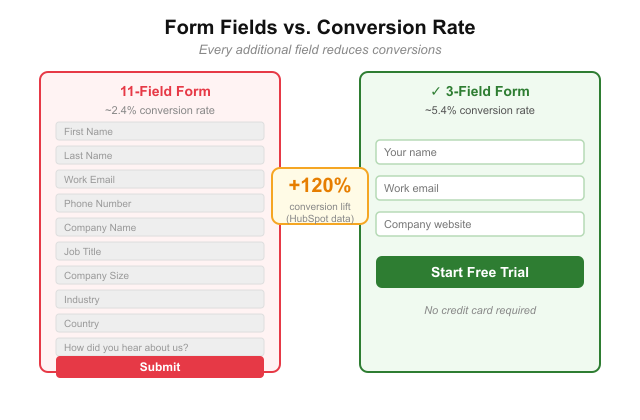
Fix: Ask for the minimum information needed to move the user to the next step. For most SaaS sign-ups, email alone is sufficient for step one. Collect additional data later during onboarding.
Mistake #8: No Social Proof
Trust is a prerequisite for conversion. Users who do not trust a brand will not hand over their email, their credit card, or their time. Social proof is one of the most powerful trust signals available on a landing page and one of the most commonly underused.
Social proof comes in multiple forms: customer testimonials, star ratings, case study results, recognisable client logos, and user count statistics. Each type signals something slightly different. Logos signal industry credibility. Numbers signal scale. Testimonials signal real human satisfaction.
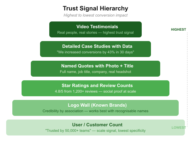
Fix: Place social proof as close to your primary CTA as possible. A testimonial directly beneath your sign-up button removes doubt at exactly the moment the user is deciding. Do not bury proof at the bottom of the page.
Mistake #9: Generic Stock Photography
Stock photos of smiling professionals in generic office settings send an unspoken signal: this company does not trust you with how things actually look. They reduce authenticity, which reduces trust, which reduces conversions.
Modern high-converting landing pages rely on product UI screenshots, custom illustrations, real team photos, and branded visuals that reinforce the actual product experience. If your hero image could appear on ten competitor pages unchanged, it is the wrong image.
Fix: Replace any stock photo with a screenshot of your actual product at its best moment. If it is a physical product, use high-quality photography showing it in real-world context. Authenticity converts better than polish.
Mistake #10: Hidden Pricing
Users dislike uncertainty. When a landing page forces visitors to "Contact sales" just to find out what something costs, many will leave rather than engage.
Hidden pricing creates a trust gap. It signals the price might be something to hide. It also removes the user's ability to self-qualify, forcing them to invest time in a sales call before knowing if the product is even in their budget.
Hidden pricing can be appropriate for enterprise products where deals are custom-scoped. For most SaaS and e-commerce products, it creates unnecessary friction.
Fix: If you cannot show exact pricing, show a starting price, a price range, or the pricing model (per seat, per month, usage-based). Give users enough information to know if they are in the right ballpark before committing to a conversation.
Mistake #11: No Mobile Optimisation
Mobile traffic consistently exceeds 60% of all web traffic across most industries. Yet many landing pages are still designed desktop-first and scaled down as an afterthought.
A page that looks clean on a 27-inch monitor often becomes a cluttered, unreadable mess on a phone. Text becomes too small, buttons too close together to tap accurately, and hero images crop in ways that lose the entire visual message.
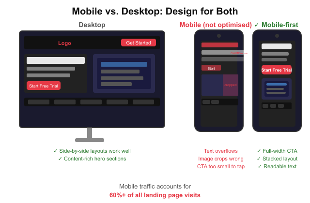
Fix: Design mobile-first. Start with the smallest screen size and expand outward. Test on real devices. Check that your CTA button is at least 44px tall, body text is at least 16px, and hero images crop correctly on portrait mobile screens.
Mistake #12: Weak CTA Design
Your call to action button is the single most important UI element on the page. Yet many landing pages use generic labels like "Submit" or "Click here", colours that blend into the background, and sizes that barely stand out from surrounding content.
A strong CTA is visible, specific, and action-oriented. It tells users exactly what will happen when they click, and it looks like the most important button on the page because it is.

✗ Bad: Submit
✓ Better: Create My Free Account
✗ Bad: Click Here
✓ Better: Start My 14-Day Trial
✗ Bad: Get Started
✓ Better: See My Landing Pages
Fix: Use a high-contrast colour for your primary CTA that appears nowhere else on the page. Make the label specific to the outcome. Add a short microcopy line beneath the button to handle the top objection — "No credit card required" is one of the most effective.
Mistake #13: Navigation That Distracts
Traditional website navigation gives users dozens of exit points before they ever convert. Every link in a top nav bar is an opportunity to leave the page and never return.
High-converting landing pages — particularly those receiving paid traffic — often remove navigation entirely or reduce it to a logo and a single CTA button. This keeps visitor attention focused on the one action the page is designed to drive.
Fix: For campaign-specific landing pages, remove your main navigation completely. If branding requires a header, include only your logo and a CTA button. Do not link to your blog, about page, or careers section from a page designed to convert.
Mistake #14: No Product Visuals
Abstract marketing language without visual evidence does not convert. Users want to see what they are actually signing up for before they commit.
Pages that rely entirely on copy, icons, or stock imagery to communicate a software product leave visitors guessing. The best-converting landing pages show the actual product interface directly in the hero section. For examples of how leading AI landing pages do this, the Landdding blog covers real-world breakdowns.
Fix: Take a clean screenshot of your product at its most compelling moment and make it the centrepiece of your hero section. Seeing the product removes the single biggest objection: "I do not know what I am signing up for."
Mistake #15: No Clear User Journey
The best landing pages tell a story. They take the visitor on a structured narrative that moves deliberately from problem to solution to proof to offer to action. When that narrative is absent, the page feels like a random collection of marketing claims.
A common failure pattern: leading with features, jumping to a testimonial, showing pricing, then looping back to a benefits section. The user has to do mental assembly work to understand why this product matters to them — and most will not.
📷 Place graphic: 07-storytelling-framework.svg — vertical scroll diagram showing the five-stage narrative: Problem > Solution > Proof > Offer > Action.
For more on how this narrative approach is evolving across top-performing pages, see The Quiet Revolution Happening on Landing Pages.
Fix: Audit your landing page against the Problem > Solution > Proof > Offer > Action framework. If any section is out of order or missing, reorganise. Every section should answer the question the visitor has at that stage of the scroll.
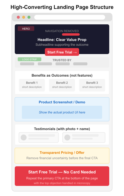
What High-Converting Landing Pages Do Differently
After studying hundreds of pages, several patterns consistently appear on those converting at 10% or higher.
• Clear value proposition above the fold — users know immediately what the product does and who it is for
• One primary CTA, repeated two to three times as the user scrolls
• Social proof adjacent to the CTA, not buried at the bottom of the page
• Product visuals in the hero — they show the experience rather than just describe it
• Short, scannable copy with bold subheadings carrying most of the message
• Mobile-first layouts that do not sacrifice the mobile experience
• Fast load times, ideally under 2.5 seconds on mobile
The combination of these elements removes friction at every stage of the visitor journey. You can browse landing page templates built around these principles to see the patterns in practice.
Landing Page Design Trends That Improve Conversion in 2026
Design is not static. Several trends are showing measurable conversion impact right now.
Bento grid layouts break content into modular card sections that are highly scannable and perform exceptionally well on mobile. They let you present multiple value points simultaneously without creating visual overwhelm. See the full bento grid design guide for implementation examples.
Interactive demos embedded in the hero section let users try the product before signing up, dramatically reducing the "I want to see it before I commit" objection that stalls conversions on most SaaS pages.
AI-assisted personalisation is enabling pages to adapt their headline, imagery, and CTA based on the visitor's traffic source, location, or behaviour. Early adopters are seeing significant conversion lift.
Motion UI, applied sparingly to hero animations and scroll-triggered reveals, improves engagement and time on page when it directs attention rather than simply decorates.
For a broader view of where landing page design is heading, the 2026 landing page predictions piece covers design, UX, SEO, and AEO shifts in detail. You can also find relevant UI direction in the UI design trends 2026 overview.
Frequently Asked Questions
What is the biggest landing page mistake?
The single most damaging mistake is a weak or unclear headline. Users make their decision about relevance in 3 to 5 seconds. If the headline does not immediately communicate what the product does and why it matters, users leave before any other element on the page has a chance to work.
How many CTAs should a landing page have?
One primary CTA. A landing page can repeat that same CTA two to three times as the user scrolls, but there should only be one conversion goal. Multiple competing CTAs create choice overload and reduce conversion rates.
What is a good landing page conversion rate?
The average landing page converts at 2% to 5%. A strong landing page converts at 10% or higher. According to WordStream benchmarks, the top 25% of landing pages across industries convert above 5.31%. These figures vary significantly by industry and traffic source — paid traffic typically converts at lower rates than email or organic because it is colder.
How long should a landing page be?
It depends on the complexity of the product and the temperature of the traffic. Paid traffic pages often convert best when short and focused. Organic traffic pages benefit from more proof and explanation. The rule: the page should be exactly as long as it needs to be to answer all objections and earn the conversion — and no longer.
Do landing page templates affect conversions?
Yes, but not always negatively. A well-designed template built around conversion principles gives you a strong structural foundation. The risk is using a generic template without customising the value proposition, visuals, and copy for your specific product and audience. Explore landing page templates across platforms including Webflow and Framer as starting points, then customise heavily.
What makes a landing page high-converting?
High-converting landing pages share a common set of characteristics: a clear and specific value proposition in the headline, one primary CTA, strong social proof near the conversion point, authentic product visuals, fast load times, mobile-optimised layout, and a narrative structure that takes the user from problem to solution to action. Removing friction at every step is the underlying principle behind all of them.
How does page speed affect landing page conversions?
Directly and significantly. Google research shows that a load time increase from 1 to 3 seconds raises bounce probability by 32%. At 5 seconds it reaches 90%. Largest Contentful Paint and Cumulative Layout Shift are the key Core Web Vitals to monitor and optimise.
Should landing pages have navigation menus?
For most campaign landing pages, no. Every navigation link is an exit point. High-converting pages — especially those receiving paid traffic — remove the main nav entirely and keep the header to a logo and a CTA only. This keeps visitor focus on the conversion goal rather than offering routes away from the page.
Landing page optimisation is not a one-time project. It is a continuous cycle of hypothesis, test, and iteration. The 15 mistakes covered here are the most common starting points for teams diagnosing why their pages are not converting. Fix the most obvious ones first, measure the impact, and keep testing.
For more on the tools and platforms being used to build and iterate landing pages right now, see AI landing page design tools for agencies.