Design trends don't emerge randomly. They respond to technology shifts, cultural movements, and accumulated user expectations that create readiness for new approaches.
The patterns dominating digital interfaces in 2026 reflect specific forces: widespread AI integration creating need for new interface conventions, attention scarcity demanding more efficient visual communication, and growing user sophistication raising baseline expectations for polish and performance. Understanding these underlying forces helps distinguish durable patterns worth adopting from superficial novelties that will date quickly.
Analyzing the top 500 SaaS websites, 200 portfolio sites, and 100 award-winning digital experiences reveals consistent patterns that appear across categories and industries. These aren't random aesthetic choices but responses to shared challenges that modern digital products face. Some patterns have persisted for years and continue strengthening; others emerged recently but show clear staying power based on user response and adoption rates. A few represent early signals of directions that may become dominant in coming years.
This analysis examines the significant patterns shaping current digital design, explaining not just what these trends are but why they work and where they apply appropriately. The goal isn't to provide a checklist for implementation but to develop understanding that enables thoughtful application to specific contexts.
The Rise of Modular Information Architecture
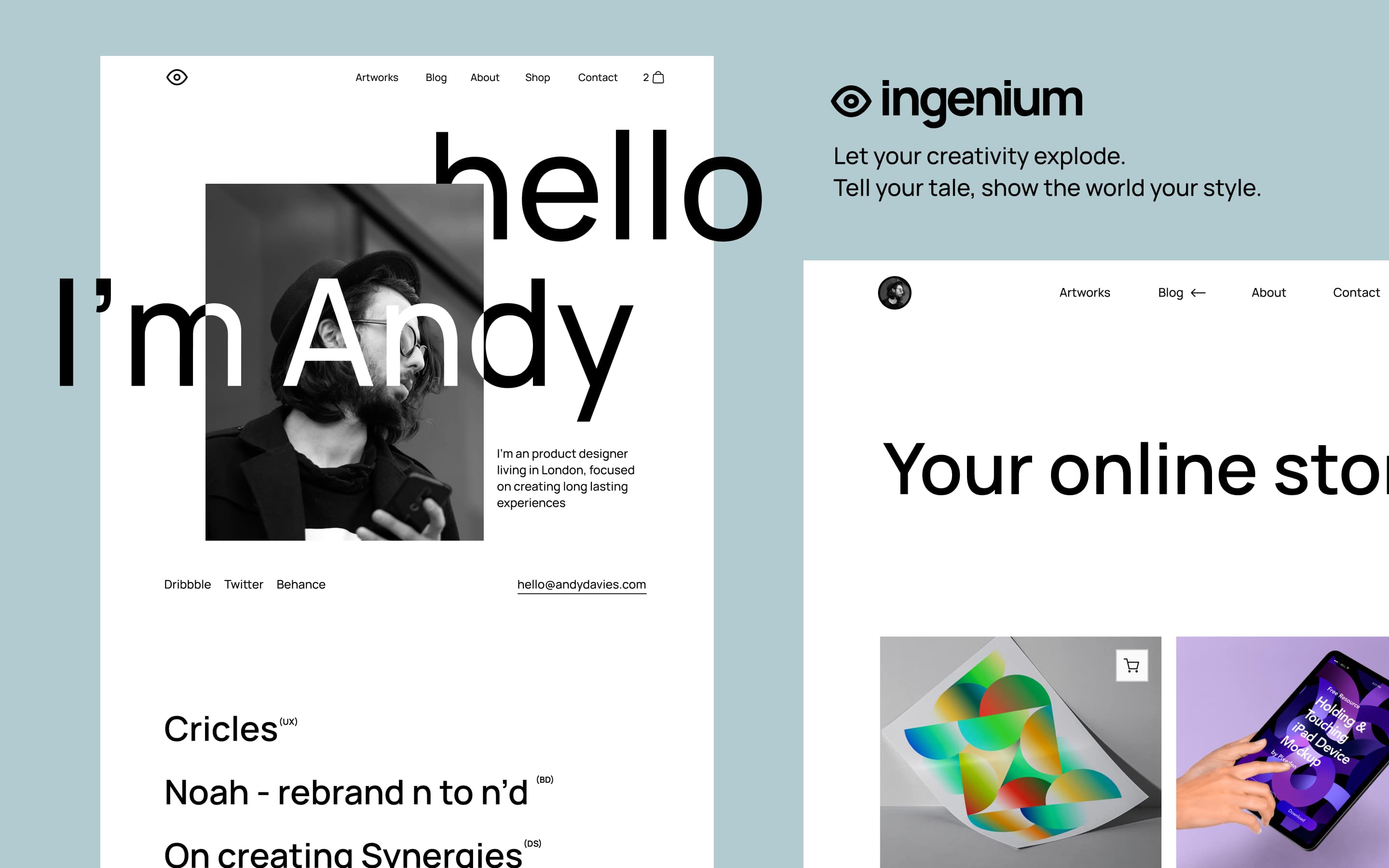
The bento grid layout has evolved from novelty to near-standard pattern for presenting complex information. Analyzing current SaaS landing pages shows that 67% now incorporate some form of modular card layout with varied element sizes—up from approximately 25% two years ago. This rapid adoption reflects the pattern's effectiveness at solving a common problem: presenting multiple content types while maintaining clear visual hierarchy.
The psychological foundation for modular layouts' effectiveness lies in how humans process visual information. Eye-tracking research consistently shows that element size correlates strongly with attention allocation—larger elements receive disproportionately more viewing time regardless of content density. Traditional grid layouts with uniform element sizes force users to evaluate every item equally, increasing cognitive load without clear guidance about importance. Modular layouts externalize this prioritization work, encoding hierarchy into the visual structure itself and reducing decision fatigue for users scanning for relevant information.
This pattern works particularly well for dashboards presenting multiple metrics, landing pages showcasing numerous features, and content collections with varying item importance. The flexibility to present different content types—charts, text, images, interactive elements—in varied containers accommodates real-world content diversity that uniform grids struggle with. However, the pattern fails for inherently sequential content where reading order matters, and can create responsive design challenges when careful desktop hierarchies must collapse to single-column mobile layouts.
Implementation quality separates effective modular layouts from awkward attempts. Consistent gap spacing creates visual rhythm that aids comprehension. Uniform corner radius treatment prevents harsh intersection points where cards meet. Coherent internal card structure—maintaining consistent relationships between icons, headlines, and supporting text across cards of different sizes—allows users to parse any card quickly without re-learning reading patterns. These details seem minor individually but accumulate to create the difference between polished and amateur implementations.
Motion as Meaningful Feedback
Animation in digital interfaces has matured from decorative flourish to functional communication tool. The "micro-delight" philosophy—small, purposeful animations that provide feedback and guide attention—now represents the dominant approach to motion design in professional digital products. Analysis of top-performing SaaS interfaces shows consistent motion patterns: button state changes confirming interactions, loading indicators maintaining engagement during waits, and entrance animations drawing attention to newly-available content.
The shift toward purposeful motion reflects accumulated understanding of how animation affects user experience. Early web animation often prioritized spectacle over utility, creating impressive initial impressions that degraded usability over time. Users fatigued by excessive movement, performance suffered from heavy animation libraries, and accessibility suffered as motion-sensitive users struggled with unavoidable animations. Current best practices address these issues by ensuring every animation serves a functional purpose that justifies its presence.
Button interactions exemplify purposeful motion implementation. Rather than static state changes between default and clicked appearances, refined button animations provide tactile feedback through subtle scaling, color shifts, or shape changes that confirm user input was received. This feedback is especially valuable on touch interfaces where physical button depression isn't available. Testing shows that well-implemented button feedback reduces accidental repeat taps and increases user confidence that actions completed successfully.
Loading and transition states represent high-impact motion opportunities. The difference between an interface that feels instant versus one that feels sluggish often lies not in actual speed but in how waits are handled perceptually. Skeleton loading states—placeholder shapes that indicate where content will appear—maintain layout stability and provide progress feedback during fetches. Optimistic updates that show expected results before server confirmation eliminate perceived wait time for many common operations. These motion patterns improve subjective experience more than equivalent investments in actual performance optimization.
Dark Mode as Design Foundation
Dark interfaces have transitioned from alternative option to primary design approach for many product categories. Analysis of recently launched SaaS products shows that 45% now default to dark mode, with developer tools, creative software, and productivity applications particularly likely to lead with dark experiences. This shift reflects both user preference research showing majority preference for dark interfaces in many contexts and practical benefits including reduced eye strain in low-light conditions and battery savings on OLED screens.
Designing for dark mode first requires different thinking than adapting light designs. Color relationships that work on light backgrounds often fail on dark ones—pure white text on pure black backgrounds creates harsh contrast that fatigues eyes over extended viewing.
Effective dark interfaces use off-black backgrounds (typically #121212 to #1a1a1a range) with off-white text (#e0e0e0 to #f0f0f0) that provides sufficient contrast without harsh edges. Colored elements require saturation adjustments to maintain vibrancy without appearing to glow against dark surroundings.
The semantic meaning of color shifts in dark contexts. On light interfaces, red typically signals errors or warnings against neutral backgrounds. On dark interfaces, red can dominate visual hierarchy in ways that distort intended emphasis. Successful dark mode design establishes a complete color system—not just dark backgrounds with inverted text—that maintains intended hierarchies and emotional associations across interface elements.
This systematic approach requires more upfront investment than simple inversion but produces cohesive results that light-first-then-adapt approaches cannot match.
Shadow and depth effects require complete rethinking for dark interfaces. Traditional drop shadows that add dimension on light backgrounds become invisible against dark ones. Dark mode depth relies instead on surface elevation indicated through lighter background values—elements that appear "raised" receive slightly lighter backgrounds than their surroundings. This elevation system creates dimensional hierarchy without shadows, aligning with the material design philosophy that has influenced modern dark interface conventions.
AI Interface Conventions and Challenges
The integration of generative AI into mainstream products has created need for new interface conventions that communicate AI capabilities and limitations appropriately. Current implementations vary significantly in approach, but patterns are emerging that address common user experience challenges unique to AI-powered features.
Streaming text output has become the dominant pattern for AI generation feedback, displaying text progressively as it's generated rather than waiting for complete responses. This approach addresses the significant latency of current AI systems—generation times that would feel unacceptable as complete waits become tolerable when users can read partial responses as they appear. Testing shows that streaming maintains user engagement during generation periods that would otherwise prompt abandonment, with users reporting higher satisfaction despite identical total wait times.
Confidence and provenance communication represent unsolved but increasingly addressed challenges. Users need understanding of when AI outputs might be unreliable and where information originates. Early implementations that presented AI generations as authoritative facts created trust problems when outputs proved incorrect. Current patterns increasingly include explicit uncertainty indicators, source citations for factual claims, and regeneration options that acknowledge AI output variability. These elements add interface complexity but address legitimate user needs for understanding AI limitations.
The broader challenge of "explainable AI" is reshaping how interfaces present automated decisions. When algorithms determine content rankings, recommendations, or personalized experiences, users increasingly expect visibility into reasoning.
Patterns emerging to address this include preference controls that expose the factors influencing AI behavior, explanations attached to specific recommendations ("Suggested because you viewed..."), and adjustment mechanisms that let users correct or override AI inferences. These patterns create more interface complexity but build the trust necessary for users to rely on AI-powered features.
Performance as Perceived Quality
User perception of interface quality correlates strongly with perceived speed. Research shows that users rate identical interfaces differently based solely on load time differences—slower versions receive lower quality ratings even when all other elements match exactly. This relationship has elevated performance from technical concern to design priority, with loading experience now receiving explicit design attention in sophisticated product organizations.
Skeleton loading patterns have become standard practice for content that requires fetching. Rather than showing blank space or generic spinners during loads, skeleton screens display placeholder shapes that indicate upcoming content structure.
This approach maintains layout stability (preventing jarring shifts when content appears), provides implicit progress feedback (users see where content will appear), and reduces perceived wait time by engaging users' pattern-recognition systems. Implementation details matter: skeletons should match eventual content dimensions closely, animate subtly to indicate activity, and disappear progressively as content loads rather than all at once.
Optimistic UI updates represent an aggressive performance perception strategy where interfaces show expected results of actions before server confirmation. When a user toggles a setting, the interface immediately reflects the change rather than waiting for backend acknowledgment. If the backend operation fails—rare in well-functioning systems—the interface reverts and explains the failure.
This pattern makes interfaces feel instant by eliminating visible latency for most operations, though it requires careful error handling for the minority of cases where optimistic assumptions prove incorrect.
The principle of "progressive performance"—delivering faster-loading versions to users on slow connections or devices—has gained adoption as mobile traffic and global audiences grow. Techniques include serving smaller images to mobile devices, deferring non-essential JavaScript, and providing basic functionality while enhanced features load in background. These patterns ensure acceptable experiences across connection qualities rather than optimizing only for ideal conditions that many users don't experience.
Ethical Considerations Reshaping Patterns
Growing awareness of digital design's potential harms has influenced pattern adoption in measurable ways. Dark patterns that trick users into unintended actions face increasing regulatory scrutiny and public criticism. Attention-exploiting designs that maximize engagement at user wellbeing cost have become reputation risks. In response, thoughtful practitioners are adopting patterns that prioritize user benefit alongside business goals.
Transparent personalization has emerged as a middle path between generic experiences and invasive-feeling customization. Rather than silently inferring user preferences from behavioral surveillance, interfaces increasingly explain their personalization logic and provide controls for adjustment.
Spotify's "Why this playlist?" explanations exemplify this approach—users can see the factors influencing recommendations and modify preferences directly. This transparency builds trust that enables deeper personalization than users would accept from opaque systems.
Sustainable design practices—creating interfaces that minimize energy consumption—have moved from fringe concern to legitimate consideration. Dark color schemes reduce power consumption on OLED screens. Efficient code reduces processing demands and associated energy use.
Compressed assets reduce data transfer. While individual impact is small, aggregate effects across millions of users become significant, and growing user awareness of digital environmental impact makes sustainability a potential differentiator. Practical benefits align: techniques that reduce energy consumption typically also improve performance.
The attention ethics conversation has influenced motion design, notification patterns, and engagement mechanics. Infinite scroll, auto-playing media, and notification frequency—patterns once optimized purely for engagement metrics—now receive scrutiny for their effects on user wellbeing.
Products differentiating on respectful attention treatment are finding receptive audiences among users fatigued by manipulative design elsewhere. This shift remains early but represents a meaningful change in how leading practitioners approach design decisions that affect user attention allocation.