AI landing page design focuses on clearly explaining complex technology in simple terms, building trust quickly, and guiding users toward a single conversion goal. The best AI landing pages balance clarity, credibility, and visual restraint to drive signups without overwhelming users.
Modern AI products face a unique challenge: they need to demystify complex technology while simultaneously building confidence that the AI actually works. The landing pages that convert best understand this tension and resolve it through strategic design choices that prioritize demonstration over explanation.
What Makes an AI Landing Page High-Converting?
The most effective AI landing pages share four essential characteristics that separate them from traditional software marketing pages:
Clear AI value proposition - They lead with what the AI does for users, not how the technology works. The focus is always on the transformation or outcome, never on the underlying architecture or model training.
Immediate use-case clarity - Visitors understand within seconds whether the product solves their problem. The best AI landing page examples answer "Is this for me?" before forcing users to scroll or read lengthy explanations.
Proof and credibility signals - Trust badges, customer logos, specific metrics, and results appear above the fold. AI products face higher skepticism than traditional software, so credibility must be established immediately.
Simple primary CTA - One clear action dominates the page without competing options. Decision paralysis is the enemy of conversion, especially when users are already uncertain about AI capabilities.
These elements work together to create what conversion experts call a "low-friction decision environment" - a page where the path forward is obvious and the risk feels minimal.
High-Converting AI Landing Page Design Examples
Below you'll find a curated collection of AI landing page examples that demonstrate conversion-focused design in action. Each example has been selected for a specific design decision that contributes to higher signup rates.
Copy.ai
Uses conversational hero copy that focuses on the outcome ("Write better marketing copy") rather than the technology
Copy.ai's landing page opens with a benefit-first headline that immediately speaks to the user's pain point. Rather than leading with "AI-powered content generation platform," they say "Write better marketing copy and content with AI" - putting the outcome before the technology.
The hero section includes a simple text input field that invites immediate interaction, lowering the psychological barrier to engagement. Below the fold, they feature recognizable customer logos from companies like Microsoft and Nestlé, establishing trust within the first two scrolls.
Key takeaway: The headline speaks to the user's goal, not the AI engine powering it. This outcome-focused approach converts better because it mirrors how customers actually think about their problems.
Jasper
Features customer logos and specific metrics prominently in the hero section
Jasper (formerly Jarvis) demonstrates the power of social proof above the fold. Their hero section prominently displays "Join 100,000+ content creators" along with logos from recognizable brands. This immediate credibility signal reduces the mental friction of trying an unfamiliar AI tool.
The page also uses specific, concrete language: "Create content 10X faster" rather than vague promises about productivity. This specificity makes the value proposition tangible and easier to evaluate.
Their CTA copy is action-oriented ("Start writing for free") rather than passive ("Sign up" or "Learn more"), which testing has shown increases click-through rates by positioning the action as the beginning of value creation rather than just account setup.
Key takeaway: Trust signals appear before product explanation, reducing friction for cautious buyers. When users see that recognizable companies already trust the product, they're more likely to convert without needing extensive feature education.
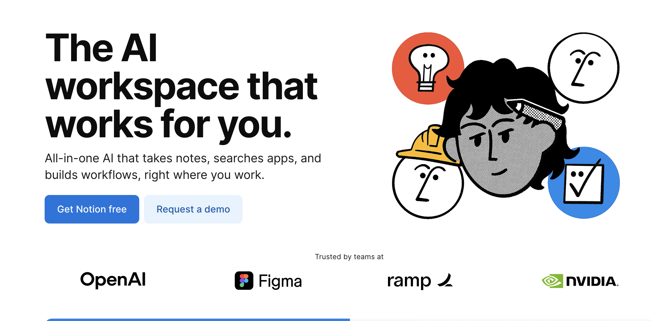
Notion AI
Shows the AI output directly in the hero with animated typing effects
Notion AI's landing page brilliantly demonstrates the product in action without requiring users to sign up first. An animated typing effect in the hero section shows AI-generated content appearing in real-time, giving visitors an immediate preview of what they'll experience.
This "show, don't tell" approach is particularly effective for AI writing tools because it removes uncertainty about output quality. Users can see the tone, structure, and polish of the AI's writing before committing to try it.
The page also benefits from Notion's existing brand trust - users already familiar with Notion are more likely to try the AI features because the core product has already proven its value.
Key takeaway: Demonstrating the end result is more persuasive than describing features. Live demonstrations or realistic previews convert better than static screenshots or feature lists.
Grammarly
Uses before/after text examples to illustrate AI improvement
Grammarly's approach centers on transformation. Their hero section often features side-by-side text examples showing "before" and "after" AI enhancement, making the value proposition instantly visual and concrete.
This before/after pattern works exceptionally well for AI tools because it shows both the problem (poorly written text) and the solution (polished text) in a single glance. Users don't need to imagine what the AI does - they can see the exact transformation they'll get.
The page also strategically places trust signals (used by millions, partnerships with major platforms) near these visual examples, creating a compound effect: "This is what it does" + "These people trust it" = higher conversion probability.
Key takeaway: Visual proof of transformation drives conversion better than feature lists. When users can see the exact improvement they'll get, the value becomes immediately tangible rather than theoretical.
Runway ML
Leads with stunning AI-generated visual outputs in a hero video
Runway's landing page is a masterclass in showing product capabilities without explanation. The hero section features a looping video showcasing stunning AI-generated visuals - from video editing to image generation to motion graphics.
For visual creation tools, this approach is essential. Users need to see that the AI can produce professional-quality output before they'll invest time in learning the platform. The visual showcase answers the critical question: "Is this good enough for my professional work?"
The page deliberately avoids technical jargon about models or training data. Instead, every section is organized around use cases: "Edit video," "Generate images," "Create animations." This use-case structure helps users quickly identify whether the tool fits their needs.
Key takeaway: For creative AI tools, showing beautiful output builds desire immediately. Quality speaks louder than features, especially when users are evaluating whether AI can match human-level creative work.
ChatGPT (OpenAI)
Minimalist design with a single prominent chat interface and simple messaging
OpenAI's ChatGPT landing page demonstrates that simplicity works when brand awareness is high. The design is remarkably sparse: a brief headline, a simple description, and a prominent "Try ChatGPT" button.
This minimalist approach works because ChatGPT doesn't need to explain itself - most visitors arrive already knowing what it does. The landing page's job is simply to facilitate access, not to educate or persuade.
For lesser-known AI startups, this approach would fail. But for established products, removing friction through simplicity can outperform more elaborate designs that slow down motivated users.
Key takeaway: Extreme simplicity works when the product is already well-known. If users arrive with intent and awareness, your job is to remove obstacles, not to persuade.
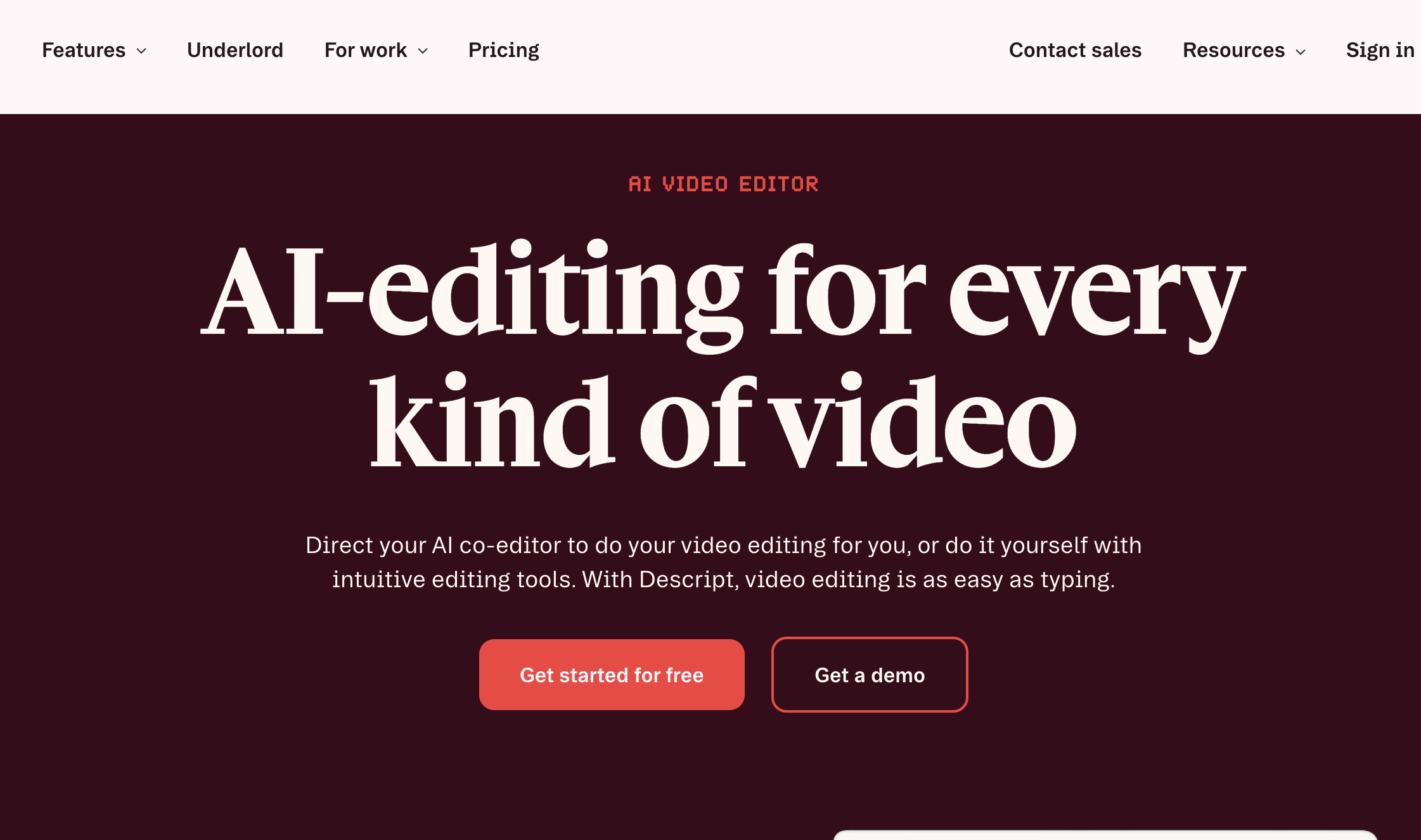
Descript
Includes a short demo video in the hero showing real AI features in action
Descript's landing page features a concise product demo video (usually 15-30 seconds) in the hero section, showing AI-powered transcription, editing, and voice cloning in real workflows.
This video approach bridges the gap between static screenshots and full product tours. Users get to see the AI working in context without committing 5-10 minutes to watch a lengthy explainer. The brevity respects user time while still demonstrating capabilities.
The page also uses specific outcome language: "Edit audio by editing text" rather than "AI-powered audio editing." This concrete description helps users immediately understand the unique value proposition.
Key takeaway: 15-second product demos outperform static screenshots for complex AI products. Short, focused demonstrations show capabilities without overwhelming users or requiring significant time investment.
Lumen5
Features a step-by-step visual showing the AI transformation process
Lumen5's landing page breaks down the "magic" of AI video creation into a simple three-step visual process: paste your content, customize, and share your video. This demystification reduces the intimidation factor that complex AI tools can create.
Each step includes a visual preview showing exactly what users will see at that stage. This transparency builds confidence - users know what to expect before they start, reducing the anxiety that causes abandonment during onboarding.
The page also includes a prominent "Create video now" CTA that uses present-tense action language, positioning the tool as immediately accessible rather than something that requires learning or setup.
Key takeaway: Breaking down the "magic" into digestible steps reduces skepticism. When users understand the process (even at a high level), they're more comfortable committing to try the product.
Beautiful.ai
Displays actual presentation slides created by the AI directly on the landing page
Beautiful.ai's approach is to showcase portfolio-quality output directly in the hero section. Actual presentation slides created by the AI cycle through the page, demonstrating the professional polish users can expect.
This portfolio approach is critical for design-focused AI tools. Users need proof that AI-generated output meets professional standards before they'll consider replacing their current workflow. Showing real examples (rather than cherry-picked marketing materials) builds genuine trust.
The page also uses specific language about what the AI handles: "Smart formatting," "On-brand colors," "Automatic layouts." These concrete descriptions help users understand which parts of their workflow the AI will improve.
Key takeaway: Showing polished output builds confidence in quality. For any AI tool where output quality is a primary concern, demonstrating real results outperforms describing capabilities.
Midjourney
Gallery-style landing page showcasing diverse AI-generated images
Midjourney's landing page is essentially a curated gallery of stunning AI-generated images. This design choice is brilliant for a generative AI tool - the product's capabilities are best demonstrated through its outputs, not through feature descriptions.
The gallery approach serves multiple purposes: it proves quality, demonstrates range (photorealistic to abstract to artistic styles), and inspires users by showing what's possible. Each image is a mini-case study in the AI's capabilities.
Notably, the page includes minimal text. The images do the persuasion work, which is appropriate for a visual creation tool where the output speaks for itself.
Key takeaway: For generative AI, a visual portfolio serves as both proof and inspiration. When the product creates visual outputs, showing examples is more persuasive than any amount of description.
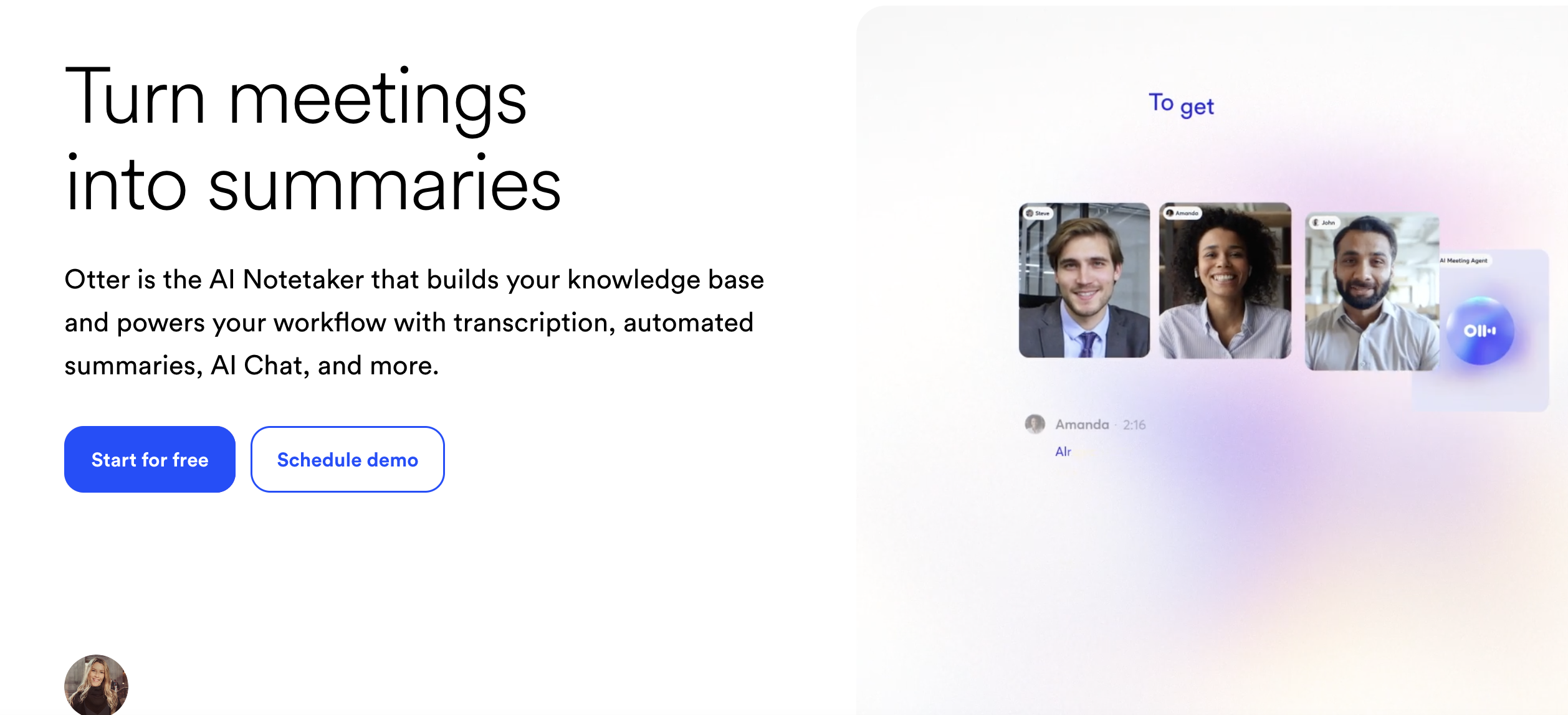
Otter.ai
Uses a live transcription demo that visitors can test without signing up
Otter.ai's landing page sometimes features an interactive demo where users can upload a short audio clip and see it transcribed in real-time. This try-before-you-buy approach removes risk and builds confidence in the AI's accuracy.
Interactive demos are powerful conversion tools because they let users experience value before committing. For transcription AI, accuracy is the primary concern, and an interactive demo addresses this concern directly.
The page also prominently displays integration logos (Zoom, Google Meet, Microsoft Teams), immediately signaling to users that the tool fits into their existing workflow without friction.
Key takeaway: Interactive demos that deliver immediate value convert better than static descriptions. Letting users experience the AI firsthand removes uncertainty and accelerates the decision process.
Synthesia
Shows diverse AI avatar examples with different ethnicities, ages, and styles
Synthesia's landing page features a grid of AI avatars representing different demographics, immediately addressing potential concerns about diversity and representation. This design choice is both ethically sound and conversion-smart - it helps more users see themselves using the product.
The page also includes before/after examples showing the transformation from script to finished video, making the creation process feel accessible even to users with no video production experience.
Customer testimonials are strategically placed near video examples, creating a proof compound: "Here's what it creates" + "Here's what customers say about it" = stronger conversion signal.
Key takeaway: Showing diversity in AI outputs helps more users envision themselves using the product. Representation in examples directly impacts whether users see the tool as "for them."
Fireflies.ai
Features a clean dashboard preview showing transcribed meetings with timestamps and highlights
Fireflies.ai's landing page shows the end-user experience: a clean, organized dashboard with transcribed meetings, searchable content, and AI-generated summaries. This "day in the life" approach helps users visualize the product fitting into their workflow.
The page uses specific outcome language: "Never take notes again" rather than "AI meeting assistant." This outcome-focused copy makes the value proposition immediately clear and personally relevant.
Integration logos appear prominently, and the page includes specific metrics ("Captures every word across 69+ languages"), adding credibility through specificity rather than vague claims.
Key takeaway: Showing the dashboard or end-user interface helps users visualize daily product use. When users can see themselves using the product in their actual workflow, conversion barriers drop.
Tome
Uses a full-screen presentation preview that scrolls through actual AI-generated slides
Tome's landing page features a scrolling presentation that users can interact with, showing how the AI structures narratives, designs layouts, and chooses visuals. This interactive element transforms passive browsing into active engagement.
The page also includes a simple content input field in the hero section: "Start with a prompt" invites users to imagine what they'd create, mentally lowering the barrier to trying the product.
Customer stories are integrated throughout the page rather than siloed in a testimonial section, making social proof feel more natural and contextual.
Key takeaway: Interactive elements that let users explore AI outputs increase engagement and conversion. Passive viewing converts less effectively than interactive demonstration.
Common Design Patterns Used by Successful AI Startups
Analyzing hundreds of AI SaaS landing pages reveals recurring patterns that high-converting pages share. These aren't random design choices - they're deliberate responses to the unique challenges AI products face in building trust and demonstrating value.
Simple Hero Messaging (Not Technical Specs)
Top-performing AI startup landing pages lead with benefit-driven headlines, not technical specifications. Instead of "GPT-4 powered content generation platform," they say "Write blog posts in minutes."
This pattern exists because users don't care about the underlying technology until after they understand the value. Leading with technical details triggers skepticism ("This sounds complicated") rather than interest ("This could solve my problem").
The most effective hero headlines follow a simple formula: [Desired outcome] + [speed/ease qualifier]. Examples:
Copy.ai: "Write better marketing copy and content with AI"
Jasper: "AI copilot for marketing teams"
Otter.ai: "Get an AI meeting assistant"
Descript: "Edit audio by editing text"
Lumen5: "Turn blog posts into videos in minutes"
Notice that none of these headlines mention machine learning, neural networks, or model architecture. The technology is implied but not foregrounded. This approach works because it mirrors how customers think about solutions: they think in terms of outcomes, not technologies.
Examples in action:
Copy.ai uses "Write better marketing copy" as the primary hero message, with a subheadline that adds context but still avoids jargon: "Generate high-performing copy for your business with AI."
Jasper positions itself as a "copilot," using metaphor to make AI assistance feel familiar and collaborative rather than complex or threatening.
Otter.ai uses "Get an AI meeting assistant" which is immediately understandable - users know what a meeting assistant does, so they instantly grasp the value proposition.
Visual Explanation of the AI Output
Rather than describing what the AI does, successful pages show the actual result. This pattern appears in nearly every high-converting AI SaaS landing page because demonstration outperforms description for building confidence in unfamiliar technology.
The visual explanation pattern takes several forms:
Before/After comparisons - Shows the transformation the AI creates. Grammarly excels at this, displaying poorly written text alongside the AI-improved version. This pattern works because it makes the value proposition visually obvious.
Live output demonstrations - Displays the AI generating content in real-time. Notion AI's animated typing effect and ChatGPT's streaming responses both use this approach to make the AI feel responsive and capable.
Portfolio galleries - Collections of AI-generated outputs that demonstrate range and quality. Midjourney and DALL-E use this approach effectively because their value proposition is entirely visual - the outputs are the proof.
Embedded product previews - Shows the actual interface with realistic content. Fireflies.ai and Otter.ai both display their dashboards with transcribed meeting content, helping users visualize the end result in their workflow.
Examples in action:
Grammarly shows corrected text with tracked changes, exactly mirroring the experience users will have when using the product
Runway displays generated video clips cycling through the hero section, proving output quality without requiring users to take action
DALL-E showcases image transformations side-by-side, demonstrating both the input (text prompt) and output (generated image) to make the AI's capabilities tangible
Beautiful.ai cycles through actual presentation slides created by the AI, proving that outputs meet professional standards
Trust Signals Early on the Page
AI products face higher skepticism than traditional software. Users worry about accuracy, reliability, data privacy, and whether the AI actually works as promised. The best designs counter this with credibility markers in the first screen.
Trust signals on high-converting AI landing pages typically include:
Customer logos - Recognizable brands that use the product. This social proof is particularly powerful when the logos come from industries known for high standards (finance, healthcare, legal).
Specific usage metrics - Concrete numbers that establish scale and adoption. "Used by 10M+ writers" or "100,000+ teams trust us" are more credible than vague claims like "trusted by thousands."
Media mentions - Logos from TechCrunch, Forbes, Wall Street Journal, etc. These serve as third-party validation that the product is noteworthy and legitimate.
Security and compliance badges - SOC 2, GDPR, HIPAA compliance indicators for products handling sensitive data. These are essential for B2B AI tools where data security is a primary concern.
Testimonials with full attribution - Customer quotes that include names, photos, job titles, and companies. Vague anonymous testimonials ("This tool is amazing! - John") have little credibility.
Examples in action:
Jasper features customer logos from Microsoft, Nestlé, and other recognizable brands prominently in the hero section, immediately establishing that serious companies trust the product
Copy.ai displays "Trusted by 10M+ writers and marketers at top companies" with accompanying brand logos, using both scale metrics and social proof
Otter.ai shows integration badges for Zoom, Google Meet, and Microsoft Teams, signaling that the product works seamlessly with tools users already trust
Grammarly highlights "Trusted by 30 million people and 50,000 teams" near the top of the page, establishing massive scale adoption
Notion AI benefits from existing Notion trust - users who already rely on Notion are more likely to trust Notion AI
Single Primary Call to Action
Unlike traditional marketing pages, AI product landing pages rarely offer multiple conversion paths. The primary CTA dominates visually and appears repeatedly, while secondary actions are either eliminated or visually subordinated.
This pattern exists because decision paralysis increases with options. When users face multiple CTAs - "Start free trial," "Book demo," "See pricing," "Watch video" - conversion rates typically drop. The mental work of evaluating options creates friction that causes abandonment.
High-converting AI landing pages structure their CTAs hierarchically:
Primary CTA - One dominant action, usually starting a free trial or signing up. This button appears multiple times on the page (hero, mid-scroll, footer) with consistent language and prominent visual treatment.
Secondary CTA (optional) - A less prominent option, usually "Watch demo" or "See examples." This is visually subordinated through smaller size, outlined rather than filled button style, or placement to the right of the primary CTA.
No tertiary CTAs - Additional options like "See pricing," "Contact sales," or "Learn more" are moved to navigation or footer, not presented as competing conversion paths.
The language of primary CTAs on successful AI landing pages tends to be action-oriented and benefit-focused:
"Start writing for free" (not "Sign up")
"Try ChatGPT" (not "Create account")
"Generate your first video" (not "Get started")
"Create presentation" (not "Register")
Examples in action:
ChatGPT features "Try ChatGPT" as the only clickable action in the hero, appearing in three locations throughout the page with no competing CTAs
Notion AI uses "Get Notion free" as the singular primary action, with a small "Request a demo" link as the only secondary option
Descript shows "Start creating for free" as the primary CTA with a secondary "Watch demo" link that's visually subordinated through size and color treatment
Copy.ai repeats "Start writing for free" throughout the page in bright, high-contrast buttons while keeping secondary actions in the navigation bar
AI Landing Pages vs Traditional SaaS Landing Pages
AI landing pages have evolved distinct patterns that differentiate them from traditional SaaS landing page designs. These differences respond to the unique challenges AI products face: higher skepticism about capabilities, greater need to demonstrate rather than describe, and increased concerns about data privacy and accuracy.
Element
Traditional SaaS
AI Landing Pages
Messaging focus
Features and integrations - what the software does
Outcomes and use cases - what users can accomplish
Visual approach
Screenshots of dashboards and feature interfaces
Output examples and live demonstrations of AI results
Trust requirements
Standard testimonials and customer logos
Proof of AI quality + ethics/safety signals + transparency about capabilities
CTA behavior
Multiple paths (demo, trial, pricing, contact)
Single dominant CTA with minimal alternatives
Technical depth
Feature lists with specifications
High-level capability summaries focused on results
Proof strategy
Case studies and ROI metrics
Before/after examples and output galleries
Messaging Focus: Features vs Outcomes
Traditional SaaS landing pages often lead with feature lists: "Includes automated workflows, real-time collaboration, 50+ integrations, advanced analytics." This approach works when users understand the category and are comparing specific capabilities across competing products.
AI landing pages typically avoid feature lists entirely. Instead, they focus on outcomes: "Write blog posts in minutes," "Turn meetings into action items," "Generate marketing images without a designer." This outcome-focused approach works better for AI because users are often uncertain whether AI can actually deliver value - they need to understand the end result before they care about the technology.
Visual Approach: Interfaces vs Outputs
Traditional SaaS landing pages showcase the product interface: dashboards with graphs, settings panels, user management screens. These visuals help users evaluate whether the workflow fits their needs and whether the interface looks professional.
AI landing pages prioritize showing outputs: the written content the AI generates, the images it creates, the transcriptions it produces. Interface screenshots appear lower on the page (if at all) because users' primary concern is output quality, not interface design. For AI products, the outputs are the product.
Trust Requirements: Standard Proof vs AI-Specific Proof
Traditional SaaS products establish trust through familiar signals: customer testimonials, logo bars, ROI metrics, case studies. Users want to know whether the software works reliably and delivers business value.
AI products need all of these signals plus additional layers of trust:
Accuracy proof - Specific metrics about AI performance or examples showing correct outputs
Capability transparency - Clear statements about what the AI can and cannot do
Data privacy - Explicit explanations of how user data is handled and whether it trains the AI
Ethical considerations - For certain AI categories (facial recognition, content moderation), explicit statements about responsible use
CTA Behavior: Multiple Paths vs Single Focus
Traditional SaaS landing pages often present multiple conversion paths to accommodate different buyer types: free trials for self-serve buyers, demo requests for enterprise buyers, pricing pages for comparison shoppers.
AI landing pages typically focus on a single primary action - usually starting a free trial or using a demo. This singular focus exists because AI products face higher user uncertainty. Decision paralysis is more likely when users are unsure whether the AI will work, so removing CTA options reduces friction.
Technical Depth: Specifications vs Simplicity
Traditional SaaS landing pages often include technical specifications: API capabilities, integration details, security certifications, performance metrics. These details help technical evaluators assess whether the software meets their requirements.
AI landing pages typically minimize technical detail, especially anything about the underlying AI models, training data, or architecture. Technical depth appears lower on the page or in dedicated documentation because premature technical detail triggers questions users can't answer ("What's the difference between GPT-3.5 and GPT-4?") and creates perceived complexity barriers.
Proof Strategy: Metrics vs Examples
Traditional SaaS products prove value through metrics: "Customers see 35% productivity improvement," "Reduce costs by $50K annually," "Save 10 hours per week." These quantified claims appeal to ROI-focused buyers.
AI landing pages certainly use metrics when available, but they rely more heavily on qualitative examples: before/after transformations, output galleries, demonstration videos. This example-heavy approach works because users need to see that the AI produces quality outputs before they'll care about productivity metrics.
The convergence point: As AI becomes more embedded in traditional SaaS products, we're seeing hybrid approaches. Startup landing pages in the SaaS space are increasingly adopting AI-style demonstration patterns even for non-AI features, recognizing that showing outcomes converts better than listing features.
Mistakes AI Landing Pages Still Make
Even well-funded AI startups with experienced design teams frequently make these conversion-killing errors. Recognizing these patterns can help you evaluate AI landing page examples more critically and avoid similar mistakes.
Over-explaining the Tech
The mistake: Leading with explanations of how the AI works - model architecture, training data sources, neural network types - before establishing why users should care.
Why it fails: Users don't need to understand transformers or neural networks to see value. Technical explanations trigger two negative responses: (1) "This sounds complicated, I don't have time to learn this," and (2) "I don't understand this, so maybe it's not for me."
Example: Landing pages that start with "Our GPT-4-powered neural network uses transformer architecture trained on billions of parameters..." lose users before ever explaining what the product does.
Better approach: Lead with outcomes, bury technical details in FAQ or documentation sections for users who want them. Copy.ai and Jasper both succeed by relegating technical explanations to support docs rather than hero sections.
Hiding the Product Output
The mistake: Using generic stock imagery or abstract illustrations instead of showing actual AI-generated results. This often happens when companies are concerned about showing outputs that might not be perfect or representative.
Why it fails: Generic visuals kill credibility. When users can't see real outputs, they assume one of two things: (1) the outputs aren't good enough to show, or (2) the company doesn't actually have a working product yet. Both assumptions destroy conversion.
Example: AI writing tools that show stock photos of people typing instead of actual written content generated by the AI. AI design tools that show abstract "creative" imagery instead of real designs created by the tool.
Better approach: Show real, unedited outputs - even if they're imperfect. Midjourney's gallery approach works because users can see genuine results, range of styles, and actual quality. Some companies even show "less perfect" outputs alongside polished ones to set realistic expectations, which actually builds more trust than cherry-picked examples.
Weak Credibility Signals
The mistake: Missing or poorly implemented trust signals when AI products face higher skepticism than traditional software. This includes vague testimonials without attribution, outdated customer logos, or trust signals placed too far down the page.
Why it fails: Users arrive at AI landing pages with questions: "Does this actually work?" "Is this company legitimate?" "Will my data be safe?" When credibility signals are weak or absent, these questions remain unanswered, and users abandon rather than take a perceived risk.
Example: Testimonials that say "Amazing tool! - Sarah" without photo, job title, or company. Customer logo sections that include only small, unknown companies. Security badges that appear only in the footer after three full scrolls.
Better approach: Place strong trust signals above the fold. Use full-attribution testimonials (name, photo, job title, company). Display logos from recognizable customers. Include specific metrics ("Used by 50,000+ teams") rather than vague claims. Jasper and Grammarly both excel at this, featuring recognizable brand logos and specific usage numbers in their hero sections.
Multiple Competing CTAs
The mistake: Offering multiple equal-weight conversion paths: "Start free trial," "Book a demo," "See pricing," "Watch video," "Contact sales" - all presented with similar visual prominence.
Why it fails: Decision paralysis increases with options. When users face multiple CTAs, they must evaluate each option before acting. This evaluation creates friction and cognitive load, both of which reduce conversion. For AI products where users already face uncertainty about whether the technology will work, adding CTA complexity compounds the problem.
Example: Landing pages with three or four equally prominent buttons in the hero section, or pages where every section ends with a different CTA, creating an overwhelming sense of "what should I do?"
Better approach: One primary CTA that appears multiple times, with secondary actions visually subordinated or placed in navigation. ChatGPT's approach is exemplary: "Try ChatGPT" is the only prominent action, repeated three times throughout the page with consistent language and visual treatment.
Unclear Use Case Positioning
The mistake: Trying to appeal to every possible user type simultaneously, resulting in vague messaging that doesn't resonate with anyone specifically.
Why it fails: Users evaluate products by asking "Is this for me?" When positioning is too broad, users can't answer that question confidently. "AI for everyone" is less compelling than "AI for marketing teams" or "AI for video editors" because specific positioning helps users self-identify.
Example: Landing pages that list 15 different use cases or try to position the AI as simultaneously serving consumers, small businesses, enterprises, developers, and non-technical users without any prioritization.
Better approach: Lead with one primary use case or audience, with secondary use cases introduced after establishing clear primary positioning. Descript positions primarily for video/podcast creators before mentioning other use cases. Jasper focuses on marketing teams before expanding to other content types.
Front-Loading Learning Requirements
The mistake: Structuring the landing page like educational content - explaining what AI is, how it works, and why it matters - before showing the product.
Why it fails: Users with commercial intent want to evaluate the product, not take an AI course. Front-loading education triggers "this is going to be complicated" responses and signals that the product isn't ready for non-experts.
Example: Landing pages that include "What is AI?" sections, lengthy explanations of machine learning basics, or multi-paragraph educational content before showing what the product does.
Better approach: Lead with the product and outcomes, provide educational content only for users who seek it out. Most successful AI SaaS landing pages include educational content in blog sections or help centers, not in the primary conversion path.
Ignoring Failure Cases
The mistake: Presenting the AI as perfect and never acknowledging limitations, failure cases, or situations where it doesn't work well.
Why it fails: Experienced users know AI isn't perfect. When landing pages present AI as flawless, it triggers skepticism rather than confidence. Users assume either the company is lying or hasn't done enough testing to discover the limitations.
Example: Landing pages that use language like "perfect transcriptions," "100% accurate," or "never makes mistakes" without any qualification or acknowledgment of limitations.
Better approach: Transparent communication about what the AI does well and where it has limitations. Otter.ai, for example, mentions that transcription accuracy improves over time as the AI learns voices, implicitly acknowledging that initial accuracy isn't perfect. This honesty builds trust rather than undermining it.
Explore Hundreds More AI Landing Page Examples
Ready to dive deeper into AI landing page design? Browse our complete collection of real AI product pages with advanced filtering by industry, product category, and specific design patterns.
Visit Landdding's AI Landing Page Gallery to explore:
500+ curated AI landing pages from successful startups and established companies
Filter by category: AI writing tools, image generation, video creation, productivity, development tools, and more
Search by design pattern: Hero demonstrations, trust signal placement, CTA strategies, visual layouts
High-quality screenshots showing full hero sections and key conversion elements
Regular updates with newly launched AI products and redesigned pages
Whether you're designing your first AI landing page or optimizing an existing one for higher conversions, studying real examples across different industries reveals the patterns that consistently drive signups. See how the most successful artificial intelligence products structure their messaging, demonstrate capabilities, build trust, and guide visitors toward conversion.