Short answer: A modern landing page in 2026 is clarity-first, AI-readable, performance-optimized, and proof-driven. It loads fast, communicates value in under 5 seconds, uses a modular layout, and is structured for both human readers and AI engines. Aesthetics alone are no longer enough.
The era of "pretty but confusing" is over. In 2026, modern design is defined by how well a page communicates and converts, not just how it looks. Visitors are more impatient. AI engines are crawling and summarizing your page content. And competition for attention has never been higher.
If your landing page can't answer "what is this and why should I care" in the first viewport, it is already outdated.
This guide breaks down every dimension of modern landing page design in 2026: layout, performance, AI visibility, social proof, motion, and more.
What Is a Modern Landing Page in 2026?
A modern landing page in 2026 has six defining characteristics:
Clarity-first: The value proposition is visible, specific, and jargon-free above the fold
AI-readable: The content is structured with headings, short answer blocks, and semantic HTML that AI engines can parse and cite
Performance-optimized: Core Web Vitals scores are green; the page loads in under 2.5 seconds on mobile
Modular layout: Sections are self-contained, reusable, and designed for easy iteration
Proof-driven: Claims are backed by numbers, testimonials, and real usage metrics
Minimal cognitive load: One primary CTA per section, no competing priorities
This definition matters because most landing pages still fail on at least three of these points. A page can look modern and still underperform if it lacks structure, speed, or credibility.
Above-the-Fold Clarity Is Non-Negotiable
The first thing a visitor sees when they land on your page determines whether they stay or leave. According to research from Nielsen Norman Group, users decide within 10–20 seconds whether a page is worth their attention.
Clear Value Proposition in 5 Seconds
The hero section must answer three questions immediately:
What is this?
Who is it for?
Why does it matter?
Vague headlines like "The future of work starts here" are a 2020 pattern. In 2026, specificity wins. "Manage client projects in one tab, no spreadsheets" is more modern than any abstract claim.
The best AI landing pages in 2026 lead with outcomes, not features. "Save 4 hours per week on reporting" outperforms "AI-powered analytics dashboard" every time.
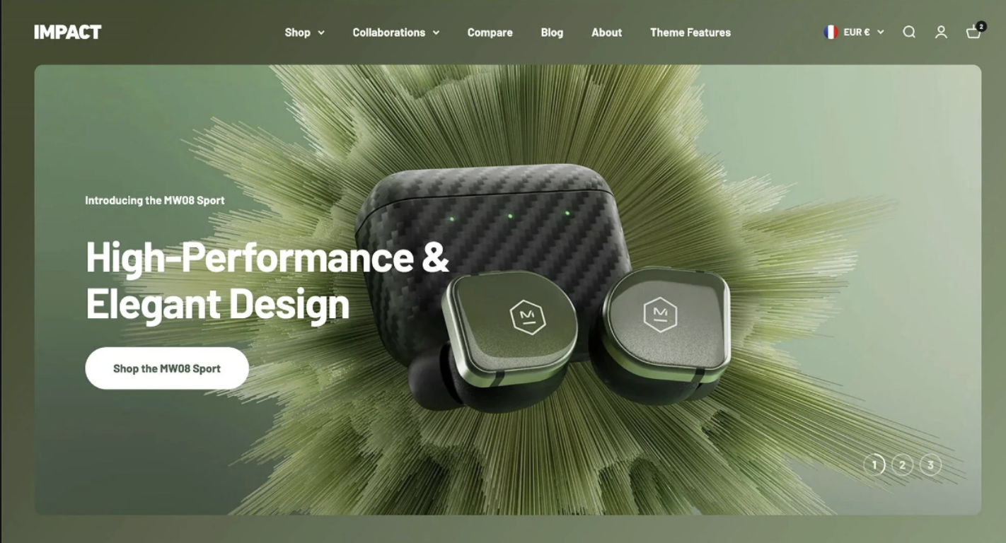
Product Visual Instead of Abstract Art
Abstract gradients and decorative illustrations have been replaced by product screenshots, UI demos, and interactive previews. Users want to see what they are buying before they scroll.
Modern technology brands use annotated product visuals directly in the hero, not buried three sections down. This reduces bounce rate and sets accurate expectations.
Single Primary CTA
One CTA above the fold. Not two. Not a CTA and a "learn more" competing for the same click.
Modern pages treat the hero CTA as the only decision a visitor needs to make at that moment. Secondary CTAs belong further down the page after the visitor has been convinced.
Structured Layouts Over Decorative Chaos
Modular Grid Systems
In 2026, landing pages are built on modular grids. Each section is a self-contained unit with a clear purpose: problem, solution, features, proof, CTA. This approach makes pages easier to A/B test, faster to load, and simpler to maintain.
The modular approach also maps well to how AI engines parse content. Structured sections with clear headings are easier to extract and summarize than walls of flowing prose.
Bento Layout Evolution
Bento grids have moved from trend to standard. In 2026, the bento layout is used across SaaS, e-commerce, and portfolio sites because it allows high information density without visual clutter.
The key to a modern bento grid is hierarchy within the grid itself. Not all cells are equal. One or two cells carry the main message. The rest support, contextualize, or demonstrate.
Clear Visual Hierarchy
Modern pages use size, weight, and whitespace to guide the eye. The hierarchy is:
Headline (largest, boldest)
Supporting subheading
Body copy
CTA button
When everything competes for attention, nothing gets it. Restraint is a design skill.
AI Visibility as a Design Constraint
This is one of the biggest shifts in 2026. Landing pages are no longer just designed for human visitors. They are being read, parsed, and cited by AI engines including ChatGPT, Perplexity, Gemini, and Claude.
Search has changed dramatically with Google's Search Generative Experience (SGE). AI-generated summaries now appear before organic results on many queries. If your page is not structured for AI extraction, you are invisible in those summaries.
Reference: Google Search Central documentation on structured data
Structured Headings
Use a clean H1 > H2 > H3 hierarchy. Do not skip heading levels. Do not use headings purely for visual styling. Every heading should describe the section content accurately, because AI engines use headings to understand page structure.
Short Answer Blocks
AI engines are looking for direct, citable answers. If someone asks "what makes a landing page modern in 2026," your page should contain a short paragraph or bullet list that answers that question directly.
This is not dumbing down your content. It is structuring it for extraction. Pages that do this well get cited in AI-generated answers, which drives qualified referral traffic.
Comparison Sections
Comparison tables are one of the most powerful formats for AI visibility. They encode structured, factual claims that AI engines can extract and reference. They also convert well with human readers who are in decision mode.
FAQ Implementation
FAQs at the end of a landing page serve two purposes: they answer objections for human readers, and they provide structured Q&A pairs that AI engines can parse and cite. More on this below.
Performance = Modern
A visually impressive page that loads slowly is not modern. It is broken.
Performance is now a design requirement, not a development afterthought.
Core Web Vitals
Google's Core Web Vitals are the benchmark for performance in 2026:
Largest Contentful Paint (LCP): Should be under 2.5 seconds. Measures how fast the main content loads.
First Input Delay (FID) / Interaction to Next Paint (INP): Should be under 200ms. Measures responsiveness.
Cumulative Layout Shift (CLS): Should be under 0.1. Measures visual stability.
Pages with poor Core Web Vitals rank lower in Google search and are less likely to be cited by AI engines, which also factor in page quality signals.
Mobile First Execution
More than 60% of web traffic is mobile. A modern landing page is designed for mobile first, then scaled up for desktop. Not the other way around.
This means thumb-friendly tap targets, single-column layouts that work at 375px wide, and hero sections that communicate clearly without horizontal scrolling.
Fast Image Delivery
Modern pages use next-gen formats like WebP and AVIF. Images are lazy-loaded below the fold. Hero images are preloaded. CDN delivery is standard.
Heavy, unoptimized images are the single most common reason landing pages fail Core Web Vitals.
Social Proof That Feels Real
Generic testimonials with stock photos and vague praise ("This tool changed everything!") are a relic of 2019. In 2026, social proof needs to be specific, verifiable, and contextual.
Data-Driven Testimonials
Modern testimonials include numbers. "Reduced our onboarding time by 40%" is more credible than "Really easy to use." Specificity implies authenticity.
The best e-commerce landing pages pair testimonials with verifiable context: company name, role, use case, and a measurable outcome.
Usage Metrics
"Used by 14,000 teams" or "4.8 stars across 2,300 reviews" are modern proof signals. They are factual, scannable, and harder to fake than written testimonials.
Display these metrics prominently, near the hero or just below it.
Logos with Context
Logo walls alone are outdated. In 2026, logos are paired with a one-line context: not just "Trusted by Google" but "Used by Google's design team for rapid prototyping."
Context transforms a logo from decoration into evidence.
Motion with Purpose
Animation on landing pages in 2026 is not about impressing visitors. It is about directing attention and reinforcing meaning.
Microinteractions
Microinteractions are small animations triggered by user actions: a button that subtly shifts on hover, a form field that confirms input, a success state that feels satisfying. These signals reduce uncertainty and make interfaces feel polished and responsive.
Agencies like Locomotive have been pushing the boundaries of purposeful web motion for years, demonstrating how scroll-based interaction can enhance rather than distract from a page's message.
Scroll-Based Reveal
Content that reveals as the user scrolls creates a sense of narrative progression. It guides the visitor through the page's argument in a controlled sequence. But timing matters. Animations that are too slow or too aggressive break the reading flow.
Modern pages keep scroll animations subtle, fast (under 400ms), and tied to content meaning rather than visual spectacle.
Performance Limits
No landing page animation should trigger layout recalculation or block the main thread. Use CSS transforms and opacity, not width, height, or top/left changes. Keep JavaScript animation libraries lightweight.
If your animation tanks your CLS score, it is not modern. It is a bug.
Minimalism with Depth
Minimalism in 2026 is not about emptiness. It is about precision. Every element earns its place.
White Space
Generous white space around headings, between sections, and around CTAs creates breathing room that makes content easier to read and decisions easier to make. It signals confidence and quality.
Cluttered pages signal insecurity. Modern pages say what they need to say and stop.
Bold Typography
Large, bold, high-contrast typography is a hallmark of modern landing pages. Type does the heavy lifting. In many cases, a strong headline over a plain background outperforms the same headline over a complex visual.
Type scales in 2026 are aggressive: hero headlines at 64px or larger on desktop are standard for design-forward pages.
Layered Background Systems
Flat backgrounds have been replaced by layered depth: subtle gradients, noise textures, mesh effects, and soft glow systems that add visual richness without distraction.
The key is restraint. Backgrounds should support the content, not compete with it. See UI design trends 2026 for more on how these systems are being applied across industries.
Product-Led Storytelling
Modern landing pages tell a story. Not a brand story, but a user story: here is the problem you have, here is how we solve it, here is proof that it works.
Problem > Solution > Proof
This three-part structure is the backbone of every high-converting landing page in 2026. It mirrors how buyers think. They arrive with a problem. They need to see a solution. They need to believe the solution works.
Pages that skip the problem and jump straight to features lose visitors who have not yet been convinced that this solution is relevant to them.
Feature to Outcome Framing
"Automated scheduling" is a feature. "Never miss a follow-up again" is an outcome. Modern pages translate every feature into the user outcome it produces.
This is especially critical for Web3 and AI products, where the underlying technology is complex but the user benefit is simple and concrete.
Use Cases Over Generic Claims
"Perfect for teams of all sizes" tells visitors nothing. "Used by 200-person agencies to cut proposal time in half" tells a specific story that qualified visitors can see themselves in.
Modern pages are written for someone specific, not everyone.
Modern vs Outdated: A Direct Comparison
Element Modern 2026 Outdated 2020 Hero headline Specific outcome-driven Vague inspirational tagline Product visual Interactive demo or UI screenshot Abstract illustration or stock photo CTA One clear primary CTA Multiple competing CTAs Social proof Data-backed, specific, contextual Generic quotes with no names Layout Modular grid or bento Full-width sections with heavy imagery Typography Large, bold, high contrast Decorative or ornate fonts Animation Purposeful microinteractions Auto-playing video backgrounds Performance Sub-2.5s LCP, green Core Web Vitals Slow load, poor mobile experience AI visibility Structured headings, short answer blocks Unstructured prose Navigation Minimal or hidden on landing pages Full site nav distracting from CTA
Examples of Modern Landing Pages by Category
The strongest examples of modern landing page design in 2026 share one trait: they make it immediately obvious who the product is for and what it does.
AI tools lead with time-saving or accuracy claims, backed by demo videos or interactive previews. Browse AI landing page examples to see this pattern in action.
SaaS and technology companies use product screenshots annotated with feature callouts. The goal is to reduce the gap between "what is this" and "I can see myself using this."
E-commerce brands lead with product photography, urgency signals, and social proof metrics directly in the hero.
Design portfolios use typography and restraint as the primary design statement. The work speaks for itself with minimal framing. See examples in the design category.
Publications like The Outline have historically pushed the boundaries of editorial web design, demonstrating how strong typographic decisions and unconventional layouts can create memorable digital experiences.
Modern Templates That Reflect 2026 Standards
If you are building or rebuilding a landing page, starting with a modern template is faster than building from scratch. The key is choosing a template that reflects current design standards, not one built four years ago with a fresh coat of paint.
Browse curated modern templates at landdding.com/templates, including options for:
The best templates in 2026 ship with semantic HTML structure, fast-loading components, and layouts designed for AI readability from the start.
Checklist: Is Your Landing Page Modern?
Use this as a quick audit. If you answer "no" to more than three of these, your page needs a refresh.
Clarity
Does your hero communicate the value proposition in under 5 seconds?
Is there one primary CTA above the fold?
Is your headline specific, not vague or inspirational?
Layout
Is your page built on a modular grid?
Is the visual hierarchy clear from headline to CTA?
Does your page work on mobile without horizontal scrolling?
Performance
Is your LCP under 2.5 seconds?
Is your CLS under 0.1?
Are images optimized and served in WebP or AVIF format?
AI Visibility
Does your page have a clean H1 > H2 > H3 heading structure?
Does it include at least one short answer block for key questions?
Is there a FAQ section?
Social Proof
Are your testimonials specific and data-backed?
Do you display usage metrics near the hero?
Are logos paired with context?
Motion
Are all animations purposeful and under 400ms?
Do animations use CSS transforms, not layout properties?
Want Your Page Featured?
If your landing page reflects 2026 design standards, submit it to landdding.com for review. We curate the best examples weekly for designers, founders, and marketers looking for inspiration.
FAQ: Modern Landing Page Design in 2026
What defines modern web design in 2026?
Modern web design in 2026 prioritizes clarity, speed, and structure over decoration. A modern landing page communicates its value proposition immediately, loads in under 2.5 seconds, uses a modular layout, and is structured for both human readers and AI engines.
Is minimalism still modern?
Yes, but it has evolved. Minimalism in 2026 is not about emptiness. It is about precision. Modern pages use white space, bold typography, and layered depth to create visual richness without clutter. Minimalism is the absence of unnecessary elements, not the absence of personality.
Are animations necessary for a modern landing page?
No. Animations should be purposeful, not mandatory. A landing page can be completely modern without any animation if it has strong typography, clear hierarchy, and a fast load time. If you do use animation, keep it tied to meaning: scroll reveals that guide the narrative, or microinteractions that confirm user actions.
How important is AI optimization for landing pages in 2026?
Very important and growing. With AI-generated search summaries becoming the default in Google (via SGE) and AI assistants being used for product research, pages that are not structured for AI extraction are losing visibility. This means clean heading hierarchy, short answer blocks, comparison tables, and FAQ sections.
What makes a landing page look outdated?
The most common signs of an outdated landing page: a vague inspirational headline, abstract stock imagery in the hero, multiple competing CTAs, generic testimonials with no names or data, auto-playing video backgrounds, and poor mobile performance. Any combination of three or more of these signals that a page was built before 2022.
How do I modernize my landing page quickly?
Start with the hero. Rewrite the headline to be specific and outcome-driven. Replace any abstract illustration with a product screenshot or demo. Remove all but one primary CTA. Then check your Core Web Vitals in Google Search Console and fix any LCP or CLS issues. These changes alone will put most pages ahead of 80% of their competition.
Does my landing page need to be designed for AI engines?
If your goal is to appear in AI-generated search summaries and be cited by tools like ChatGPT or Perplexity, then yes. Structure your content with clean headings, include a definition block near the top, use comparison tables, and add a FAQ section. This is good SEO practice regardless of AI, but it has become significantly more important in 2026.
What tools are best for building modern landing pages in 2026?
Webflow and Framer are the dominant tools for designers building modern landing pages without deep code. Both support fast performance, clean semantic output, and visual design flexibility. For teams that need CMS integration, WordPress with a modern block-based theme is still a strong option. See the full template library for curated options across all three platforms.
Explore more landing page design examples and trends at landdding.com. Have questions or want to explore working together? Get in touch.