You have felt good UX and bad UX, even if you have never used the words. The app that lets you re-order last night's dinner in two taps is UX. The parking meter that makes you re-enter your licence plate three times is also UX — just the kind that makes you walk away.
User experience is one of those terms that sounds technical but describes something completely human: how it feels to use a thing. This guide builds that idea up from scratch — clear enough for a total beginner, deep enough to be useful if you already design for a living.
What is user experience?
User experience (UX) is the sum of how a person feels when they interact with a product, service, or system. It covers everything before, during, and after the moment of use — finding the product, signing up, completing a task, getting help when something breaks.
Crucially, UX is not about how something looks. It is about how well it works for the person trying to get something done. A beautiful app that hides its most-used button has bad UX. A plain-looking form that you can finish in ten seconds has good UX.
The term was coined in the 1990s by cognitive scientist Don Norman, then at Apple, precisely because older words like "usability" were too narrow. He wanted a phrase that captured the whole emotional and practical journey, not just whether a button was clickable.
"Design is really an act of communication."
— Don Norman, who coined the term "user experience"
A quick non-digital example makes it concrete. Think of a door with a flat metal plate on it. The plate silently says "push." If that door actually needs to be pulled, you will yank, fail, and feel briefly stupid — even though the mistake was the design's fault, not yours. Norman called these "Norman doors." Most bad software is a Norman door in disguise.
UX vs UI vs usability: clearing up the confusion
These three words get used interchangeably, and they shouldn't be. The cleanest way to keep them straight: UX is the journey, UI is the surface, and usability is a measure of how smooth that journey is.
UX (User Experience) – The whole end-to-end feeling of using a product, including emotion, ease, and outcome.
Everyday analogy – The entire restaurant visit — booking, seating, food, paying, leaving.
UI (User Interface) – The visual and interactive layer: buttons, colours, type, spacing, icons.
Everyday analogy – The menu, plates, and table setting you actually touch and see.
Usability – How easily and reliably a person can complete a task. One key part of UX.
Analogy – Whether you can flag down a waiter when you need one.
So UI is a part of UX, and usability is a property you can test and measure. You can have a gorgeous UI and still deliver terrible UX — that is the trap many redesigns fall into.
As usability expert Steve Krug summed up his whole philosophy in three words:
"Don't make me think."
— Steve Krug, author of Don't Make Me Think
Why UX matters (the business case)
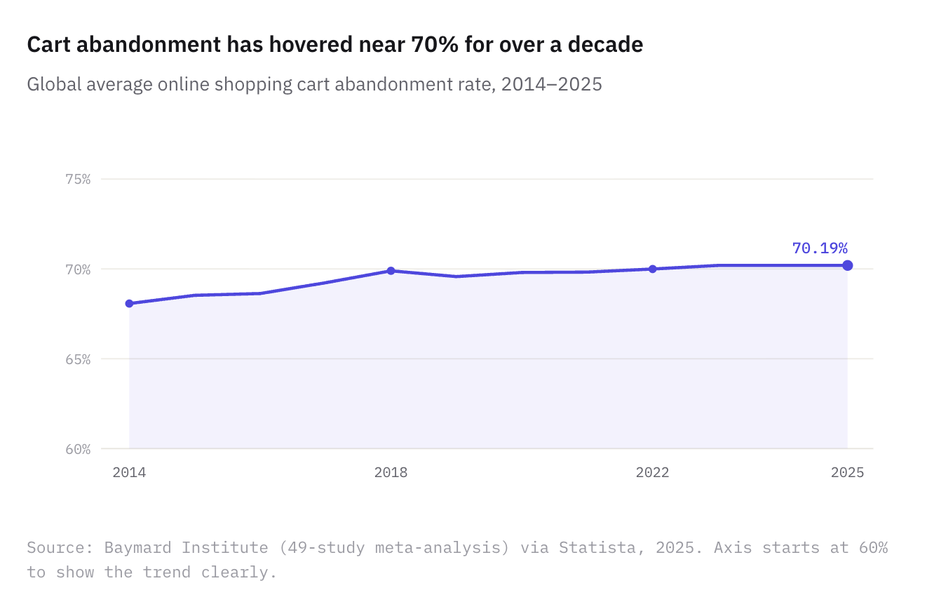
Good UX is not a nice-to-have. Every point of friction quietly leaks users, and at scale that becomes lost revenue. The clearest proof is what happens at the checkout — the exact moment a motivated buyer is ready to pay.
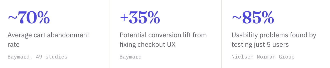
According to the Baymard Institute's meta-analysis of roughly 49 studies, the average online shopping cart abandonment rate sits at about 70% — and it has barely moved in a decade. Seven in ten people who add to cart still leave without buying, and a large share of that is avoidable friction, not lack of intent.
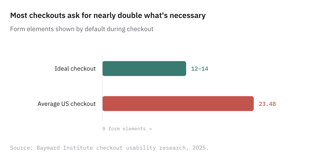
Why do they leave? A leading cause is a checkout that simply asks for too much. Baymard found that nearly 1 in 5 US shoppers have abandoned an order because the process was too long or complicated — and the average US checkout shows almost twice as many form fields as it needs to.
The flip side is the opportunity. Baymard estimates that fixing documented checkout usability issues can lift conversion rates by up to ~35% for a typical large store. UX work is one of the few design investments with a measurable line to revenue.
The 7 principles of good UX
The most enduring way to think about quality UX comes from information architect Peter Morville, who mapped it as a honeycomb of seven facets. A product doesn't need to max out every cell — but the more it satisfies, the better the experience.
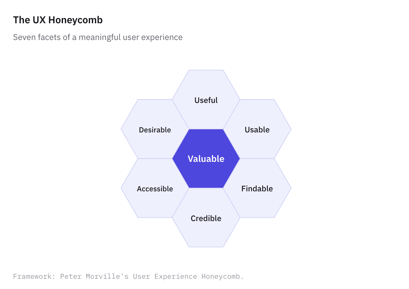
Useful — it solves a real problem people actually have. The first and easiest test to fail.
Usable — people can complete tasks without struggling or being trained.
Findable — content and features are easy to locate, both within the product and from the outside.
Credible — users trust what they see; the product feels honest and reliable.
Desirable — the design, identity, and tone create a positive emotional pull.
Accessible — it works for people with disabilities and across devices and contexts.
Valuable — it delivers worth to both the user and the business. The cell everything else feeds into.
How UX designers actually work
The process, step by step
Good UX is rarely a flash of inspiration. It is a loop of understanding, building, and checking. Most teams move through some version of these stages — and importantly, they circle back rather than march in a straight line.
1. Research — understand the user
Before designing anything, figure out who you are designing for and what they are trying to do. This means interviews, surveys, and watching real people use existing solutions. The goal is to replace assumptions with evidence.
2. Define — frame the problem
Turn research into a sharp problem statement and tools like personas or journey maps. "Users abandon signup at the payment step because they don't trust the form" is something you can actually design against.
3. Architect — structure the information
Information architecture is how content and features are organized and labelled. Get this wrong and no amount of pretty UI will save you, because people simply won't find things.
4. Design — wireframe and prototype
Start low-fidelity (rough wireframes) to test layout and flow cheaply, then move to high-fidelity, clickable prototypes. The point is to make ideas tangible enough to react to before a single line of code is written.
5. Test — watch real people
Usability testing means giving people a task and observing where they hesitate, misclick, or give up. You don't need a lab full of participants either.
The 5-user rule: Jakob Nielsen's research found that testing with just five users typically uncovers around 85% of a design's usability problems. Small, frequent tests beat one big study.
6. Iterate — fix and repeat
Feed findings back in, improve, and test again. UX is never "done"; products evolve as users and contexts change.
"Design is the rendering of intent."
— Jared Spool, UX researcher and educator
UX best practices you can apply today
You don't need a research team to improve UX this week. These principles, several drawn from Nielsen's classic usability heuristics, apply to almost any screen.
Respect Jakob's Law. People spend most of their time on other sites, so they expect yours to work the same way. Be conventional where it counts; be original where it delights.
Reduce choices and steps. Every extra field, option, or click is a chance to lose someone. Cut the checkout, shorten the form, default the obvious.
Show clear system status. Loading spinners, progress bars, and confirmation messages tell people the product heard them. Silence breeds anxiety.
Prevent errors before they happen. A date picker beats a free-text date field. Good design makes the wrong action hard.
Write helpful errors. When something fails, say what went wrong and how to fix it — never just "Error 422."
Maintain consistency. The same action should look and behave the same everywhere. A "Save" button shouldn't become "Submit" two screens later.
Design for accessibility from the start. Sufficient colour contrast, keyboard navigation, and alt text aren't extras — they widen your audience and are increasingly required by law.
Establish visual hierarchy. Size, weight, and spacing should guide the eye to what matters most first.
Common UX mistakes (and how to avoid them)
Designing for yourself – Assuming your users think like you do. You are not your user — their context, skills, and goals differ from yours.
Beauty over clarity – Prioritizing a striking look over a usable one. Trendy designs that hide function age fast and frustrate users.
Skipping testing – Shipping based on internal opinion alone. Without watching real users, you are guessing — and guesses are expensive.
Ignoring mobile – Treating mobile as an afterthought when most traffic — and the highest abandonment — happens on small screens.
From beginner to advanced: where are you?
UX knowledge is a ladder, not a switch. Use this to find your next step rather than feeling you must know everything at once.
Curious
You're starting out; Focus on noticing UX in daily life. Ask "why was that easy or annoying?" Read about usability and try one UX teardown of an app you use.
Practising
You design or build things; Apply the principles and heuristics here. Run a five-user test. Learn a tool like Figma and practise wireframing real flows.
Advanced
You ship UX professionally; Move beyond heuristics to evidence: A/B testing, analytics, accessibility audits, design systems, and tying UX metrics to business outcomes.
Key takeaways
The short version
UX is how it feels to use something — the whole journey, not the visuals.
UI is part of UX, and usability is a measurable slice of it.
Friction costs money — checkout abandonment near 70% is largely avoidable.
Good UX follows principles — useful, usable, findable, credible, desirable, accessible, valuable.
It's a loop — research, design, test with real people, and iterate.