Above-the-Fold Landing Page Design Patterns That Increase Signups
Short Answer: The above-the-fold section should communicate value, credibility, and next action in under 5 seconds using a clear headline, benefit-focused subhead, visible CTA, and trust signals.
Why Above-the-Fold Still Matters in 2026
Attention is the scarcest resource on the internet, and above-the-fold real estate is where you either earn it or lose it.
Research from Google shows that 53% of mobile users abandon a site that takes longer than 3 seconds to load, and first impressions form in as little as 50 milliseconds. That is not a metaphor. It is a measurable cognitive reaction that determines whether someone scrolls, signs up, or bounces.
In 2026, the stakes are even higher. AI engines like ChatGPT, Perplexity, and Google's AI Overviews scan your page structure to generate summaries. What sits above the fold now influences not just human attention, but algorithmic understanding of your product's value.
This guide breaks down 10 proven above-the-fold design patterns from real SaaS products, AI tools, and fintech platforms, with performance context, conversion psychology, and clear rationale for each.
What Above-the-Fold Means in 2026
Above the fold refers to everything a visitor sees on a webpage before scrolling. The term originates from print journalism but its digital application is more nuanced than ever.
On desktop, the typical above-the-fold height is around 768px to 900px depending on screen resolution and browser chrome. On mobile, that shrinks dramatically, often to 500px to 600px, and is further reduced by browser UI elements and device notches.
Here is why this matters practically:
Heatmap studies from the Nielsen Norman Group show that users spend 57% of their page viewing time above the fold. Attention drops sharply as users scroll, with below-the-fold content receiving significantly less engagement. This does not mean you should cram everything into the top viewport. It means the above-the-fold section must do enough work to earn the scroll.
Scroll behavior has also shifted. Users scroll more than they did a decade ago, but they only scroll when the above-the-fold content gives them a reason to. A vague headline and a generic stock photo will not earn that scroll.
For AI crawlers and LLM summary behavior, the above-the-fold section is treated as the primary entity block. Headline text, subhead copy, and visible trust signals are extracted as the core signal of what your page is about. Structured, explicit language above the fold directly improves your chances of being cited in AI-generated answers.
Pattern 1: The Clear Value Proposition Stack
Structure: Headline + Subheadline + Primary CTA + Micro trust signal
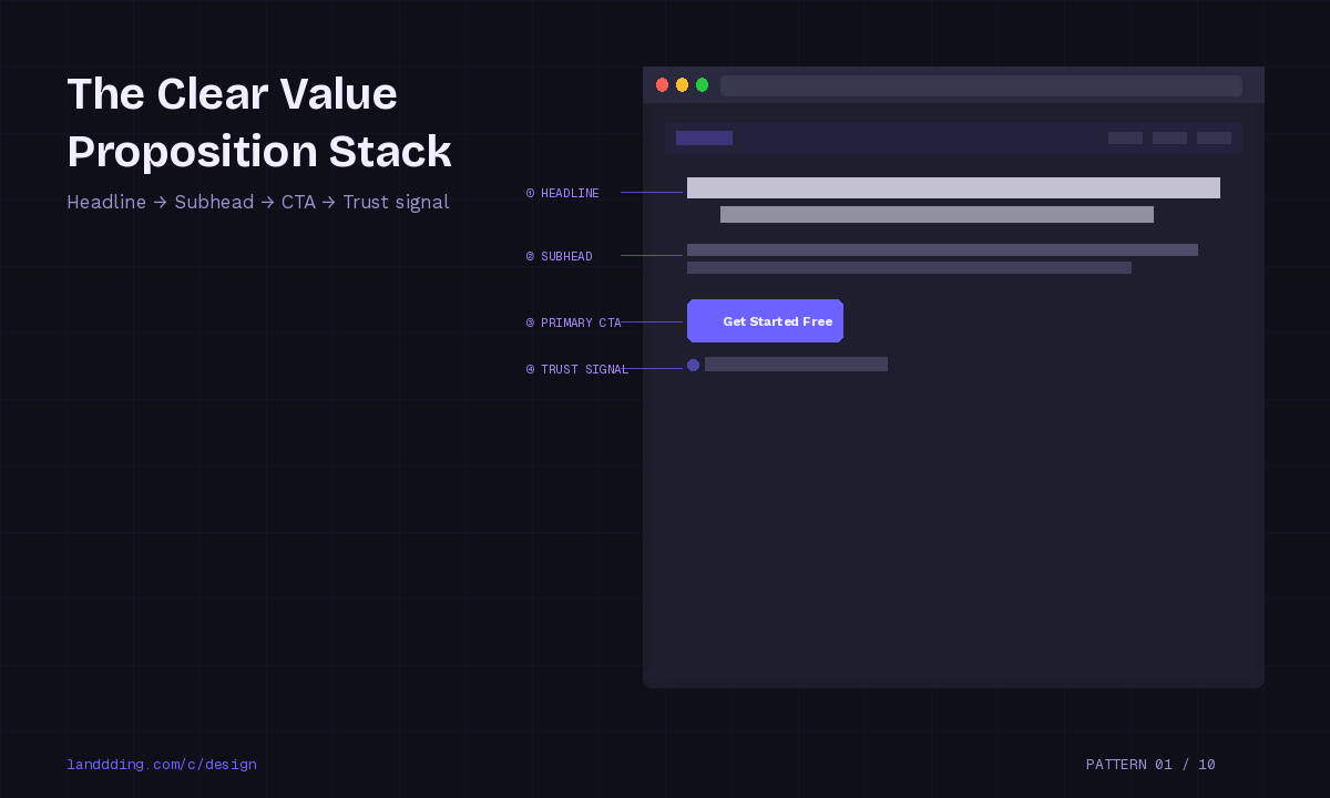
This is the most foundational above-the-fold pattern and the one most brands still get wrong.
The Value Proposition Stack works by following a simple cognitive sequence. The headline answers "what is this." The subheadline answers "why does it matter to me." The CTA answers "what do I do next." The micro trust signal (a count of users, a security badge, a rating) answers "is it safe to proceed."
Why clarity beats cleverness: Clever headlines test poorly against direct benefit statements in almost every A/B test context. According to Baymard Institute research, users in usability studies frequently cannot articulate what a product does after seeing a hero section with an abstract headline. Specificity converts. "Manage your entire team's workflow in one place" outperforms "Work better, together" in almost every conversion context.
Real examples that use this pattern well: Notion, Linear, and Loom all lead with a specific outcome statement followed by a short functional subheadline. No mystery. No metaphor. Just clarity.
Performance impact: Direct value proposition headlines have been shown to lift signup conversion rates by 10 to 30% versus abstract or brand-narrative headlines in multivariate testing environments.
This pattern is especially critical for AI tools and SaaS products in the AI category and technology space where users arrive with high intent and low patience.
Pattern 2: The Social Proof Anchored Hero
Structure: Headline + Logos or testimonial snippet + CTA
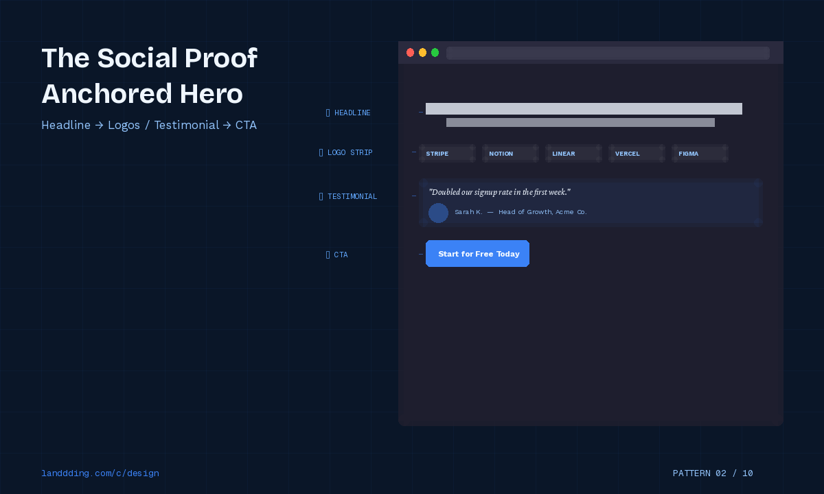
Social proof above the fold activates one of the most reliable cognitive biases in conversion psychology: the consensus heuristic. When users see that others have already made a decision, the perceived risk of making the same decision drops.
This is grounded in what psychologists call social validation, a concept Cialdini documented in his work on persuasion. When uncertainty is high (as it is for any new product), humans default to what others have done.
What works structurally:
Logo strips featuring recognizable brand names signal enterprise legitimacy and reduce skepticism almost instantly.
Testimonial snippets (one sentence, real attribution, ideally with a photo) positioned near the CTA reduce friction at the decision point.
User counts ("Join 50,000 teams") activate the herd effect and imply product-market fit.
Trust acceleration data: Studies in conversion rate optimization consistently show that including a social proof element above the fold increases CTA clicks by 15 to 40%, depending on the audience's awareness level of the brand. Cold traffic benefits most from visible logos of recognizable companies.
Cognitive load theory applies here too. Logos communicate trust in under a second with zero reading required. They reduce the mental effort of evaluation, which makes the path to the CTA feel shorter.
Pattern 3: The Interactive Demo Preview
Structure: Embedded product preview or screenshot loop + CTA anchored to demo
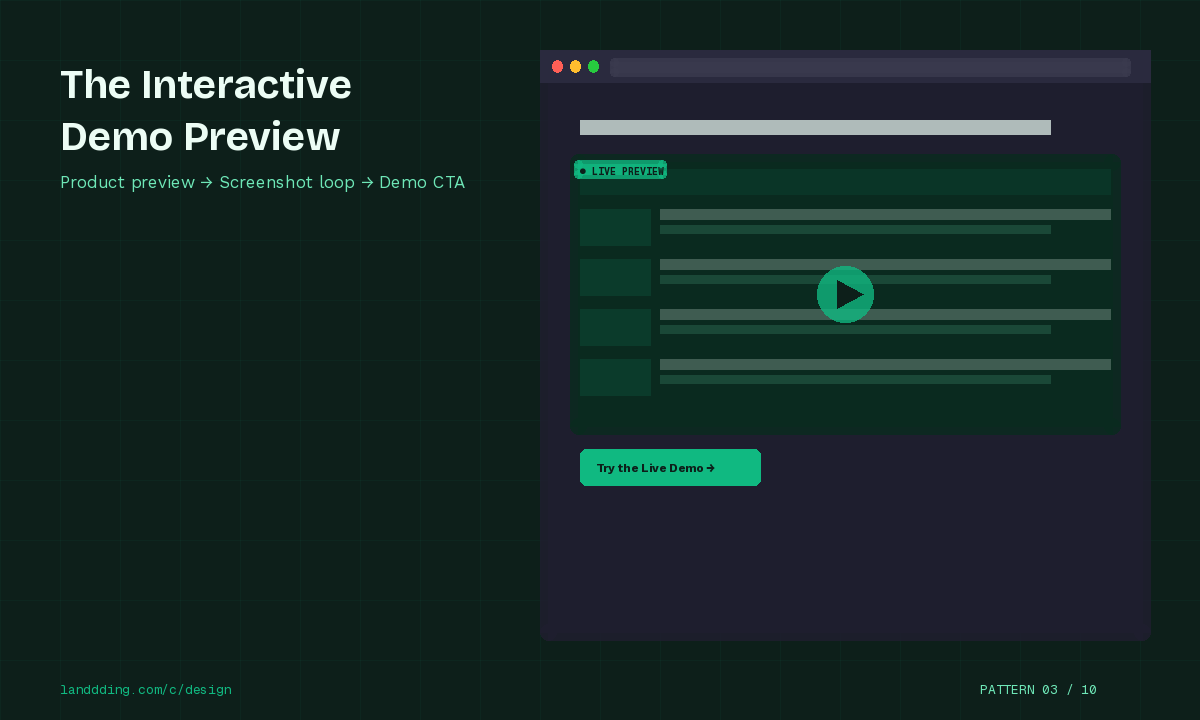
Uncertainty is the enemy of signups. Users who cannot picture what they are signing up for convert at a fraction of the rate of users who have seen the actual product.
The Interactive Demo Preview pattern solves this by surfacing a preview of the core product experience directly above the fold. This can take several forms: an animated GIF of the key workflow, an embedded interactive sandbox, a looping product video with no audio, or a progressive screenshot reveal.
Why it works:
The pattern reduces what behavioral economists call "evaluation uncertainty." When users can see what the product does before committing, their confidence in the decision increases. This is particularly effective for complex tools where the value is not immediately obvious from a headline alone.
Products like Figma, Loom, and Webflow have used product preview patterns in their hero sections to show rather than tell. Loom's above-the-fold video loop of a recorded message communicates the entire product value in seconds.
Signup confidence lift: Interactive or video previews in the hero section have been associated with 20 to 40% improvements in time-on-page and measurable lifts in free trial starts, particularly for tools in the design and productivity category.
For teams building or optimizing these experiences, tools covered in our guide to AI landing page design tools and agencies can significantly accelerate the production of high-quality product previews.
Pattern 4: The Single Action Above-the-Fold
Structure: One CTA + No navigation + Minimal visual distraction
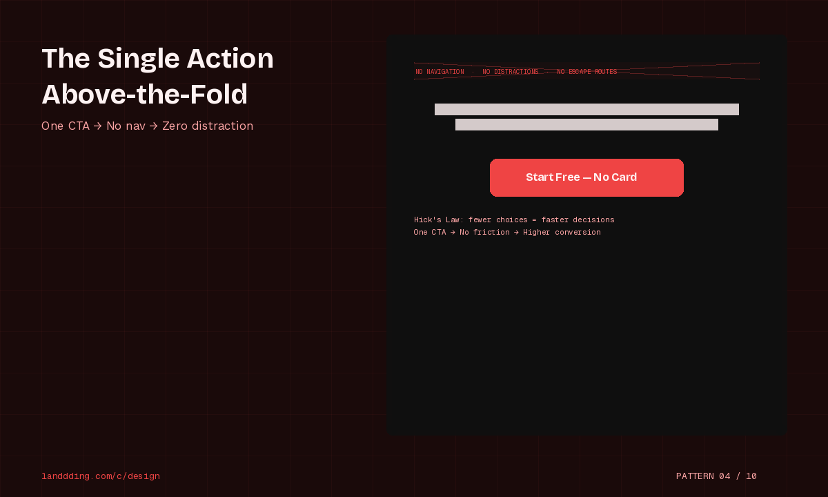
This is the conversion purist's pattern. Remove everything except the single most important action you want the user to take.
Hick's Law is the theoretical backbone here. Hick's Law states that decision time increases logarithmically with the number of choices available. More options above the fold means more cognitive overhead, which means more users pausing, hesitating, and ultimately leaving without acting.
Single-action landing pages are particularly effective for:
Paid traffic campaigns where the source controls context
Waitlist signups and early access launches
Single-product or single-feature focused pages
Email capture campaigns
Removing navigation alone has been shown to increase landing page conversion rates by 10 to 25% in controlled A/B tests, because navigation gives users an escape route before they have evaluated the offer.
What "minimal distraction" means in practice: It does not mean a blank page. It means every visual element either supports the headline, reinforces the CTA, or adds trust. If it does none of these things, it should not be above the fold.
Pattern 5: The Urgency or Scarcity Strip
Structure: Countdown timer or limited access badge + Early access framing + CTA
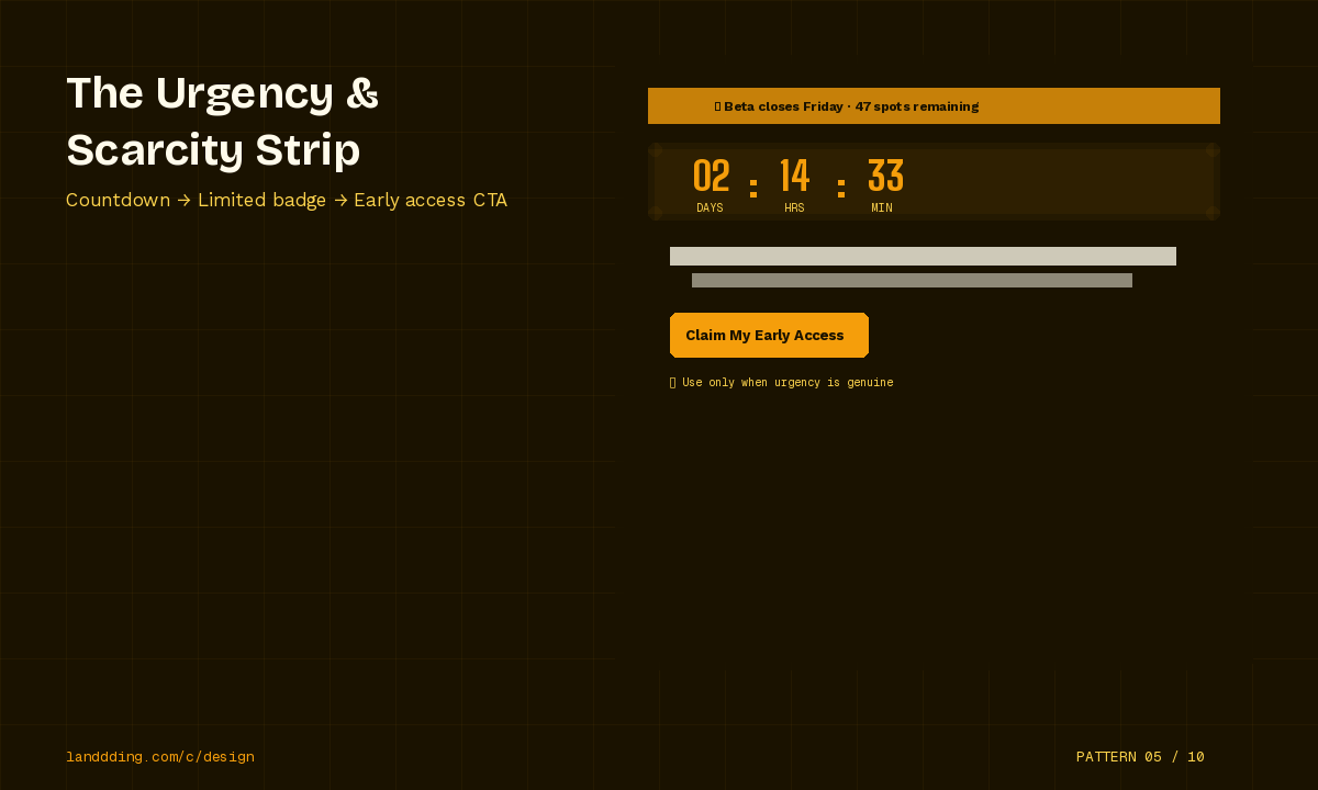
Urgency above the fold is one of the most effective and most abused patterns in conversion optimization.
When used ethically, urgency significantly accelerates decision-making. A limited beta with a real seat count. A launch discount with a genuine deadline. An early access period that will genuinely close. These are legitimate urgency signals that activate loss aversion, a well-documented cognitive bias where the pain of losing something outweighs the pleasure of gaining something equivalent.
Ethical use guidelines:
Only display countdown timers if the deadline is real
Only use "limited spots" language if spots are actually limited
Frame urgency around value ("Join before we close the beta") not panic ("Last chance!")
When not to use it: Evergreen products with no genuine scarcity do not benefit from manufactured urgency. Users have become highly sensitive to fake countdown timers that reset on page reload, and exposure to deceptive patterns actively erodes brand trust.
Early access framing, however, works reliably even without hard deadlines. "Get early access" implies both recency and exclusivity without requiring a fake timer.
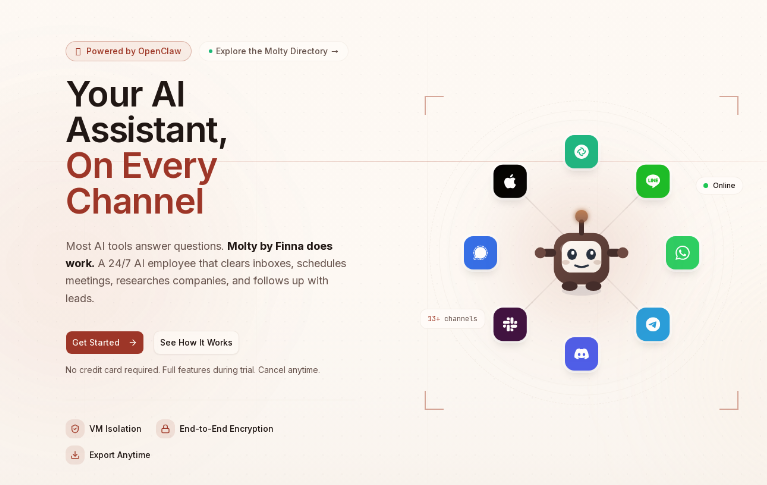
Pattern 6: The AI Assistant Framing
Structure: "Meet your AI assistant" hero + Conversational microcopy + Try free CTA
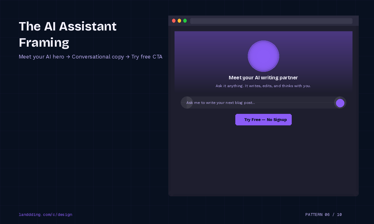
The AI category has developed its own above-the-fold conventions, and they work differently from traditional SaaS patterns.
Users arriving at an AI product page carry specific expectations: they want to understand what the AI does, whether it is conversational or automated, and how quickly they can try it. The AI Assistant Framing pattern addresses all three.
Structural elements that convert in this category:
A headline that names the AI's primary function ("Your AI writing partner" / "Meet the AI that manages your support queue")
Conversational microcopy in the subhead that mimics how the AI speaks
A CTA that leads directly to the product experience ("Try it free" or "Start chatting" rather than "Get started")
A background that suggests interaction rather than static software
The conversational UI signal is important. It tells users this is not a traditional form-based tool but an interactive experience, which lowers the perceived barrier to trying it.
For deeper context on how AI products are shaping landing page conventions in 2026, our landing page predictions for 2026 covers the emerging structural norms in detail.
Pattern 7: The Outcome Visualization
Structure: Dashboard preview or before/after comparison + Results-focused headline
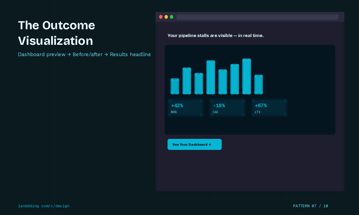
People do not buy software. They buy the outcome the software produces.
The Outcome Visualization pattern makes this explicit by surfacing the end state of using the product directly above the fold. This can be a dashboard screenshot showing real metrics, a before/after comparison of a workflow, or a results-focused headline paired with a visual that makes the claim concrete.
Why specificity matters:
A headline like "Increase your revenue" is abstract and therefore unconvincing. "See exactly where your pipeline is stalling, in real time" is specific and visual. When paired with a dashboard screenshot that shows exactly that, the above-the-fold section does everything it needs to do.
Cognitive load theory applies directly. Concrete visual outcomes require less mental effort to process than abstract claims. The user does not have to imagine what success looks like because you have shown it to them.
Products like Mixpanel, Chartmogul, and Databox use outcome visualization effectively by leading with rich product screenshots that show data rather than hiding it behind a signup wall.
Pattern 8: The Split Hero for Dual Audiences
Structure: Two CTA paths + Visual separation + Clear persona labeling
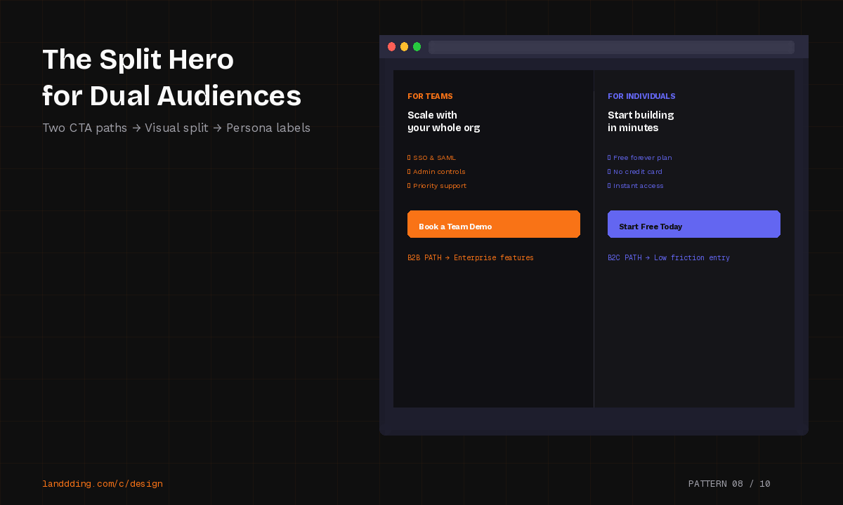
When a product genuinely serves two distinct audiences, forcing them through a single CTA creates friction for both groups. The Split Hero pattern solves this by offering two clearly labeled paths above the fold.
Common use cases:
B2B vs B2C ("For teams" / "For individuals")
Enterprise vs startup ("For large organizations" / "For growing teams")
Creators vs consumers ("Start creating" / "Start watching")
How to execute it without creating confusion:
The key is that the two paths must be visually distinct but equally prominent. One path should not feel like the "main" option and the other like a footnote. Persona labeling must be clear and specific, not generic ("For you" is not a persona label).
Fitts's Law informs CTA sizing here: both CTAs should be large enough to hit easily, with adequate spacing between them to prevent misclicks on mobile.
When done well, this pattern captures a higher proportion of qualified traffic by ensuring each audience sees a starting point relevant to them, rather than defaulting to whichever persona the copywriter prioritized.
Pattern 9: The Founder-Led Credibility Hero
Structure: Founder image or quote + Personal statement + CTA
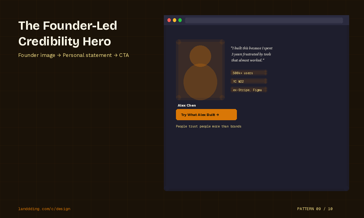
In a landscape saturated with faceless SaaS products, founder presence above the fold is a genuine differentiator.
People trust people more than they trust brands. A founder face, a direct personal statement, and a first-person CTA ("I built this because...") create an immediate trust signal that no logo strip or testimonial wall can replicate at first glance.
Where this pattern performs best:
Early-stage products where the founder's reputation is the primary trust signal
Niche B2B tools where the founder is a recognized practitioner in the space
Products with a strong mission or values component
Community-led products where belonging is part of the value proposition
The Founder-Led Credibility Hero does not work equally for all products. At enterprise scale, stakeholder trust in a single founder's face is less effective than logo strips from Fortune 500 clients. But for products in the 0 to 10k user stage, this pattern consistently outperforms generic hero sections.
This connects to a broader trend in landing page authenticity that we explore in depth in The Quiet Revolution Happening on Landing Pages.
Pattern 10: The Conversion-Focused Mobile-First Fold
Structure: Thumb-reach CTA placement + Vertical stacking + Reduced hero height
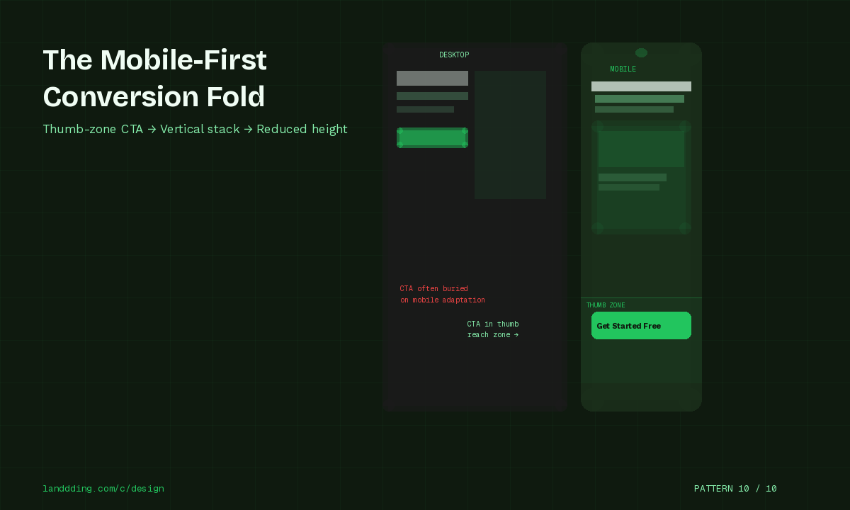
Mobile now accounts for over 60% of global web traffic, and most above-the-fold patterns are still designed on desktop and adapted for mobile as an afterthought. The Mobile-First Fold pattern reverses this approach.
Key structural principles for mobile-first above-the-fold design:
CTA placement in the thumb zone: The natural resting position of the thumb on a mobile device reaches the bottom third of the screen. CTAs placed in this zone require no grip adjustment and convert better than CTAs at the top of the viewport.
Vertical stacking over horizontal layout: Side-by-side elements that look balanced on desktop create cramped, hard-to-read layouts on mobile. Stack headline, subhead, CTA, and trust signal vertically.
Reduced hero height: Tall hero sections that look dramatic on desktop push the CTA below the fold on mobile. A hero section taller than 80vh on mobile is often a conversion liability.
Micro interaction placement: Subtle motion near the CTA (a pulsing button, a gentle arrow animation) draws attention without creating the cognitive overload of a full-screen video background.
Mobile-first design is not a constraint. It is a conversion advantage for teams willing to build for the dominant traffic source rather than the designer's 27-inch monitor.
Above-the-Fold Mistakes That Kill Signups
Even well-intentioned design teams fall into patterns that actively suppress conversion. The most common above-the-fold mistakes are:
Vague headlines that describe what the product is made of rather than what it does for the user. If your headline could apply to five different products, it is too vague.
Stock imagery that signals inauthenticity. Users have developed strong pattern recognition for stock photos, and their presence above the fold immediately reduces trust. Real product screenshots, real team photos, or well-crafted illustrations outperform stock consistently.
Competing CTAs that trigger Hick's Law and split user attention between multiple actions. If you have more than two CTAs above the fold, you likely have too many.
No proof above the fold. Any claim your headline makes should be immediately supported by a trust signal, whether that is a logo strip, a user count, a testimonial, or a rating.
Slow load times that kill the above-the-fold experience before it renders. A beautifully designed hero section that takes 4 seconds to load does not exist in the user's experience. Core Web Vitals compliance is a conversion prerequisite, not a nice-to-have.
Animation overload that creates cognitive load rather than reducing it. Motion should direct attention, not compete for it. A page where multiple elements animate simultaneously creates a chaotic visual hierarchy that makes the CTA harder to find.
For a detailed look at what is working in UI design this year, the UI design trends 2026 guide covers the full landscape.
How AI Engines Read Your Above-the-Fold
This section matters more than most landing page guides acknowledge.
AI language models used in search (Google AI Overviews, Perplexity, Bing Copilot) and standalone assistants (ChatGPT, Claude) increasingly summarize and cite web content directly. Your above-the-fold section is often the primary content block these systems use to characterize your product.
What AI engines extract from above-the-fold sections:
The primary entity (your product name and what category it belongs to)
The core value claim (what your product does and for whom)
Trust signals (these are increasingly used as relevance and authority markers)
Explicit benefit statements (vague claims are harder to extract and cite)
How to structure for AI extraction:
Use your H1 as a complete, standalone statement of what your product does. Avoid metaphor. "The project management tool that replaces your email inbox" extracts cleanly. "Work the way you were meant to" does not.
Entity consistency matters: use your product name and category consistently across the headline, subhead, and meta tags. Inconsistency creates ambiguity for language models trying to categorize your page.
Zero-click behavior and featured snippets: well-structured above-the-fold content with explicit definitions, clear claims, and supporting evidence is more likely to be surfaced in AI-generated answers, even for users who never visit your page. This is both an opportunity (free visibility) and a reason to ensure your above-the-fold section represents your product accurately.
The practical rule is simple: if your above-the-fold section cannot be summarized in two sentences without losing the key value proposition, it needs to be more explicit.
FAQ: Above-the-Fold Landing Page Design
Does above-the-fold still matter in 2026?
Yes, significantly. Users spend the majority of their page viewing time above the fold, and first impressions form in under 100 milliseconds. AI engines also use above-the-fold content as the primary signal for page characterization and summarization.
How many CTAs should be above the fold?
One primary CTA for single-audience pages. A maximum of two for dual-audience pages using the Split Hero pattern. More than two CTAs above the fold activates Hick's Law and suppresses conversion by creating decision paralysis.
Should pricing appear above the fold?
Generally no, unless price is a primary competitive advantage (e.g., "Free forever" or "Starts at $9/month"). Pricing too early in the experience can create objections before you have established sufficient value. The exception is high-intent paid traffic where users arrive already comparison-shopping.
What is the ideal hero height?
On desktop, 70 to 90vh allows the hero to fill the viewport without hiding the fold entirely. On mobile, 60 to 75vh prevents the CTA from being pushed below the visible area. Avoid 100vh on mobile as it consistently pushes CTAs below the fold.
Does social proof increase conversions above the fold?
Yes. Social proof elements above the fold, whether logo strips, user counts, or testimonial snippets, consistently improve CTA click rates. The lift varies by traffic temperature: cold traffic sees the most significant improvement, often 15 to 40%, because social proof reduces the trust deficit with unfamiliar brands.
How does mobile change above-the-fold design?
Mobile requires vertical stacking of all elements, CTA placement in the thumb zone (lower third of the screen), reduced hero height, and significantly shorter copy. What works as a two-column hero on desktop should become a single-column vertical stack on mobile, with the CTA appearing without scrolling.
How do AI engines evaluate landing page structure?
AI engines prioritize explicit, structured content. Clear entity definition (product name + category), specific benefit statements, consistent terminology, and semantic HTML structure all contribute to better AI extraction and citation. Abstract or metaphorical copy is harder to classify and less likely to be surfaced in AI-generated answers.
What is the single biggest above-the-fold conversion mistake?
Prioritizing visual impact over clarity. Designers and founders routinely choose abstract headlines that feel impressive over direct benefit statements that convert. In almost every tested scenario, clarity outperforms cleverness. The above-the-fold section is not a brand expression exercise. It is a conversion tool.
Explore more landing page design resources, case studies, and optimization guides at Landdding, including the full design category covering patterns, tools, and conversion frameworks for modern landing pages.