Less is more - especially when you want someone to click a button. Minimal landing pages have quietly become the default format for high-performing SaaS products, AI tools, and e-commerce brands, not because of aesthetics, but because they work. This post breaks down 15 real-world minimal landing page design examples, explains the conversion mechanics behind each one, and shows you how to apply the same principles to your own pages.
What Is a Minimal Landing Page?
Short answer: A minimal landing page removes unnecessary UI elements and focuses attention on a single goal using whitespace, strong hierarchy, and one primary call to action.
Key characteristics:
Single CTA focus - one goal, one action
Limited color palette - typically 1-2 accent colors
Strong typography - hierarchy does the work visuals usually handle
Why Minimal Landing Pages Convert Better
1. Reduced Cognitive Load
Every element on a page competes for your visitor's attention. When you add a hero banner, a navigation bar, three competing CTAs, a chat widget, and a promotional ribbon all at once, you force the brain to spend energy parsing which thing matters most - and that energy comes directly out of the budget that should go toward your actual conversion goal. Minimal design removes the competition. There is one thing to look at, one action to take, and one reason it matters. The result is faster decision-making and lower bounce rates.
2. Clear Value Proposition
A cluttered page buries its headline. Minimal pages cannot hide behind visual complexity, so they are forced to do the harder work: saying exactly what they offer, for whom, and why it matters - in a single sentence above the fold. This constraint produces sharper messaging. When your layout cannot compensate for weak copy, your copy gets stronger.
3. Faster Load Times
Fewer images, fewer scripts, fewer third-party embeds. Minimal pages load faster by default. Google's Core Web Vitals framework rewards this directly - Largest Contentful Paint (LCP) and Cumulative Layout Shift (CLS) scores improve when pages carry less visual weight. Faster pages rank higher and convert better. The performance benefit of minimalism is not cosmetic; it is structural.
4. Stronger CTA Visibility
On a visually dense page, a CTA button must fight for visibility. On a minimal page, it is often the only interactive element in view. When the eye finishes reading the headline, it has nowhere to go but the button. This is not an accident - it is deliberate visual funneling. Fewer distractions mean a measurably higher click-through rate on the primary action.
For a broader view of where landing page design is heading, see our guide to the future of landing page design.
15 Minimal Landing Page Design Examples
The following examples are grouped by industry category. Each breakdown focuses on conversion mechanics - not just aesthetics.
Minimal AI Landing Pages
AI products have led the minimalism wave. Browse more in our collection of AI landing page examples.
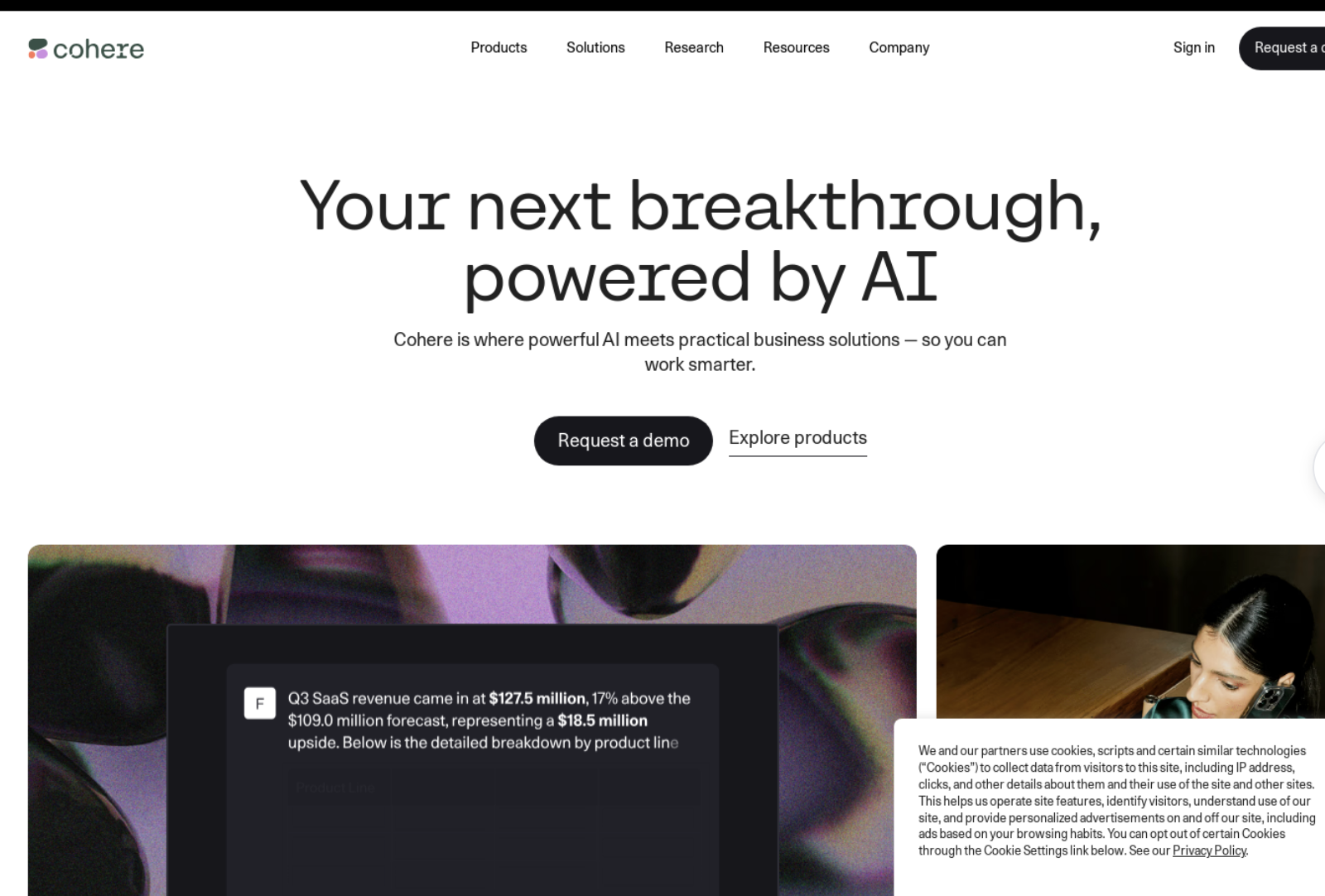
Linear - AI-Assisted Project Management Tool
Linear's landing page is a masterclass in typographic hierarchy. A dark background frames a single bold headline at center screen. The subhead is two lines. The CTA is one button. There are no hero images, no feature grids above the fold, and no navigation clutter.
Why It Converts:
Dark mode creates immediate depth without additional graphic elements
The headline fills 60% of the viewport, making it impossible to miss
Single white CTA button has maximum contrast against the dark background
No navigation links above the fold - reduces exit paths to near zero
Social proof appears below the fold, after conviction is already building
Design Takeaway: If your product's name is strong enough, let it fill the screen. Confidence in typography signals confidence in the product.
Perplexity AI - AI Search Engine
Perplexity puts a single search input front and center. The entire page above the fold is a search bar and a prompt. No elaborate hero section, no feature list, no pricing teaser. The interface IS the landing page.
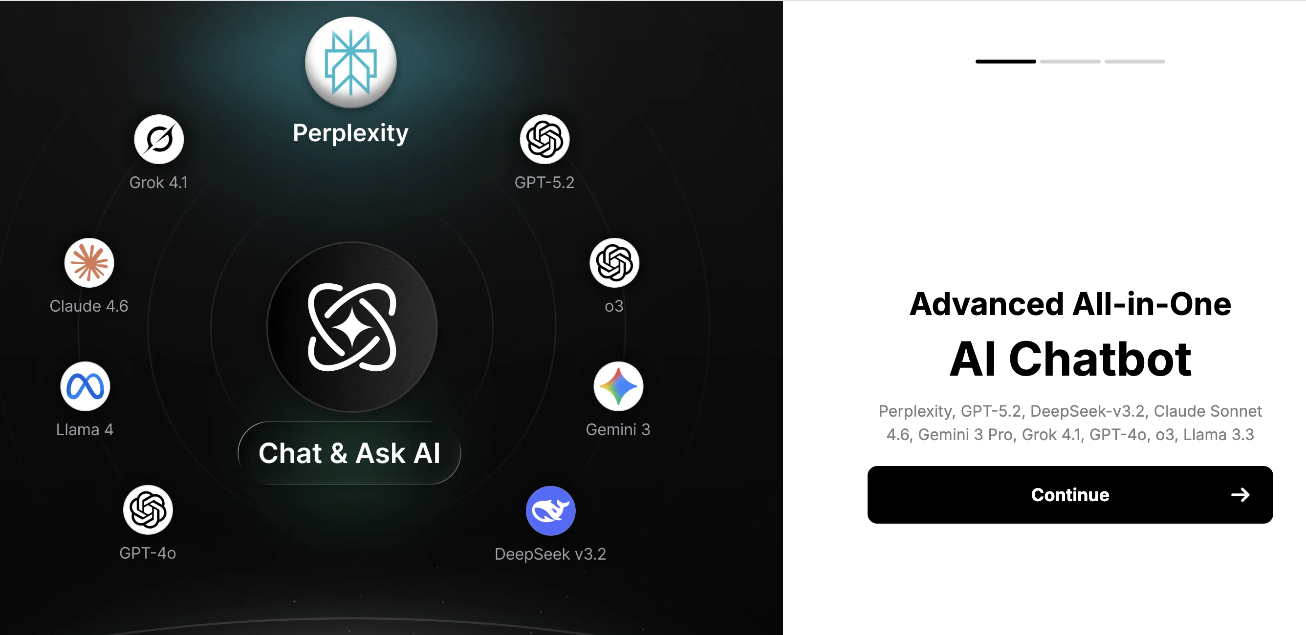
Why It Converts:
Product demo replaces traditional landing page copy entirely
Immediate interaction reduces the distance between 'landing' and 'trying'
Whitespace creates a sense of calm that signals ease-of-use
No header navigation - visitors cannot leave to browse other sections
The search bar's size communicates exactly what the product does
Design Takeaway: When your product is simple to demonstrate, make the demo the page. Interaction converts better than description.
Notion AI - AI Writing and Knowledge Tool
Notion AI's sub-page uses a centered layout with a short animated product preview. The headline is under ten words. The CTA appears twice - once above the fold, once after the feature proof.
Why It Converts:
Animated GIF shows the product working without requiring a click
Two CTAs (above and below the demo) capture both impulsive and deliberate visitors
Muted color palette keeps attention on the product animation
Tight headline spacing forces word-by-word reading rather than skimming
No pricing on this page - reduces decision friction at the awareness stage
Design Takeaway: A short looping animation can replace a full feature section. Show the output, not the feature list.
See also: AI landing page tools and agencies for a curated list of platforms building in this space.
Minimal SaaS and Technology Landing Pages
SaaS pages need to convert cold traffic fast. Find more examples in our technology landing page inspiration gallery.
Vercel - Deployment and Frontend Platform
Vercel's homepage uses a dark gradient field with a glowing central headline. There are no images of the product, only text, a glow, and a CTA. The entire hero fits in a single viewport with no scrolling required.
Why It Converts:
The central glow effect draws the eye to the headline without additional graphics
Short headline ('Build. Ship. Scale.') mirrors developer brevity
Two CTAs side-by-side offer a binary choice: start for free, or talk to sales
Below-the-fold content is dense but modular - each block is self-contained
Logo strip of enterprise clients appears immediately below the hero
Design Takeaway: A lighting effect (glow, gradient, spotlight) creates visual drama with zero image assets - ideal for performance-first pages.
Stripe - Payment Infrastructure
Stripe's landing page remains one of the most-cited conversion references in SaaS design. A gradient hero, a short bold headline, and two CTAs have remained largely unchanged for years - because they work.
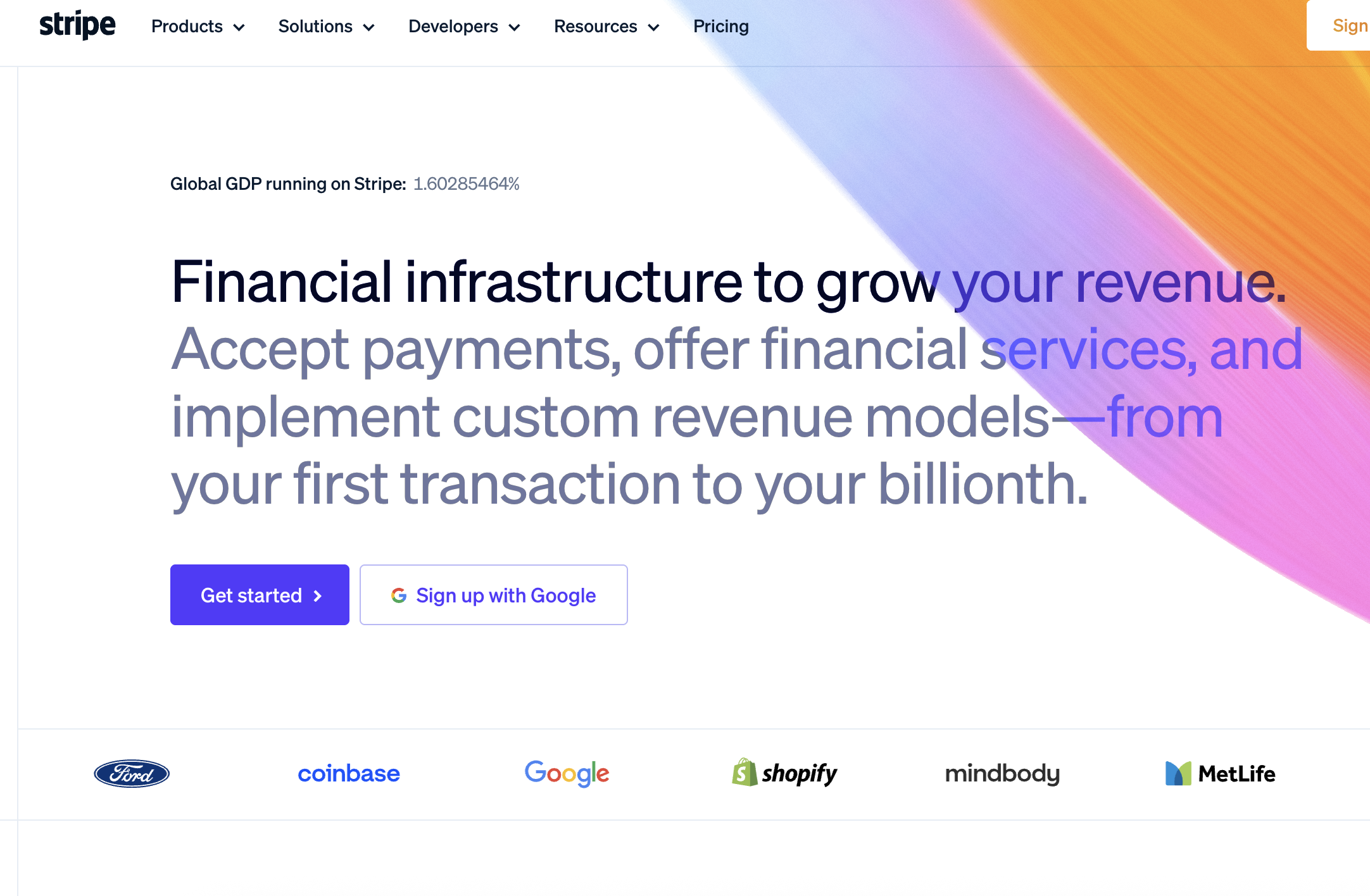
Why It Converts:
Purple gradient differentiates the page from a saturated SaaS landscape
'Get Started' and 'Contact sales' CTAs serve two distinct visitor types simultaneously
Code sample appears in the hero, signalling developer trust without a word of copy
Minimal nav - six items maximum - reduces distraction while enabling exploration
Social proof (companies using Stripe) renders as logos, not text - fast to parse
Design Takeaway: Showing code in your hero is one of the fastest ways to build developer trust. It signals that your product is real, technical, and ready to use.
Loom - Async Video Messaging
Loom uses a video-forward minimal page where the product demo plays automatically on load. Headlines are short. The CTA is 'Get Loom for free'. Everything else is secondary.
Why It Converts:
Auto-playing product video replaces hero copy for visual learners
Free tier CTA removes the single biggest friction point: cost uncertainty
Headline is benefit-led ('Say it better with video') not feature-led
Clean white background makes the colourful product screenshots pop
Trust badges (G2, Product Hunt) appear without disrupting visual flow
Design Takeaway: Lead with your free tier in the CTA. 'Free' is conversion copy, not just a pricing strategy.
Minimal E-commerce Landing Pages
Product pages do not need to be loud to sell. Explore more in our ecommerce landing page examples collection.
Allbirds - Sustainable Footwear
Allbirds uses generous whitespace to position each product as a premium object. The landing pages for new product drops often feature a single hero image, a product name, one line of copy, and a 'Shop Now' button.
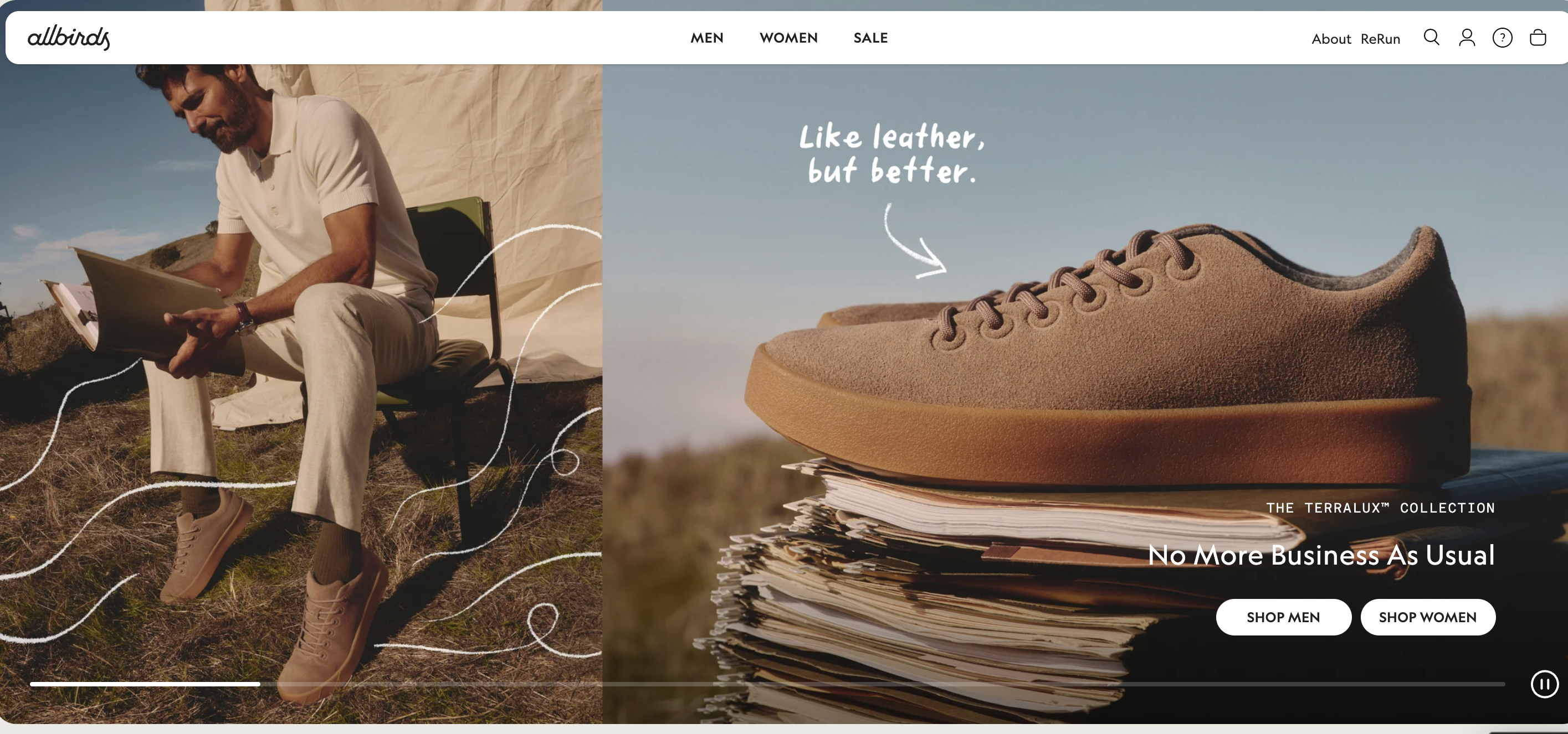
Why It Converts:
Premium whitespace signals premium product - no discount-era clutter
Product photography fills the frame on a clean white or light-grey background
Single CTA avoids the typical e-commerce trap of linking to five different collections
Material storytelling (wool, tree fibre) is done in short sentences, not long blocks
No countdown timers or urgency mechanics - restraint builds brand credibility
Design Takeaway: In e-commerce, what you remove signals as much about your brand as what you keep. Whitespace is a premium pricing signal.
Glossier - Direct-to-Consumer Beauty
Glossier's campaign landing pages are studied in DTC circles. They typically feature a large editorial photo, a product name in clean serif typography, and a Buy button. The minimalism communicates that the product sells itself.
Why It Converts:
Editorial photography replaces feature lists - the product is the story
Pink brand color is used sparingly - one accent, maximum contrast
No complex navigation on campaign pages - visitors arrived for one reason
'Add to bag' CTA is above the fold on desktop, and first on mobile scroll
Customer photo reposts appear below fold as low-friction social proof
Design Takeaway: Let your photography do what copy cannot. One hero image with emotional resonance outperforms ten feature bullets.
Minimal Web3 Landing Pages
Web3 pages have evolved from cluttered token launches to clean, founder-led designs. See more web3 landing page designs.
Uniswap - Decentralised Exchange Protocol
Uniswap's landing page uses a gradient background, a centered headline, and a single 'Launch App' CTA. There is no whitepaper link, no tokenomics table, and no roadmap - just a clear invitation to start.
Why It Converts:
App-first CTA removes the information overload typical of crypto projects
Abstract gradient visuals convey technology without screenshots of complex UI
Short strapline ('Trade crypto with confidence') is accessible to non-native DeFi users
No social media links above the fold - eliminates the biggest distraction in Web3
Trust is built via protocol stats (volume, pairs, users) in small secondary text
Design Takeaway: In Web3, simpler pages signal more mature products. Complexity in the landing page often reflects complexity (or unreadiness) in the product.
Minimal Portfolio and Creative Landing Pages
Personal brands and creative studios benefit enormously from restraint. Explore design portfolio landing pages for inspiration.
Studio Freight - Creative Development Studio
Studio Freight's website is a live portfolio that doubles as a landing page. A full-bleed dark canvas with minimal text, slow typography animations, and a single contact CTA. The restraint communicates elite positioning.
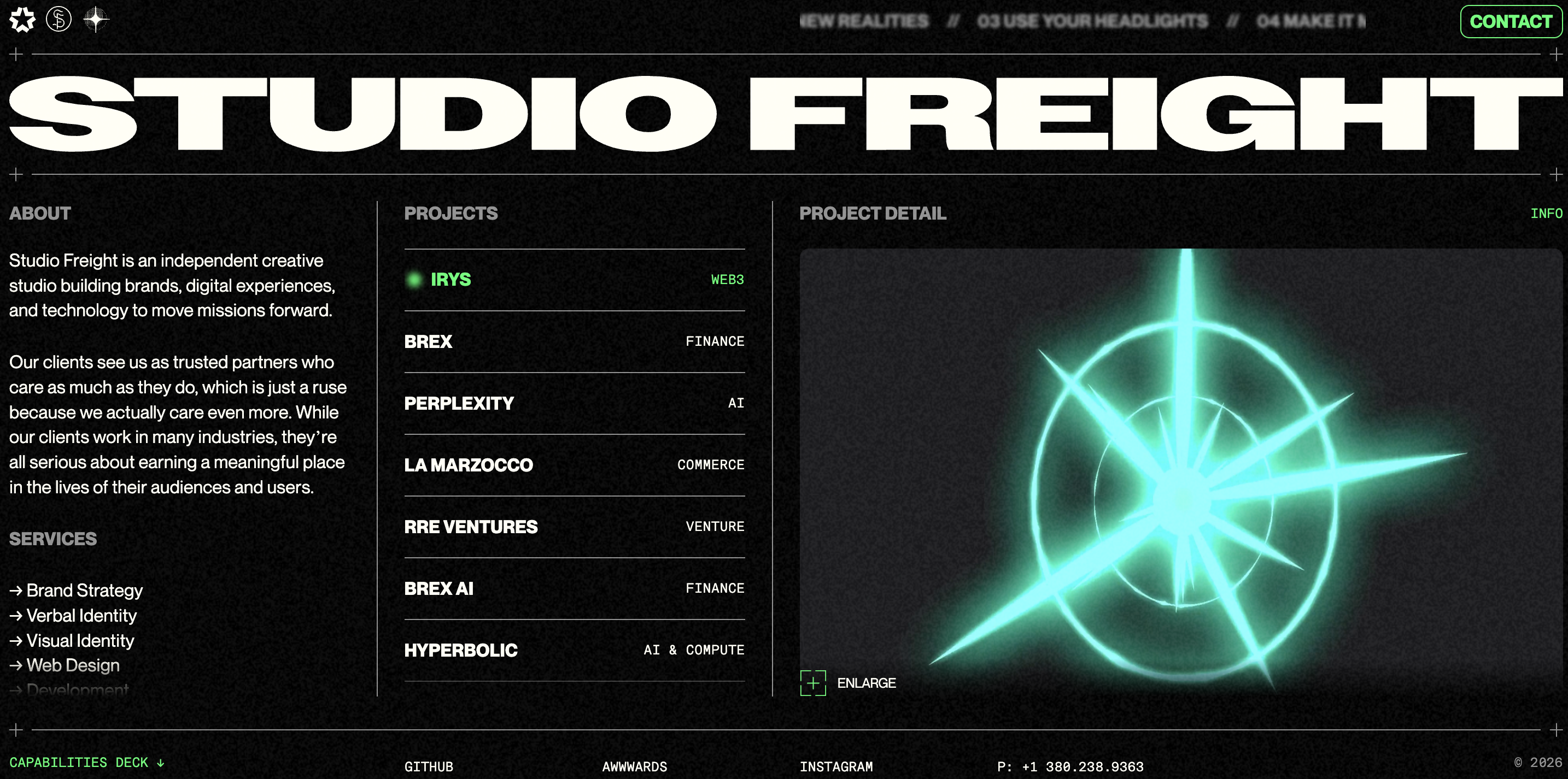
Why It Converts:
Full-bleed dark canvas creates immediate, memorable visual impact
Slow typography animations show technical capability without screenshots
Single email CTA - contact us - filters for serious enquiries only
No pricing, no packages, no service menus - removes commodity framing
Navigation is hidden until hovered - keeps the initial impression clean
Design Takeaway: For creative studios, the website IS the proof of concept. Make the design do what words about design cannot.
Femke van Schoonhoven - Product Designer Portfolio
Femke's portfolio homepage leads with a short bio, a clear role statement, and links to work. No carousel, no gallery, no animation. The simplicity itself is a strong design signal.
Why It Converts:
Above-the-fold bio establishes trust, context, and tone in three sentences
Case study links are text-only - forces visitors to click based on curiosity, not imagery
Light, warm background palette differentiates from typical dark-mode design portfolios
No social metrics or follower counts - lets the work speak without vanity signals
Contact CTA appears in the main nav and footer - consistent without being aggressive
Design Takeaway: For personal portfolios, your voice is your visual. A confident bio converts better than a polished splash screen.
Related reading: our designer portfolio website guide covers structure, layout, and case study presentation in detail.
Three More Minimal Pages Worth Studying
Figma - Collaborative Design Tool
Figma's hero uses a product screenshot centered in a clean white frame with a concise benefit headline and two CTAs. The page communicates collaboration through the product visual, not through lengthy copy.
Why It Converts:
Product screenshot above the fold validates the tool before any copy does
Dual CTAs ('Get started for free' / 'Watch demo') serve action-ready and research-mode visitors
White background and light interface create maximum screenshot legibility
Navigation is sparse - five links - preventing distraction during the conversion moment
Pricing link in the nav acknowledges commercial intent without foregrounding cost
Design Takeaway: A clean product screenshot converts. Do not animate it, illustrate it, or replace it with an abstract graphic unless your product genuinely requires it.
Pitch - Presentation Software
Pitch's landing page uses oversized typography, a muted gradient, and a single product GIF. The visual language is editorial rather than software-product - making it feel premium and creative in a crowded category.
Why It Converts:
Oversized headline typography creates a magazine-quality feel in a SaaS context
Muted pastel gradient differentiates from the typical blue-heavy SaaS palette
Short animated GIF shows the product's speed without a full demo video load
Minimal nav with no dropdown menus reduces the cognitive surface area
Team-focused copy ('for your whole team') repositions the tool from personal to enterprise
Design Takeaway: Editorial typography signals creative maturity. If your audience includes designers or marketers, this is a positioning lever, not just an aesthetic choice.
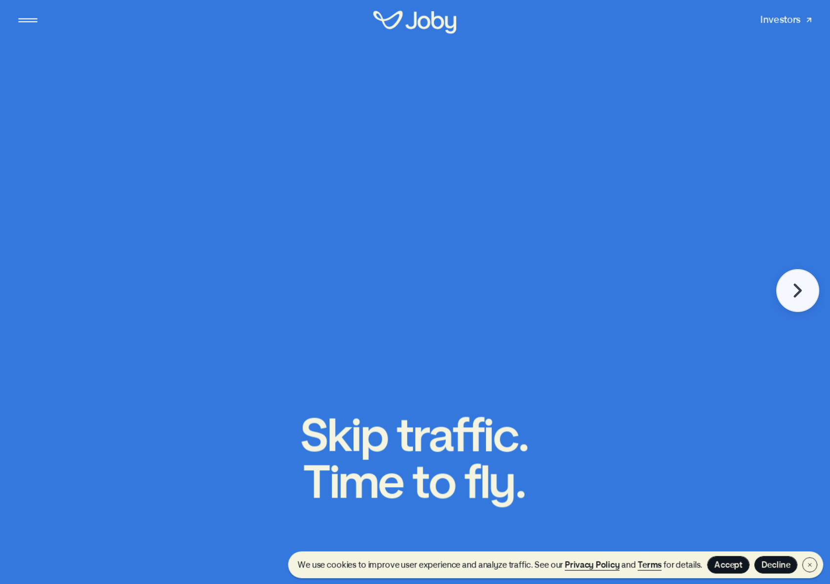
Superhuman - Premium Email Client
Superhuman's landing page is legendarily minimal. A short waitlist headline, a single email input, and a submit button. For years, the entire above-the-fold experience was a signup form backed by one line of social proof.
Why It Converts:
Exclusivity framing ('the fastest email experience ever made') justifies the waitlist mechanism
One input field is the lowest-friction signup experience possible
Dark, focused background eliminates every distraction from the email input
Single social proof quote appears below the input - timing is deliberate
No feature list, no pricing, no screenshots - scarcity and curiosity do the work
Design Takeaway: Waitlist mechanics only work when the offer is positioned as exclusive. Minimalism reinforces that exclusivity by refusing to explain itself fully.
Explore the full gallery of minimal landing pages
→ Browse all examples on Landdding
Common Mistakes in Minimal Landing Page Design
Minimalism without intention produces pages that feel empty rather than focused. These are the five most common failure modes.
1. Too much whitespace without hierarchy
Whitespace works when it creates contrast and directs the eye. When elements are spaced equally far apart with no visual hierarchy, the page feels aimless. Whitespace is a tool for emphasis - not a replacement for structure.
2. Weak CTA contrast
Minimal pages often suffer from over-restrained CTAs. A ghost button (outline-only) on a white background nearly disappears. Your CTA needs maximum contrast with its surrounding context, regardless of how subtle the rest of the page is.
3. No proof elements
Stripping social proof in the name of minimalism is a conversion killer. You do not need a review carousel or a five-star rating widget - but a single well-chosen customer quote, a recognisable logo strip, or a specific usage number dramatically increases conversion without visual clutter.
4. Removing navigation without context
Hiding the navigation works for dedicated campaign pages and product launches. It fails on homepage replacements where visitors need context before they trust the CTA. Remove navigation when you are driving warm, targeted traffic. Keep a minimal nav for cold organic traffic.
5. Minimal but slow
A page that looks minimal can still be technically heavy. Unoptimised fonts, large background images, and unnecessary JavaScript libraries can make a 'minimal' page load in 4+ seconds. Visual minimalism must be matched by technical minimalism. Test your Core Web Vitals scores before launch.
How to Design a High-Converting Minimal Landing Page
Follow these five steps in sequence. Skipping step one makes every subsequent step harder.
Define one conversion goal. Write it down: 'This page exists to get visitors to start a free trial.' Every subsequent decision is tested against this goal. If an element does not serve the goal, it does not belong on the page.
Remove secondary actions. Go through your existing design and identify every link, button, or navigation item that is not the primary CTA. Remove them. If you cannot remove a navigation link, collapse it into a single minimal menu that is only visible on scroll.
Use one accent color. Choose the color with the highest contrast against your background. Use it exclusively for CTAs and key highlights. This creates a visual grammar: your accent color means 'act here'.
Prioritise above-the-fold clarity. Your headline, subhead, and CTA should all be visible without scrolling on a standard laptop viewport (1280×800). Test this explicitly. If a visitor has to scroll to find your CTA, you have not finished designing your hero.
Validate with scroll heatmaps. Deploy the page, drive initial traffic, and examine scroll depth and click heatmaps. Look for where users stop scrolling - that is often where your hierarchy breaks. Look for rage clicks - that is often where your CTA is not visible enough.
Ready to build? Start with our landing page templates - built for conversion from day one.
Platform-specific minimal landing page templates:
Minimal vs Modern Landing Page Design
Minimal and modern are not synonymous. Modern landing pages increasingly use rich motion, bento grid layouts, and layered interaction patterns that can conflict with the conversion-focused restraint of minimal design. Use this comparison to decide which approach fits your product and audience.
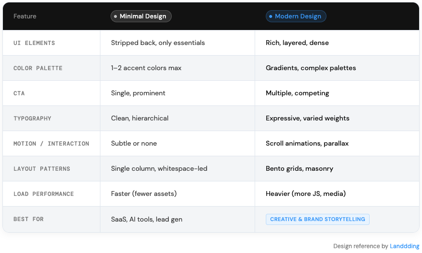
The right choice depends on your traffic source, your product's complexity, and your brand positioning. Cold ad traffic converts better on minimal pages. Warm organic traffic exploring a complex product may need the depth that modern layouts provide.
If you are working with bento grids or richer modern layouts, see our bento grid layout guide for implementation patterns.
For broader context on where design is heading this year, read our UI design trends 2026 overview.
FAQ
What is a minimal landing page?
A minimal landing page is a single-purpose web page that removes all non-essential UI elements to focus visitor attention on one conversion goal. It is defined by limited colour usage, strong typographic hierarchy, generous whitespace, and a single primary call to action. The format is widely used by SaaS products, AI tools, and DTC e-commerce brands.
Do minimal landing pages convert better?
In most contexts, yes. Reduced cognitive load, stronger CTA visibility, and faster load times all contribute to higher conversion rates on minimal pages compared to visually complex alternatives. The exception is product categories where extensive social proof, detailed feature comparisons, or visual demonstrations are required before visitors will act - in those cases, longer-form pages may outperform minimal designs.
How many sections should a minimal landing page have?
A high-converting minimal landing page can work with as few as three sections: a hero (headline, sub-headline, CTA), a proof section (social proof, logos, or a brief feature confirmation), and a closing CTA. Most minimal pages that convert well have between three and six sections. Adding more sections is not inherently wrong, but each section should earn its place by addressing a specific objection or providing necessary context.
Are minimal designs good for e-commerce?
Yes, particularly for premium and direct-to-consumer brands where product quality and brand positioning are the primary conversion drivers. Minimal e-commerce pages reduce distraction around the purchase decision and signal premium pricing through restraint. They are less effective for clearance or multi-SKU catalogue pages where comparison and filtering are part of the buying process.
What platforms are best for minimal landing pages?
Webflow, Framer, and Squarespace are the most widely used platforms for minimal landing page design because of their visual control and performance defaults. WordPress with a block-based builder (like Kadence or GeneratePress) works well for content-heavy sites that need minimal campaign pages. Wix has improved its performance significantly and works for simpler minimal builds. The platform matters less than the discipline to remove unnecessary elements - a minimal page can be built on any modern no-code tool.
─────────────────────────────────────────
Building landing pages for clients? Get in front of the right audience.
Have a minimal landing page that deserves to be seen?